There appears to be, at least to me, a fundamental difference between how we view photographs and how we view ‘real life.’ It might say something interesting about our perceptions, but that’s a philosophical post for another time. When out someplace photogenic, for instance, we tend to notice certain things and yet entirely miss others, even when they fall within the frame of the photo that we’re taking. And we’re probably more alert to the details when we’re taking photos than otherwise. There’s a trait called “inattention blindness” that’s often very easy to demonstrate, with more than a couple of online videos showing how it works. From a photography standpoint, it’s how ‘photobombing’ can take place, where someone can show up in our photos because we never noticed them when taking the shot.
 When we view the photos themselves, however, we tend to see most of the details. I suspect this is because, in the open world, there’s too many individual objects to pay attention to, and we pick the ones that our brains tell us are important. There’s also undoubtedly the visual aspect, most especially of depth perception, where we focus on something in particular and other things, out of focus, just don’t attract our attention. A photo is just one object, however, and we tend to think of it as ‘complete’ – what’s in there is intended to be in there and thus has some importance to the scene, mood, idea, whatever. Depth is flattened, with distance and separation between elements lessened or even eliminated, so background trees can easily blend into foreground bushes. It’s something that I warn my students about routinely.
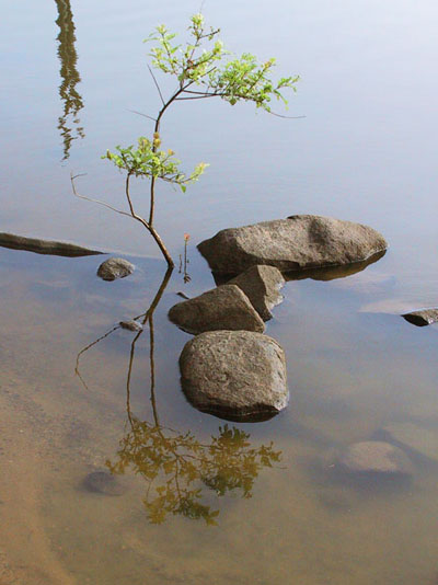
But let’s take a look at that process, and most especially, seeing the unseen elements and using them creatively. One way that I demonstrate the difference is, when alongside some body of water, asking a student what color the water is. Usually the answer is something like, “Kind of greenish brown,” but for a photograph, this only applies if that’s the color register that’s going to appear in the image itself. Depending on the angle and the lighting, the water may reflect the sky or the background foliage, or show the color of the creek bottom, or even be inky black from reflecting nearby shadows – it’s easy enough to have combinations of these. By recognizing this, you can occasionally have the background of choice by changing which angle you’re shooting from and thus what the water is reflecting in your frame.
It’s not just water, however. Any portion of the background can become a useful element in the scene you create. Very often, it helps to position your subject against a contrasting background, or one that frames or surrounds it, while avoiding background elements that might interfere – the classic “pole out of the top of the head” is a prime example. As often as not, this means positioning yourself instead; crouching down can put a subject against a bright sky and eliminate clutter from background foliage, and for small subjects, you can even place a large leaf to change your background (or, in the macro studio, use a photo itself to provide a natural-looking background instead of the tabletop or garage walls.)
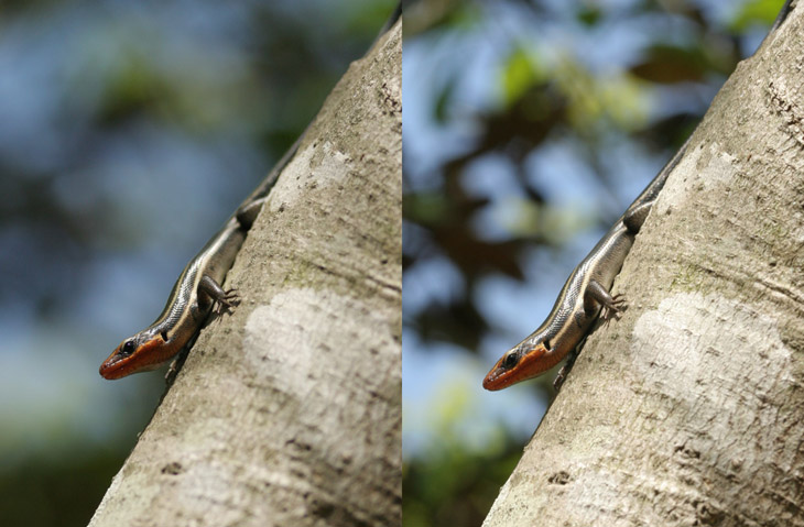
One of the harder aspects to manage is how the background will render due to depth of field, since most cameras routinely maintain the widest aperture, for clarity of vision and improved autofocus, up until the shutter is actually tripped; what this means is that depth of field will be the shortest available at that focal length and focus point in the viewfinder, but the image itself may render entirely differently. And while our eyes don’t have infinite depth of field, they focus so rapidly that we often consider everything to be in focus when examining the scene before we take the picture – it can be hard to know just what level of focus and blur is ideal. A lot of cameras have a depth-of-field preview option and it helps to know how to use this, but the view in the viewfinder/LCD is far removed from the finished image in size and resolution, so there usually still remains some guesswork.
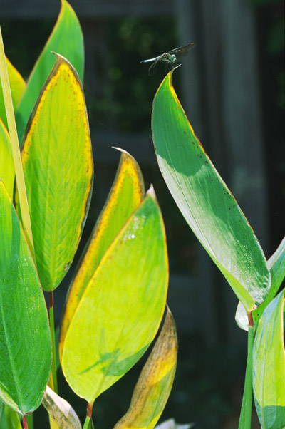 What’s more fun, though often challenging, is to capture subtle details that don’t immediately leap to the viewer’s eye, but can be found on closer examination – there’s a certain delight in the discovery, and a recognition of your efforts to put together a clever image. Initially you may miss these yourself, but over time you’ll develop an ability to notice small details, or realize that a different approach might yield something twice as interesting. In a lot of ways being able to see things that others miss is a mark of a creative photographer, and can make the difference between a nice photo and a captivating one. It also helps to know what kind of effects you can produce, either in-camera or by editing; some scenes are obviously interesting, while others may become interesting with the application of a certain technique. This might mean adjusting exposure to make something darker and moodier, or boosting contrast to make it stark. It might even mean using a reflector or a focused light source to brighten a particular aspect of the scene and draw more attention to it, or simply converting it to monochrome or sepia tone – a faint hint of sepia and a bit of extra grain can instantly age a photo fifty years, but this often works best if you think of it when taking the original image.
The way that you frame (or subsequently crop) the shot can have an affect on how easy it is to see that extra element, since we’re used to expecting the important parts of the image to show up in certain areas – not too close to the edges, for the most part, but also balanced to a degree. If the subject seems too far off to one side or edge, we’ll be looking through the rest of the frame to see if there’s something else that was captured, and you can use this trait or intentionally thwart it if you like, sneaking in another element that falls too far from ‘proper’ framing to attract attention immediately.
 There’s also a knack to seeing a particular element – a certain shape, or a certain color, or just a specific object – and realizing that it would work best when composed with another element, such as a contrasting color or complementary shape, then seeing if this can actually be accomplished; a simple example would be a yellow flower with another color blossom offsetting it from the background, which could require a significant shift from a ‘normal’ position to line the two up, but the end result is magnitudes better than the flower among neighbors of the same color, which is what everyone else sees.
Naturally, there’s the opposite side of the coin, where we have to see the subtle and unnoticed elements that we don’t want in the image in order to keep them out and avoid distractions – again, the photobomb effect, but it also applies to bits of trash or electrical wires or other things that we’ve tuned out but become far too noticeable in the resulting image. Granted, this is a pretty fundamental aspect of composition and it might seem like I’m belaboring the obvious, but it’s also true that all of us still miss things like this on occasion. It helps a lot to examine the surroundings in detail before even taking the camera out, so when the ideal subject or conditions or what-have-you captures our attention, we’re not wasting time looking over the entire frame to see what we don’t want in there – we’ve already chosen the vantage or angle that works best and is free from such detritus. As the bird crosses the sky, we already know that there’s a nice opening through the branches right there, or the clouds are optimal here, and can trip the shutter at the ideal moment even as we pan to maintain focus on the bird. Alternately, we might already have the lens aimed at a good spot (fixed on a tripod perhaps) and can nail the pic as the subject enters the precise portion of the frame. A little forethought can help a lot.
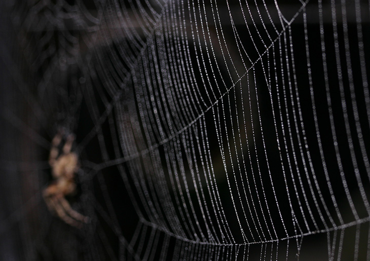
As we close, I’ll direct you back up to that opening image of the spiderweb. Yes, the spider was obvious and intended, a counterpoint to the focused dewdrops on the web, but what wasn’t intended was the spiral in the background, a bit of iron scrollwork on the porch behind the web. The resulting image was entirely different from how it looked in the viewfinder, due to aperture and flash, and I wasn’t expecting to see anything other than darkness back there. But the spiral is located very well in the frame, and forms a complementary curve with the most prominent strand of the web, not exactly lined up yet still tracing the same decreasing ratio – a nice addition to the image that was pure dumb luck on my part. Still not enough to offset the creepiness of the spider perhaps, but hey…


