


Yes, it’s finally here! The podcast I’ve been trying to finish for literally weeks! It will surely live up to the hype and anticipation…
Walkabout podcast – Composition
First off, since I’m speaking in generic composition terms within the podcast, you can click here for the entire list of posts that deal with composition, especially more specific and detailed aspects. There’s just a couple…
And while I’m at it, my views on art, a small part of the reason why I don’t pursue it rabidly. It’s got nothing to do with not being very good at it…
Did you get to the point where I demanded that you watch the video? Good – it’s this one [found here if the embed isn’t working for you]:
As noted, it’s not my video (I wouldn’t have used a suit,) but instead done by Daniel J. Simmons.
 Several of the things I talk about in the ‘cast are illustrated within this one image, such as simplicity, point of focus (strong subject,) creating a scene, keeping the subject off-center, and framing to keep whole elements such as the boardwalk and the railed overlook. The overlook balances out the lighthouse, while the curve of the boardwalk helps direct our attention towards the subject, inviting us to come along. Also notice both the light quality/color and the angle, shaping the lighthouse and telling us it’s morning there; not only that, but both the overlook and the lighthouse are facing into the light, a subtly positive mood. A couple of clouds in the sky help fill in a large blank space, and the grasses tell us it’s a rustic setting – which is kind-of true. The lighthouse itself and the immediately-surrounding grounds are immaculately tended, but overall the locale is marshlands, which is more interesting and expressive, thus the “you choose what you want to portray” bit. Rule of thirds? Not really, but not far away – in other words, the concept is okay, but the mathematical precision so often given to the rule is completely unnecessary and not at all grounded in fact. if you want further detail about this, I’ve tackled it no less than three times: once, and again, and finally here.
But here’s another illustration, contrasting the rule with the approach I suggest, which is to use the elements within the frame to good affect.

The faint grey lines indicate the thirds concept, where the ladybeetle kinda but not quite falls. More importantly, the entire frond is framed well, not cut off at any point and thus providing a complete setting, actually a key part of the scene, and aesthetically pleasant all by itself. The soft backlighting gives it a brilliant glow, contrasted by the dark and muted ladybeetle, while the remainder of the background seems to indicate not a lone plant, but a thicket, one among many – even though, when you look at it, it doesn’t have to be a very big patch at all; there’s just nothing that contradicts the idea. And overall, a strong emphasis on just “green,” which works for display prints quite well. This is what I meant when I suggest tearing apart a favorite image to understand how and why it works for you.
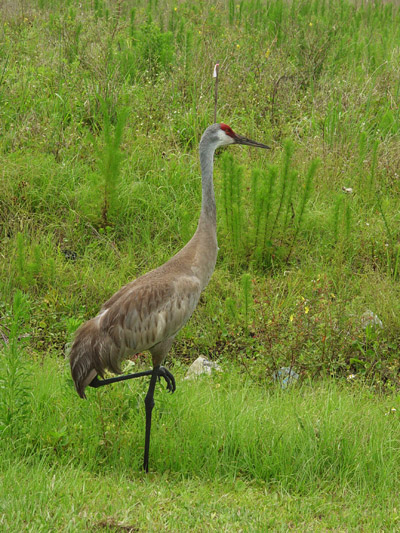 And this is how you do it wrong – yes, I really did take this photo, at a time when I should have known better, and my only defense was shooting from a car window and anticipating the crane leaving the area before I could get off many frames. But look at how complicated and distracting the background details are, and how centered the crane is, and then the trash in the photo, and holy shit, the pole sticking right smack out of the top of the crane’s head! Seriously, do better than this (it’s not hard.)
 Now here are more illustrations of things I talked about, such as setting the point-of-focus against a contrasting color in the background, while also using the background to build a frame around the focal point. The soft light allows for the subtleties of the flowers (even when it produces a truly boring sky, which is why it’s minimized in this frame,) but the larger version show the raindrops on the blossoms much more distinctly, so the grey conditions become more understandable. The single flower is set apart from all of the others so our eyes go right there, assisted by the shorter focus range, but the background is still expressive and distinct; this is not a photo of a flower, but of a particular scene, and anyone at all familiar with UNC Chapel Hill recognizes Old Well instantly. Moreover, other distracting and unwanted elements are hidden behind the flowers by shooting at a low angle. It’s easy to shoot a landmark and just have a photo of a landmark, but with only a smidgen more effort, you can add a lot of charm to the scene.
Did you get a nice impression from the opening photo? Admittedly, the heron could have been a little more separated from the rocks, framed by open water in an ideal composition, but at least the head and beak are distinctive enough to grab our attention, and the colors of the water and rocks offset each other nicely. And it may be hard to tell, but the heron is showing a hint of the color and light angle that tells us, in this case, approaching sunset. But now take a look at the original frame, without the cropping:
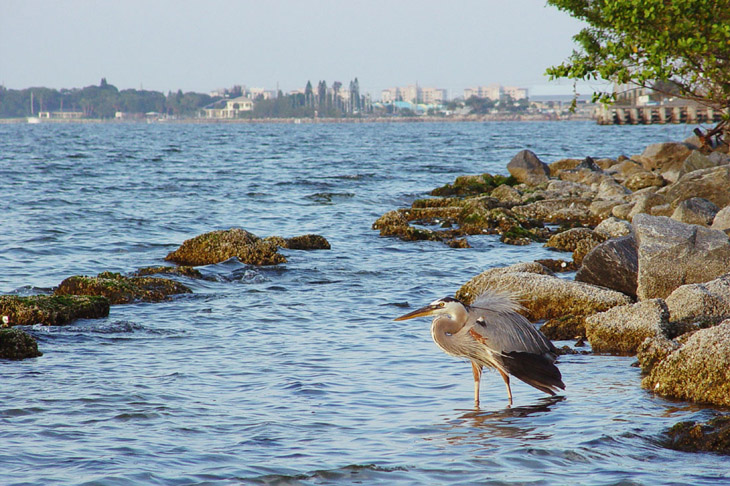
Makes a big difference, doesn’t it? if you originally got the impression of the heron being someplace out “in the wild” and far from civilization, good! That was the idea. Including the distant shoreline with its plethora of development changes the idea of where it was taken, and includes a lot of distraction that serves no purpose.
Now here’s another aspect, or at least the impression that I get. The version at top, without the shoreline, invites us to pay attention to the heron more, and we see it gazing at something out of the frame – there’s an implied direction that way, a definite bias to the left. But with the buildings in the picture, there’s another subject, and now the heron is oblivious to it all, seeming to gaze at nothing, but certainly paying no attention to the bustle beyond it, and we relate a lot less to the heron even though nothing about the heron itself has changed. Do you get the same impression?
 Here we see why high-contrast light doesn’t work for high-contrast subjects. The head of the kid becomes so indistinct that it’s impossible to tell where it stops and the shadow begins, and while there’s the faintest hint of a sheen from the black fur on its shoulder, it drops almost entirely into the bottom registers of the image, even while the white coat has bleached out to indistinct pure white in most places – it illustrates the narrow range quite well. Adjusting exposure for either aspect would have driven the opposing aspect even further out of range, so no matter what, we would have to pick which portion of the goats we simply didn’t want to see the detail of – or choose better light conditions to shoot within. I personally have three different presets on my cameras: an ‘average’ setting with mid-range contrast and saturation, then one with reduced contrast and saturation, and one going the opposite way with increased settings. The one with reduced contrast and saturation is for use in high-contrast lighting such as this, helping to control these extremes, while the increased contrast/saturation preset is for use when the light is low-contrast and muted, making the colors pop a bit better.
By the way, if you’re looking for more information about white balance and the failure of the Auto White Balance setting, this page should help a bit.
So there you have it; don’t just take a picture, but make it. And keep moving forward – we all have room for improvement, and the more you do it, the easier it becomes.
Good luck!