















First off, I know it’s going to be hard to maintain posts for a few weeks, so they may become sparse, but they will be back up to normal after some stuff goes down – they might even increase in number. Well, I mean they always increase in number, because there’s only one or two posts that I’ve actually taken down, so the count keeps climbing. What I mean is, the average number of posts per week might increase a bit. But we’ll get to that later.
Right now, we’re back to posting a few images that I reminded myself of when doing the photo sort into their appropriate categories – I really haven’t been taking much, and most of what I have pursued has been sunspots, monitoring how they’re progressing. But there’s an outing scheduled for tomorrow, so we’ll see what that might produce.
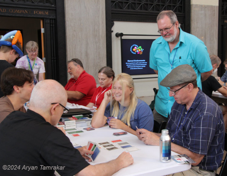
The first three came from the beginning of the month, from the Science Museum of Virginia, one of those places that has a big vaulted rotunda that features a pendulum; I first saw this in the Franklin Institute in Philadelphia. Given a free hinge, i.e., the ability to swing in any direction, a large pendulum will slowly change its direction of swing as the Earth rotates, eventually traveling through 360° provided the momentum is enough – precession, in other words. To demonstrate this, such pendulums are ringed with something to knock over periodically, to show that the direction is gradually changing – you should be able to predict roughly when one will get knocked over because it’s an increment of the length of the day. While I was there, I endeavored to try and capture the moment when it did so.
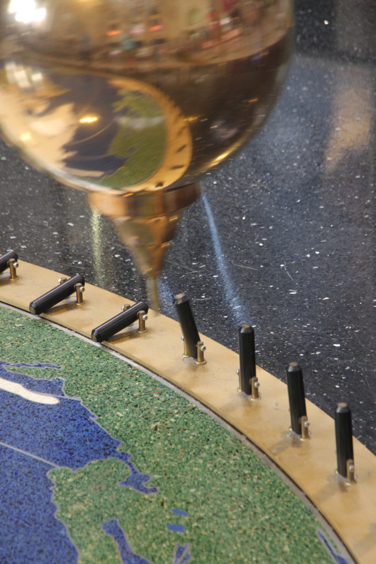
I realized, in watching, that the pins were slightly bottom-weighted on their hinges so it would take a solid strike to topple one, as this one wobbled but returned to upright. The pendulum took about ten seconds to do a full sweep, and I could see that there was a slightly oval component to its swing, because it would miss the pin notably to one side on the return swing.
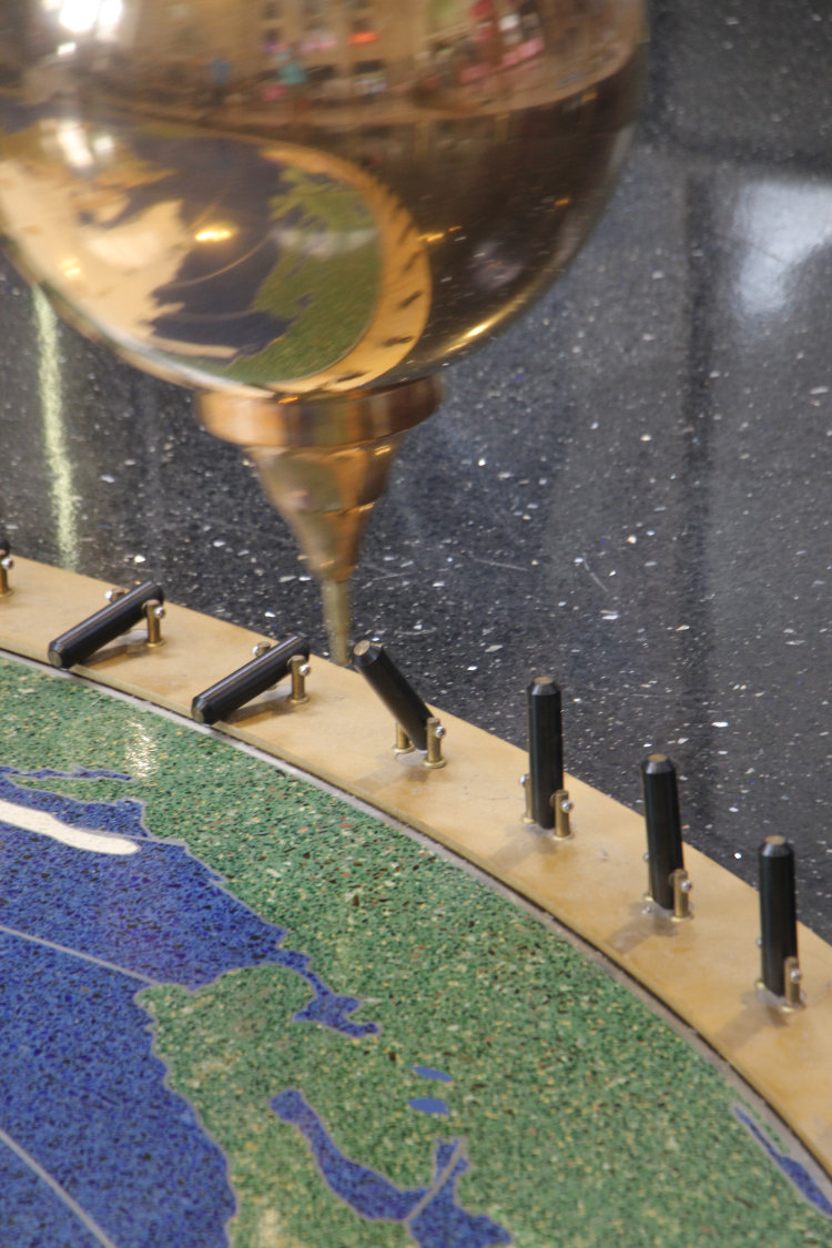
Another pass, another wobble. The pattern of pins toppled were semi-consistent: here, they were facing in towards the center, but at one point they switched to facing outwards instead, indicating how the pendulum would topple them on the outward part of the sweep instead of inward. It was the same for both sides of the circle.
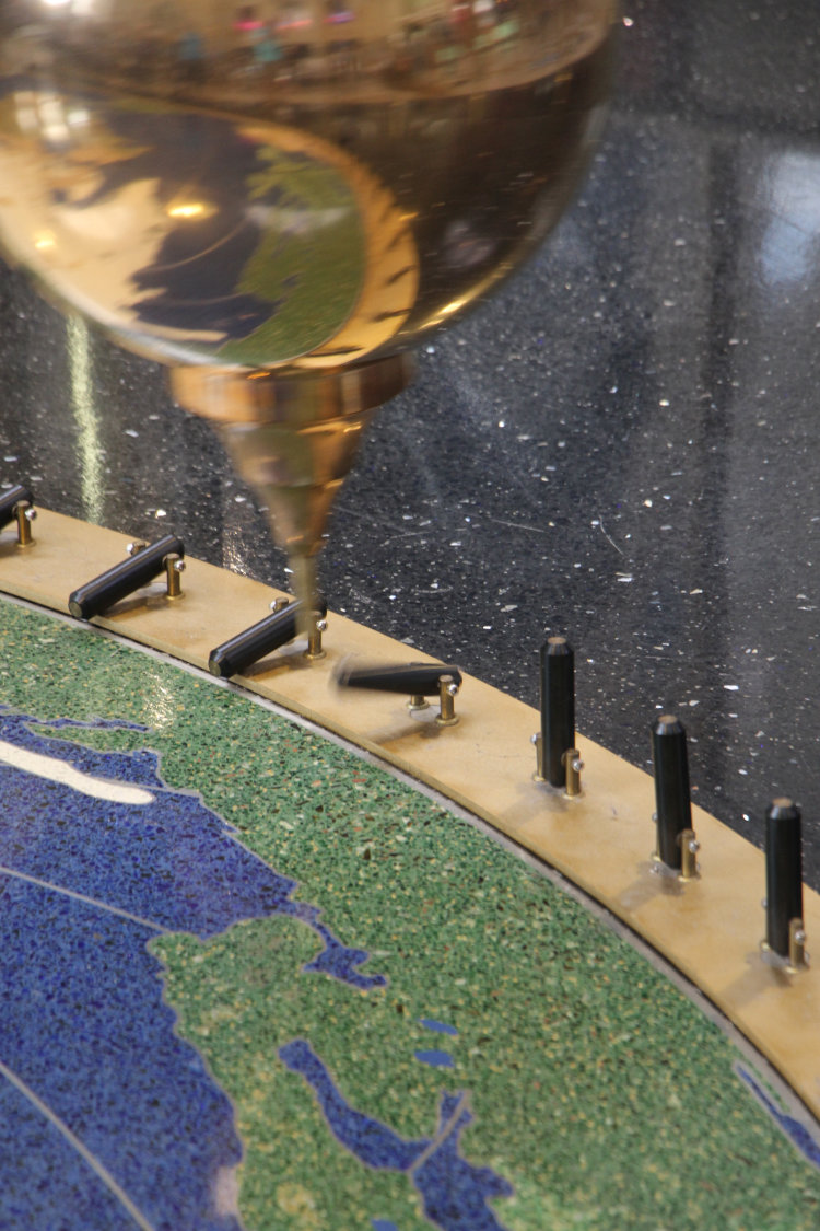
Success! After three passes where the pin righted itself, this time it went down. It took just a little patience and there was only so much time I was going to devote to this since I had other things I should have been doing, but it was much easier than, say, waiting for woodpeckers.
And finally,
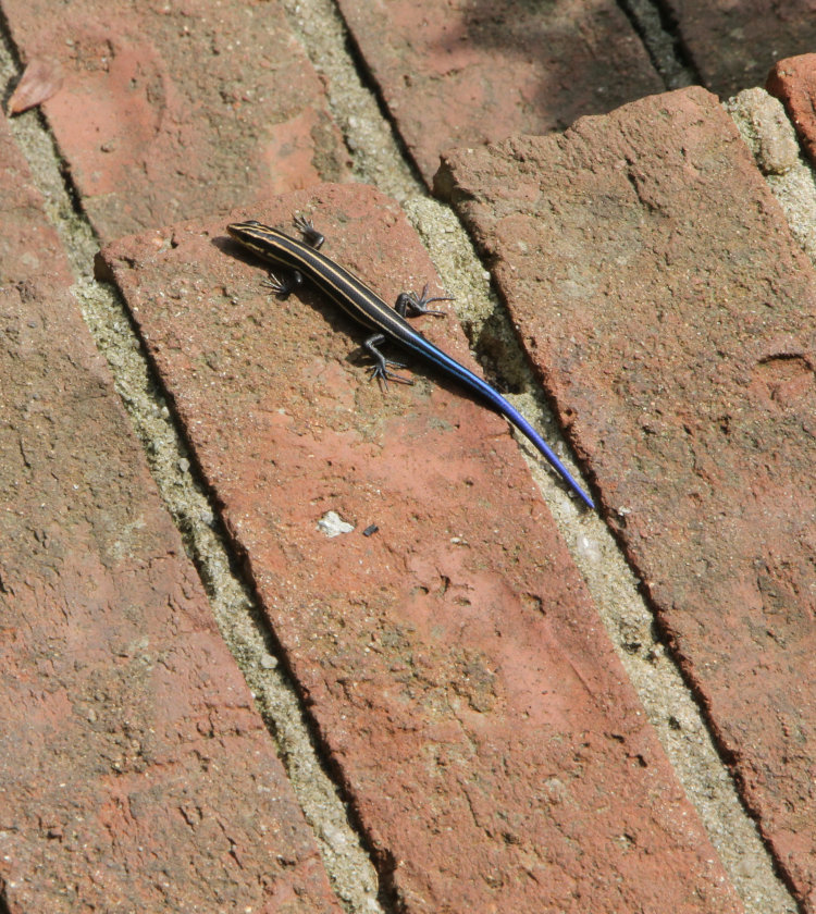
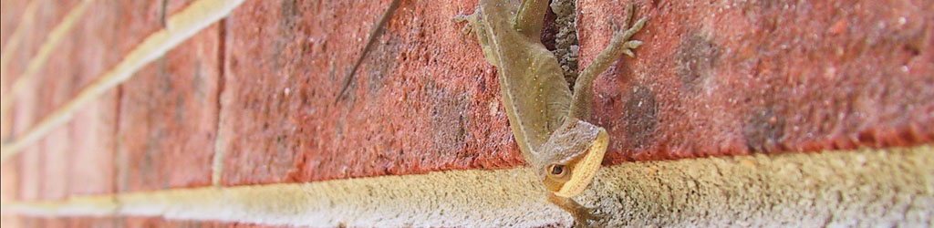
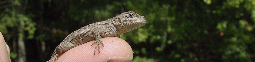
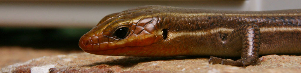
This was only a few days ago, and not the first that I’d seen it, but the first that I’d gotten a photo. This is a very young five-lined skink (Plestiodon fasciatus) basking on our front steps, and those bricks are standard size, about 50mm in width, to give you the scale. I honestly don’t know when it hatched, but it was only a week out where I could spot it anyway. It’s not far from where the anole had been found for a while, now mostly vacated – I went for a couple of weeks of not spotting it, worried that it had fallen prey to something, but then found it again a few days ago. Territorial battle? Can’t say, but it’s good to see the little guys anyway.
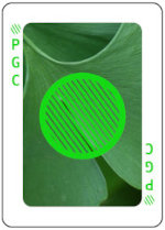 To begin with, we needed background images which in essence were the three primary colors, Red, Green, and Blue, and ideally would be apparent what they were when examined, but not distracting and mostly just being a background color. Within these criteria, however, they could not clash with or disguise the symbols which would lay over top of them, also in those primary colors, which meant that whatever we chose for ‘Blue’ could not be too close to the 16-bit RGB value of 0,0,255, because the symbol would disappear against the background if this was too close. They also could not have any shapes within that might be mistaken for shapes of the symbols and thus make it confusing in any way what the card represented. This might seem like we’re being nit-picky, but it’s easy enough to glance too quickly at a card and make a mistake when you’re involved in playing a game. Not too long into the design process, we realized that the RGB value for Green (0,255,0) was actually too bright to be used, and switched to 20,217,20 instead. The background color decisions kicked back and forth for a short while, and in fact, we ended up switching the Red image after the first test printing of the deck.
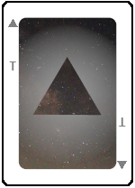 Also needed were cards to represent shapes of the symbols without any color at all, trickier that it sounds at first. So, a grey Circle, right? No, because that appears to be a Filled Circle, or even a Hollow one, so we needed a circle without any internal pattern. Eventually, we settled on a curious gradient shadow around the outside of the shape, over top of a starfield background, kind of doubling down on the ‘void’ concept. Because I do things like this, the center of the starfield image is actually the ‘center’ of the Milky Way, or at least the direction that it lies in Sagittarius.
 Among all of this sits what every designer and commissioned artist has to accommodate: the desires of the client. I submitted countless images for just about every aspect before we settled on what’s in use now, generally starting off with three or four choices but, for some, this went on for a while. Specifically, the image for the card backs was a challenge, since it had to be abstract and non-oriented, not easy to mistake for any of the face images, and not dominated by any one color. Eventually we settled on a sunset clouds grab shot that I actually obtained one evening while the selection process was ongoing. “Green,” however, was intentional manipulation, since Dan is a big fan of ginkgos and I knew he wouldn’t reject that one.