Again, sunset looked promising, so to the neighborhood pond I went. Again, sunset didn’t live up to its promise, so I chased a few other pics while there.
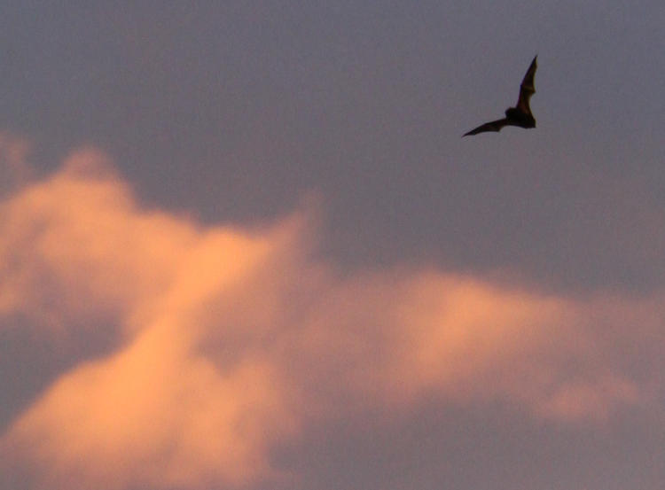
Notably, the bats were active, and while I had only the 18-135, I got a couple of frames that worked. You get to decide which crop works best for this one, though – vertical?
Or, horizontal?
I was just winging it (heh!), not expecting to get too much with the shorter reach of the lens, the velocity of the subject, and the fading light, but I was pleased to pull a little wing detail out of a few frames. This is nearly full-resolution:
Don’t ask me for the species, because I could see no color any better than this, plus I was unable to even judge size/distance. I did see a brief dogfight while there, two bats winding around so close together they overlapped in multiple frames, but what that was all about I can’t say, because I’m a discreet neighbor.
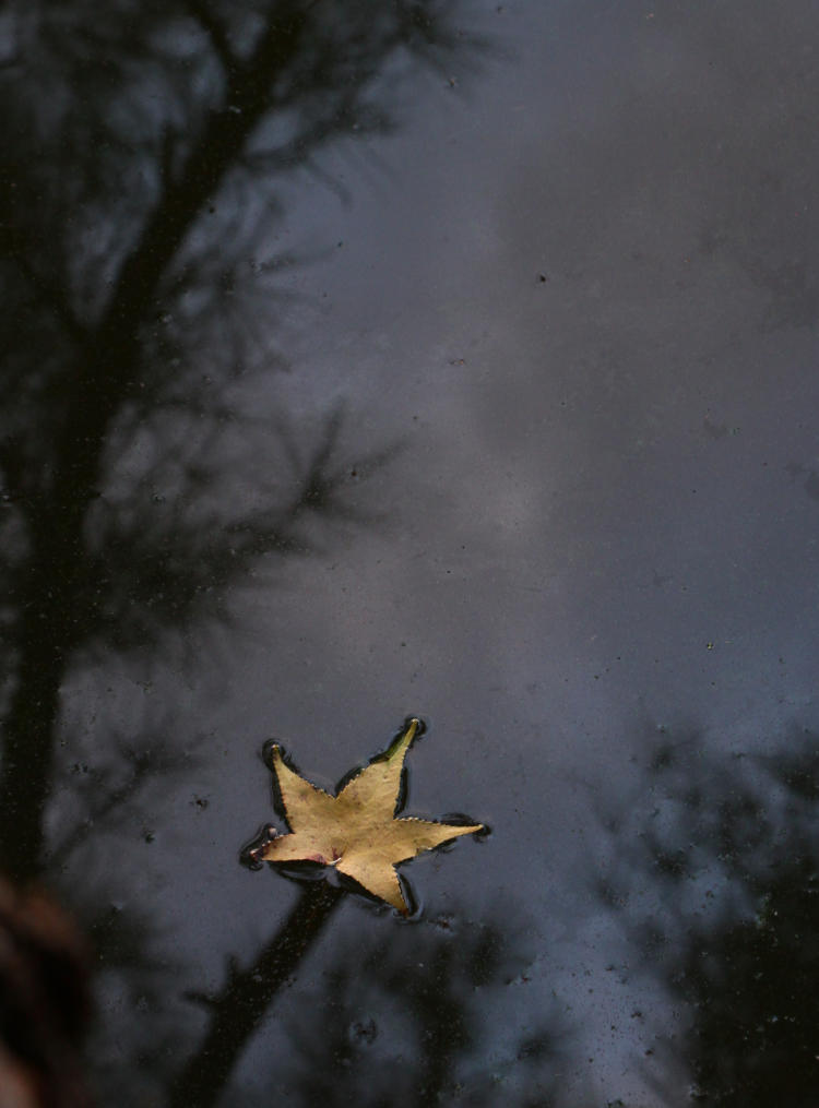
Plus, I chased a couple of other compositions while I ensured that the sky would get no less boring.
Getting a sharp frame of this took some playing around, because the light was disappearing, but by intentionally underexposing I was able to get this. What I like about it is, the leaf is totally isolated on the water – the thick ‘stem’ is simply a reflection of a branch, but it’s easy to escape notice.
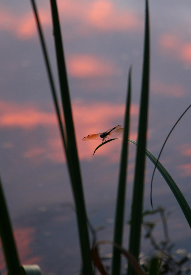
And finally,
As the color was fading from the clouds, I had to crouch and move around a bit to put it behind the dragonfly, but at least it’s more than acceptably sharp. For ten minutes of playing around all told, it works for me.
Isn’t that what Mama Celeste always said? Something like that, anyway. And you have to be a certain age to even have the faintest clue what I’m talking about…
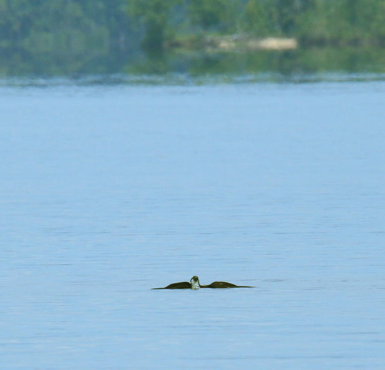
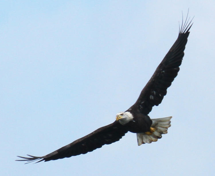
I went down to Jordan lake today, for the first time in weeks, because really, it’s been too hot to do so otherwise. It was plenty hot today, but not quite “pass out after 30 minutes” hot. I didn’t stay too long, because “not quite,” plus there wasn’t a whole lot of activity, but I did get a few images anyway.
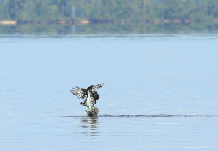
Here’s the story. Not too long after picking a vantage spot, because I’d already seen some osprey (Pandion haliaetus,) I witnessed one in the distance do a completely vertical dive, flare out at the last second, and crash into the water – my tracking, however, was off and I missed the action. Then I watched the bird attempt to climb back out again.
This was the first attempt, but it never got fully airborne and settled back into the water after a few seconds, which gave me the distinct clue that the fish it had captured was quite heavy for the bird.
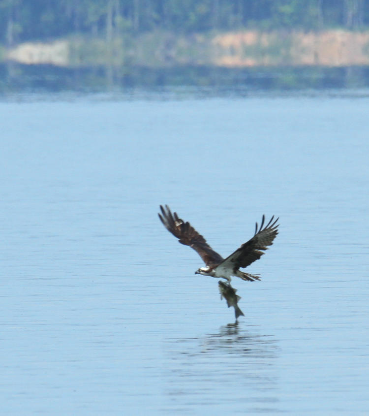
It took better than 30 seconds just sitting in the water, the longest I’d ever seen one treading water after a capture, before it made another attempt to climb out.
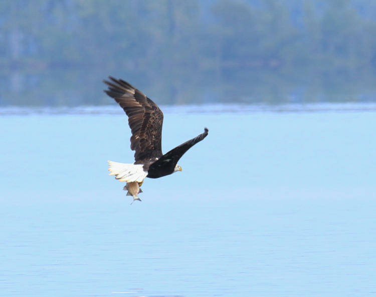
Which it did manage, but it took a running start, and the osprey covered at least six meters horizontally before managing to get the fish clear of the water. This image, not the clearest I’ve shot, shows why though: the fish was far too close to weighing what the osprey did (especially since birds have hollow bones and are much lighter than they appear, while fish tend to be pretty dense – no judgment though.)
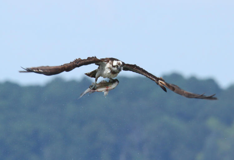
But luck was with me, in that the osprey turned towards me rather than away as it circled back towards a perch.
I’m more than happy with this shot, but it gets even better.
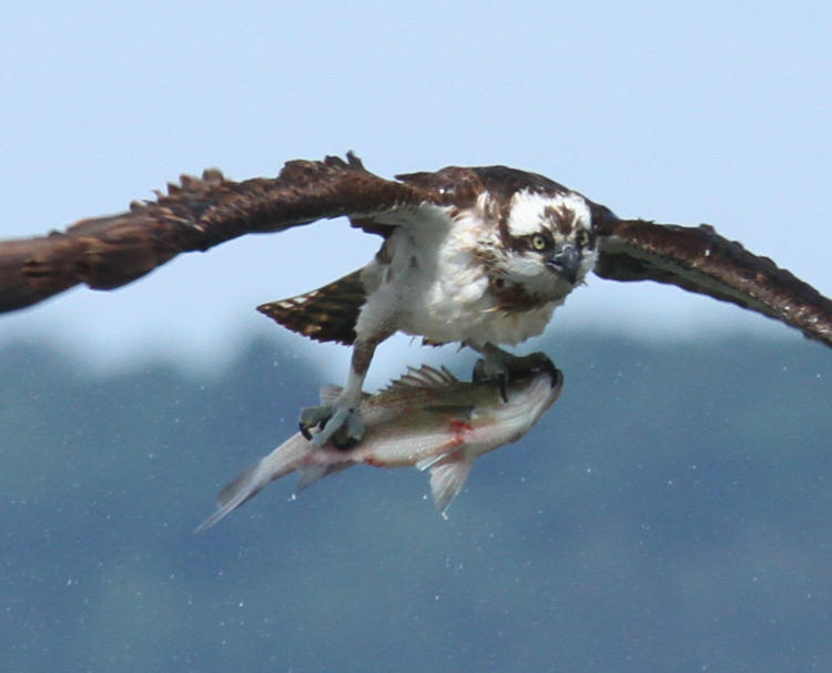
This was as the osprey had finally gotten enough altitude to feel safe with the maneuver, and did its typical hard shake to rid itself of excess water, which always causes a dip in height. But even this isn’t enough – we have to go in tighter on the same frame.
Yeah, I approve. Feel free to tell me what the fish is if you like.
And then the mistake. I watched as the osprey continued circling and eventually got high enough, with obvious effort, to take a perch with the fish, well over a hundred meters distant so my view wasn’t all that great. Here I broke my cardinal rule, which is, “No chimping,” this referring to looking at the images on the LCD of the camera. There are two main reasons: one, that the tiny little preview won’t tell you anything crucial about the image, and two, when you’re doing that you’re not watching for more subjects or further developments. I wanted to see if the photos above passed muster while things seemed quiet, and I paid the price. Because I heard the alarm calls of an osprey and looked up too late to find, right out in front of me again, an osprey and a bald eagle (Haliaeetus leucocephalus) in the air rather close together, with a splash in the water underneath. Apparently the eagle, from a perch I hadn’t discovered, had popped out to steal the fish from the osprey, who took off with it out over the water before abandoning it. Osprey are faster and more maneuverable than eagles, but not while burdened so, and eagles are lazy. However, the eagle missed the fish dropping and circled around without even dipping down towards the water, at least giving me a few decent frames.
The mottling visible on the head and tail, and under the wings, tells me the eagle is just four years old, molting out of its third year plumage into adult coloration. Nice enough shot for me, but I should have captured the harassment action, in addition to this, and missed it. Lesson learned, the hard way.
A little later on, I witnessed the same eagle (discerned by the coloration) and an osprey out over the water again, only the osprey had no fish – I’d been watching close enough to know that no captures were made in the area. It might have been the eagle being territorial, but we’re well past nesting season and the area was rife with ospreys, so I suspect the eagle thought the osprey might have had a fish and was giving chase, breaking it off just as I was trying to focus on both of them. But almost negligently, it turned back towards shore, then dipped quickly and snagged its own fish almost as an afterthought.
See! You can catch your own, you lazy sod. I’ll leave commentary on this being our national symbol to others.
Things quieted down a bit following that, and after sitting out there for a while and seeing nothing else happening, plus the sweat running down my spine, I wrapped things up for the afternoon, but not before being a little fartsy with a perched osprey and a commercial airliner climbing out high overhead. Plus those clouds made me suspect the weather might turn uglier before too much longer. Still, this is okay for returning to the lake for the first time since late July.
Just playing around this week, because I didn’t dig out anything of interest and comparison from the archives – been that kind of week. Still, these will be visibly different, so you can’t take away points for not meeting the bare criteria.
We open with a dramatic and contrasty image, though I admit I should have dropped the exposure down slightly to keep the snow from bleaching out in so many places, but there’s nothing I can do about it now, so we’re living with it. The berries, however, have become more enigmatic, because this is channel-clipping once again, taking advantage of a digital trait by eliminating two of the three colors that all images are composed of (those being Red, Green, and Blue, whence comes the term, ‘RGB’) – all of the subtleties and variations come solely from varying the intensity of these three. In this case, we’re looking at only the Blue channel, and the berries are so dark because there is very little blue in their natural color. Which doesn’t narrow it down too much, even though in this image they kinda look like blueberries, but they’re far from it.
One of these days I’ll stop being lazy and figure out what these are, since we have several trees of them nearby and they’ve formed the subject of countless images. But that is not this day. Or even any day previous to this, which is narrowing it down steadily.
Regardless, since monochrome images are best with distinctive contrast, the Blue channel was the best one to use here. Not so much with the next one, so this is not the Blue channel below.
This one, unfortunately, looks not-quite-authentic, the wings of this eastern tiger swallowtail (Papilio glaucus) becoming a bit too bright in this channel, but perhaps giving the impression of being backlit. A little too contrasted? Your call, but this is the Red channel, though that isn’t readily apparent when you see the original.
Were you expecting yellow wings? In the RGB color space, yellow is a combination of red and green – strange but true – but since there’s a lot of green in the background, using the Green channel brightened that up too much and didn’t have the contrast that this does, while naturally the red flower lost its vibrancy.
Now for one from this week, at least.
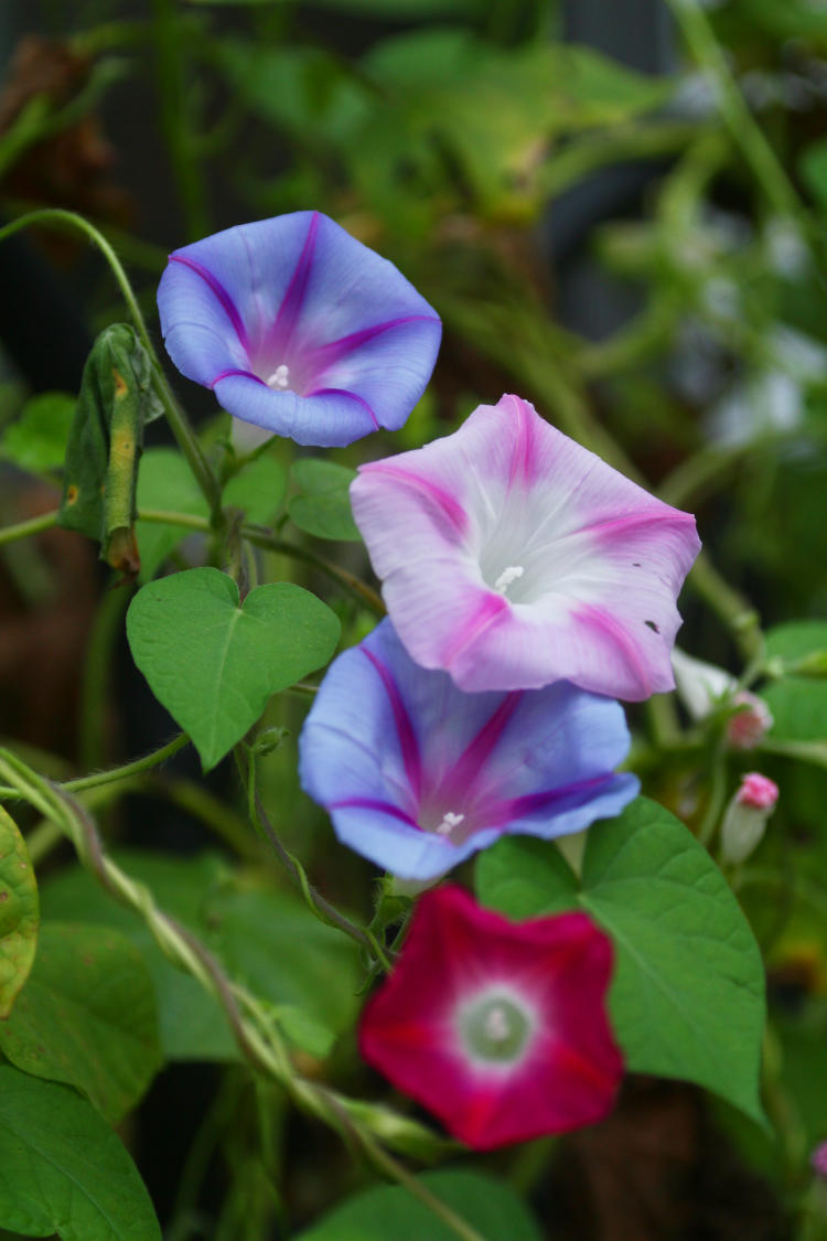
Definitely muted this time, with little differentiation from the background – this is the Green channel. Why did I use that when the surrounding foliage is green and thus would be brighter? Ah, there was a specific reason, which we get at least a clue of when we see the original.
Yeah, I agree, it’s better in color, but let’s look at this. The various lavender hues of the blossoms meant that both the Red and the Blue channels were well represented and fairly bright in the monochrome versions, but the magenta ‘spokes’ were what made Green the choice; magenta is the opposite of green in RGB, and so they became the darkest and thus distinctive in the Green channel, instead of the blossoms being only subtle variations in brightness with the other two channels.
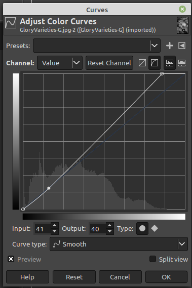
Still, not as much contrast as we like to see from monochrome images, so I performed a final tweak.
This was a minor Curves adjustment, boosting the brightest portions of the image all the way up to full white, and slightly reducing the shadow levels. Very simple, and the Curves function is something that every photographer should have at least some grasp of.
Here’s how it looks – this is from GIMP, but most other programs are very similar. The mountain range at the bottom of the graph is a representation of how many pixels in the image fall into each brightness value – black at the left, white at the right, so you see a very sharp spike at the left edge, a good portion of black pixels, and none of white – this is what made the original muted and a little dark. [You can do this for each color channel as you like, but the default is ‘Value’ as it shows at top left, which means overall brightness, and since we’ve eliminated the other colors for this image anyway that’s all that we have to work with: 256 shades of grey, super kinky.] The bold diagonal line across the image is the adjustment curve, only slightly curved here. I moved the upper right endpoint to the left slightly, lining it up with the brightest pixels on the ‘mountain’ below, which means that they got moved up all the way to white. This skewed the whole diagonal (the ‘average’) away from the original values, the faint blue line, and so over to the left more – which are the shadowy portions of the image – I brought those back down to where they had been, just clicking on the line and dragging it. This increased contrast a little because the first move had increased all brightness. Make sense? Seriously, just play with it sometimes if you don’t already – it can greatly improve your images.
Which reminds me: one of these Visibly Different posts will be about darkroom versus digital editing, which will take a few specific images to illustrate – that’ll likely be more towards winter. You’re coming here regularly, of course, so you won’t miss it…
I’ve actually featured this photo here before, with perhaps a portion of the story but not all of it. It’s time to rectify that and set the record straight.
While living in Florida, there was this undeveloped sand road that was basically an access lane out to the edge of the lake, bordered on both sides by drainage channels. It wasn’t far outside the city, but the farthest I could get without serious driving and thus the spot I chose when I was doing some long-exposure night sky photography. During one exposure, probably aiming for twenty minutes or better, I had locked open the shutter and was poking around well away from the camera with a flashlight, this now being about 1 AM. Hard as it may be to believe, I wasn’t inclined to sit there and stare at the sky the entire time the exposure was progressing – I know, right?
Anyway, at the edge of one of the drainage channels I spotted a snake’s head, lifted from the water and holding perfectly still. I knew snakes were primarily night hunters but still rarely saw them at night, and while I was in Florida for a couple of years and doing a serious amount of exploring, this represented only the second snake that I’d seen the entire time – very peculiar, as far as I’m concerned, but there you go. After observing it for a few minutes and not seeing any movement, I began to gradually shift my position. I knew the light from the flashlight was largely masking my own position and outline, but I could still spook the snake if, for instance, I cast a shadow from the reeds across its eye.
Eventually, I determined that the snake hadn’t moved because it couldn’t; it was seriously ensnared in someone’s discarded casting net, having slipped through several loops and eventually caught itself as the nylon bound itself tighter around the snake’s body. I wasn’t about to let this slip by, so I carefully edged down to the water and disentangled the entire net, with the snake within, from the weeds and twigs and brought the whole ball up to the car, then set about trying to work the snake free. For its part, the snake helpfully bit me several times as I tried to slip the loops free from its scales.
It wasn’t long before I realized that, between the number of openings it had gone through and its general inability to hold still while I concentrated on each loop, I wasn’t going to accomplish a lot in this manner, especially without help, and chose a different tactic. I had a sharp knife on me as usual, but the nylon was fine enough that simply slipping the blade into a loop and pulling wouldn’t work; the nylon was tough and took a lot of pressure to cut, more than the snake’s skin did, and all I would do was pull the loops deep into the snake before they ever separated. Instead, I found a small piece of wood and used that as a cutting board on the trunk of the car, pressing the junction of numerous key loops of the net under the knife blade to cut through them. It required a lot of this and was tedious, but eventually, I freed the snake entirely from the net without injury (well, to the snake at least – I had several bites and a few nicks from my own knife as I performed this entire operation with the flashlight held in my teeth.)
This was, however, a species that I had never seen before, much less photographed, and I couldn’t let this opportunity go, though I was unprepared to exploit it at the time. This mean that I dug through the trunk of the car until I found something to secure the snake within to transport it home; not the most altruistic of actions, I admit, but hey, I’d just saved it from dying by scavengers or exposure – it could cope with a little posing. The next day, I constructed a ‘set’ of sorts in the bathtub, using palm fronds, and did a few portraits and detail shots in controlled conditions, one of which you see above; if you look closely, you’ll notice the white enamel peeking through at one point. Once I’d gotten a handful of shots (and another bite or two,) I took the snake back to where I’d found it and released it into the water, checking carefully to ensure that there was no more dangerous debris to be seen.
This is a southern banded water snake, by the way, or simply a southern water snake, but the scientific name is Nerodia fasciata fasciata – I believe, anyway. I keep finding conflicting identifications of species, and previously identified it as simply Nerodia fasciata. I’ve never seen one above Georgia, which is a shame, because I like their coloration much better than the species that I find around here. Meanwhile, cleaning out the debris from the tub was a whole lot more involved than I’d initially imagined, but I’m kinda glad that I took the opportunity, because it would be something like 12 years before I was to find another.
I have a tendency to lump reptiles and amphibians into the same general classification, including within my stock categories, even though either is just as close to, say, badgers – the phylum Chordata is the last common point for all of them. But fine – you want me to make a separate post to break them all out? Is that what you want? Because I’ll do it if you want.
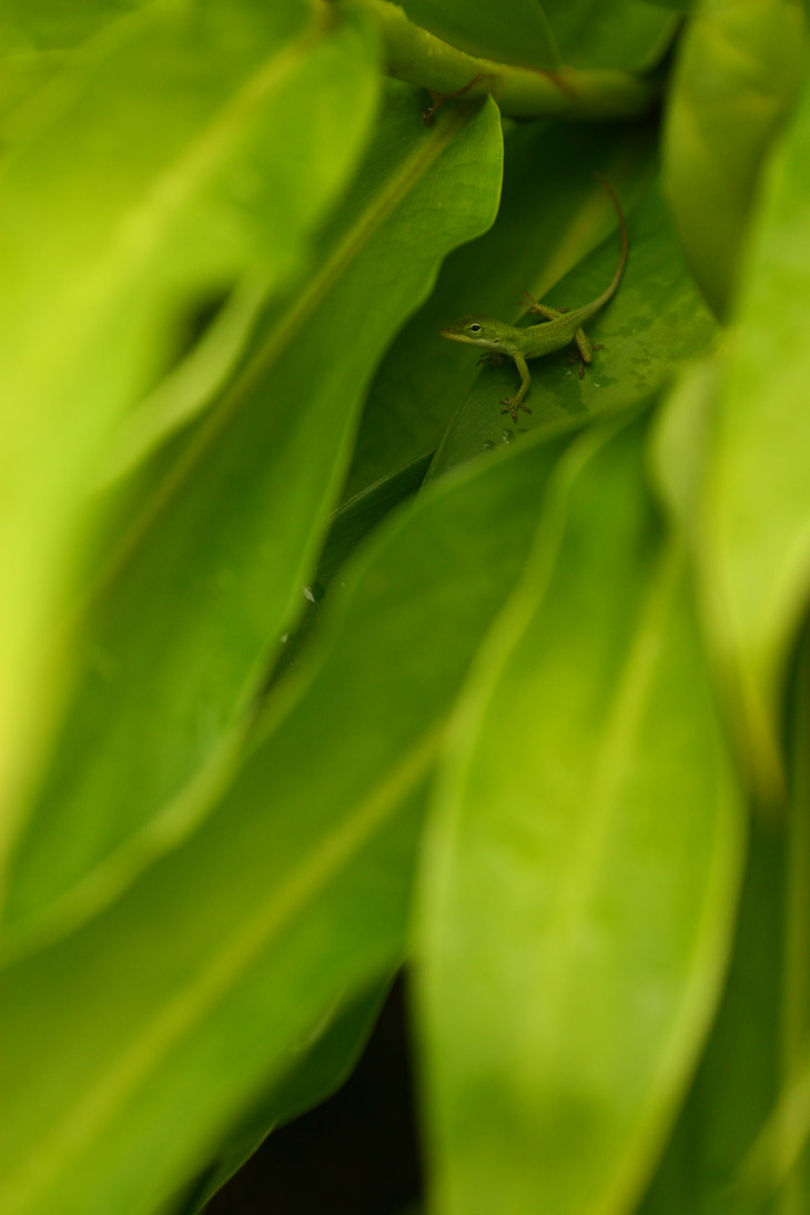
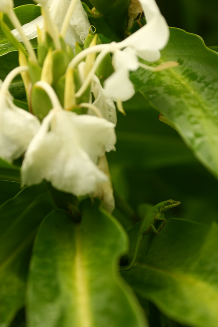
On a trip to the NC Botanical Garden about a month ago I was, of course, on the lookout for the green anoles. It turns out that I didn’t see one, even when I thought I did. And in fact, the opportunity to see them has now entirely passed. No, they didn’t go extinct, but the name did – they are now, apparently, Carolina anoles (yet still Anolis carolinensis) – another reason to check up on species even when I know what the hell they are. But of those, I saw a couple.
This one, a juvenile about half adult size (or maybe simply a half-adult – I can never keep those two apart,) was being more shy than usual and scampered for cover almost as soon as I saw it, going deep into the leaves. Since the day was overcast with the occasional raindrop, this was pushing the limits for useful results while handholding. The photo still makes the lizard obvious, but anyone there in person would have had to have been quite sharp-eyed to see this one in its hiding place.
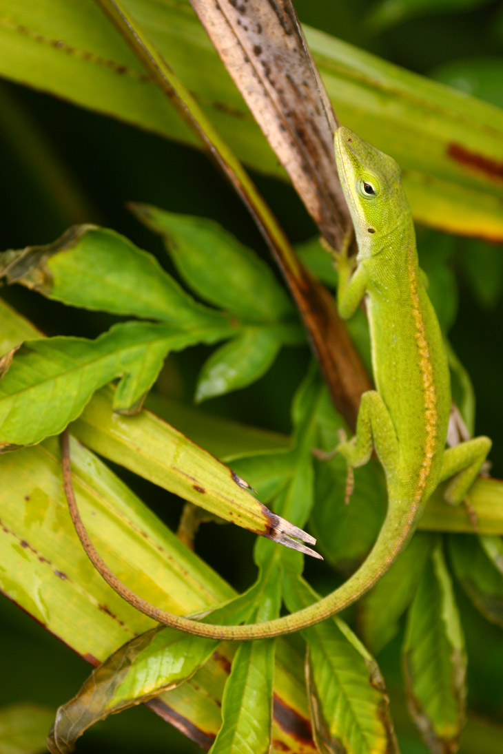
Another had initially been overlooked by me as I perused the foliage, and might have escaped attention entirely had it not moved its head suddenly when it could register on my peripheral vision.
This one was a bit large even for an adult, and out in plain sight, so how I missed it on my initial pass I can’t say – since I was looking for just this species (okay, kinda,) I can’t figure how I overlooked it. But I probably would have seen it on second glance, so it jumped the gun by drawing attention to itself, like a little kid playing hide-and-seek. Good thing they don’t have the ability to giggle.
One more, because.
This is likely the same anole as the first pic up there, but I saw it on my second pass through the area. It was out on the upper surfaces of the leaves right near those flowers and I wanted to coax it towards the blossoms for a more fartistic composition, but it was having none of that. Still, after it dove for cover I still managed to put the frame together in a way that worked.
It does – stop backtalking.
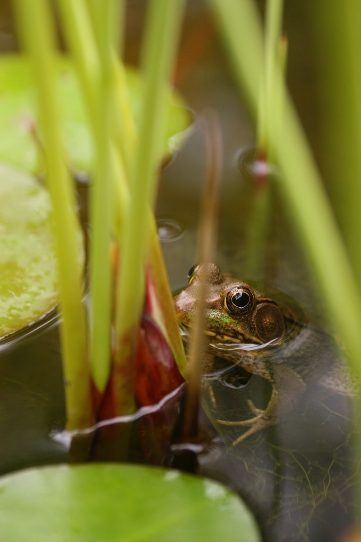
In a nearby pond planter, a green frog (Lithobates clamitans) or maybe it’s a Carolina frog, was hanging out in reasonably good cover among the lily pads, and stayed put as I maneuvered around for a portrait shot. I’m fairly certain that giant ear drum means it’s a male, and I’ll let you make all the comments that you want. Certainly nothing of the sort occurred to me.
This other one is a little freaky – I didn’t notice the crucial details until I got back and was unloading the card.
Now, the state of the frog hadn’t escaped my attention; I do shots of this nature just for illustrative and ‘authentic’ purposes, because nature isn’t always pretty (or ever, if your only exposure is my stuff.) What I’d missed are the tadpoles clearly feeding from the skin of the dismembered frog. I mean, what the hell, guys? I thought you were vegetarians at this stage?
(They likely are, but the decaying frog is playing host to any number of pond growths, and that’s what they’re eating.)
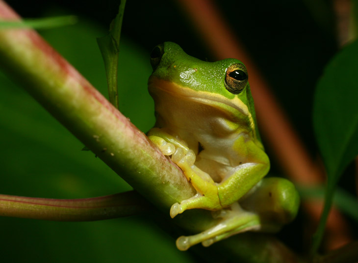
We’ll head back home for some more savory images. I mentioned before that I was hoping to establish some green treefrogs (Hyla cinerea) in the area, and it appears I have been successful. Even as the heat of summer caused most of the frogs to seem scarce and the common Copes grey treefrogs hadn’t been visible for a while, one night I suddenly found two of the green treefrogs, hanging out on the pokeweed plant in the backyard.
The frogs seem to know what they blend into the best, and the pokeweed is the closest thing we have in the yard to their coloration, but it also attracts countless other species like varieties of marauding caterpillars, so they’re getting food there too. Every once in a while, I find their daytime hiding place somewhere near the back porch, often enough under the grill cover – I have to check the grill over carefully before I fire it up.
Not too far away, closer to the backyard pond, sits one of our rainbarrels, and for a couple of days I was finding a minuscule variety of frog hanging out there.
This one was pretty shy, which is good because it means it will seek shelter when danger threatens, but it makes my job a bit tougher. I wanted a scale shot and had the dime handy, but the frog wasn’t taking direction well and kept hopping further away, making me place the dime in a new position ahead of it in the hopes that it would cross it. Eventually, with many false starts, I got what I was after, even though the flash angle wasn’t ideal. Based on the size there’s a good chance it’s a form of chorus frog, which are much smaller than the either of the treefrog species.
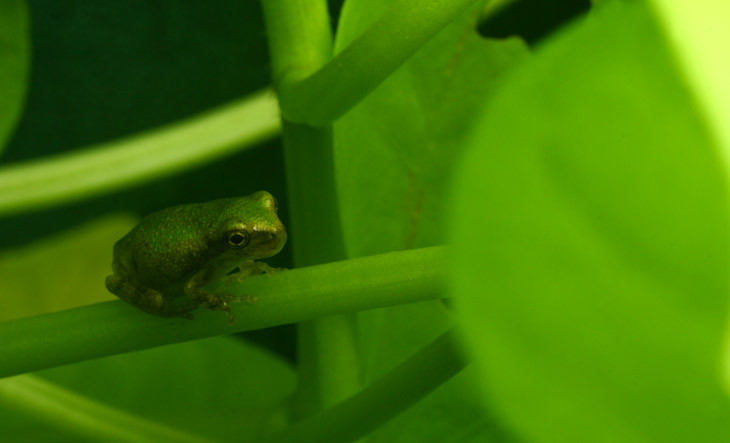
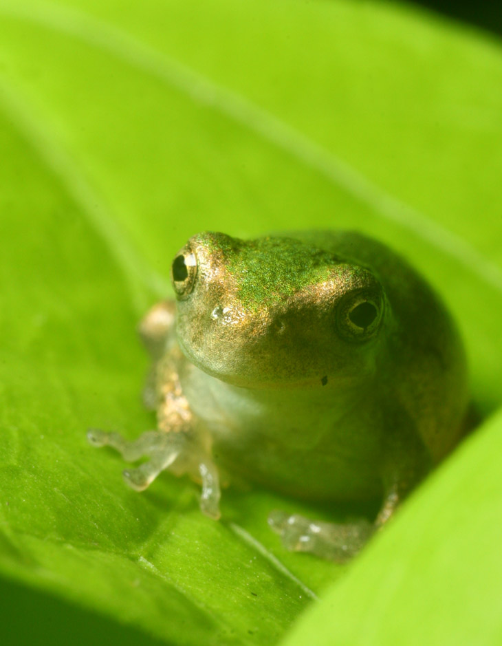
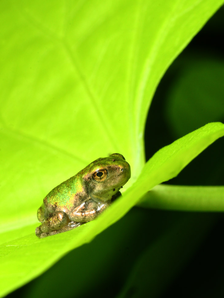
More fun has been the trio of tiny frogs that have taken up residence on the front porch. The Girlfriend has gotten a pair of ornamental sweet potato plants with large pale green leaves, and a few posts back I said something about them attracting the golden tortoise beetle. But the frogs seem to like them too.
Again, I’m not sure what species these are. The leaves run roughly the size of your palm, so the frog itself is literally fingernail-sized – yes, even smaller than a thumbnail. Since the nights have been getting cooler now, the frogs are often seen during the day, venturing out to bask in the sunlight. They’re semi-wary, not real wild about my leaning in close, but if I go slow they’ll often stay put. Of course, I discovered the limits of their patience to determine what I could get away with.
One of them seems more shy that the others, too. And one of them is more gold-hued, making for a colorful portrait.
But yeah, I can still get close. It seems likely that these are new emergents from the backyard pond, so quite possibly the same species that I was photographing as tadpoles, but I have no easy way of telling – there were several species in there at the same time and I see them sporadically enough not to be able to trace lineage.
As I close with my favorite composition (so far, anyway,) I’ll point out a little detail. There’s a pale spot under the eye, and this might be an indication that these are juvenile Copes grey treefrogs (Hyla chrysoscelis) – they have a telltale light spot edged with black as adults, and I’ve seen it in a juvenile, albeit one a bit larger than this. So, maybe? Either way, they’re nice little accents on our front porch plants – when anyone is sharp-eyed enough to distinguish them.
This is probably my favorite of Jim’s Badlands shots, because of the light quality and the clouds in the sky – most of his other shots show skies that are brilliantly blue yet bare, in need of something to offset the solid color. Here, however, the color has softened, and not just in the sky – everything has a pastel appearance that comes very close to making this look like a painting. You can even see the brush strokes in the clouds and on the rock faces.
Wait a second. I think Jim might be trying to pull a fast one here…
[Want some irony? Often enough, painters try to make their images look like photographs, while occasionally photographers try to make their images look like paintings. Yes, art is weird.]
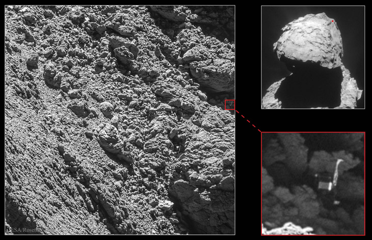
Image Credit: ESA, Rosetta, MPS, OSIRIS; UPD/LAM/IAA/SSO/INTA/UPM/DASP/IDA/Navcam Courtesy of Astronomy Picture of the Day, we have actual images of the Philae lander in its resting place on Comet C67/P Churyumov-Gerasimenko, and you definitely will want to not only click on that link, but on the image therein to see the full-resolution version. If you recall, about 22 months ago, the washing-machine-sized lander was launched from its ‘mother ship,’ the Rosetta probe, to land directly on the surface of the comet. Only the anchoring systems failed to activate, and the lander bounced multiple times before coming to rest in an awkward and unknown location. This is not surprising when you know the physics of it; mass and weight are two different things, the latter being governed by gravity (itself a factor of mass.) The small size of the comet nucleus means it has a ridiculously low gravity to attract anything to its surface, so despite its size, Philae effectively weighed the same as 1/4 of a sheet of paper here on Earth. I’m not kidding – I’m actually exaggerating slightly. With hard materials and no wind resistance, it was able to bounce quite high under the impact of its own touchdown – according to an article on Universe Today, perhaps higher than 3 kilometers. Had it touched down any faster, it might simply have escaped into open space. And as can be seen from the photos, the chances of finding a smooth and ‘level’ landing spot were incredibly slim. A lot of this has to do, again, with the negligible mass of Churyumov-Gerasimenko; it simply doesn’t have the gravity to smooth out its very substrate. And of course, no wind, no rain, no disturbances of any kind (save for pesky landers) to cause anything to settle further. Much of this material is simply accumulation of dust and ice from space, captured in casual passing contact with the weak gravity of the nucleus.
There was no ability to witness the touchdown, either by video onboard Philae or remotely from Rosetta, so no one was quite sure what happened, but a lot could be inferred from the data that started coming back. For one, the batteries aboard Philae died quickly, meaning they were not being recharged by the surrounding solar panels, giving some indication that Philae had dropped into a shadowy area – this was later confirmed by one of the cameras getting photos of a massive overhang. By triangulating the signals as the comet turned and Rosetta kept pace, the rough area of Philae’s location could be determined. Eventually, it was spotted in shadow, awkwardly tipped onto its side. As that article from Universe Today shows, it is pointed to our left, one of its three legs highly visible at top, another very faintly visible by the end of its foot at lower right.
Or so they say – I’m always suspicious of photos where I have to be told what I’m seeing, but you’re welcome to compare the diagrams of Philae’s construction with the photo. To me, it looks a lot more like a broad-headed robot, with its back to us, climbing the rocks. And not an experienced one, either, because it’s blindly putting one hand up on top of a rock surface that it cannot see, always a bad move for climbers, because it might mean plopping a hand directly atop a snake basking on the rock. Sure, maybe most comets don’t host snakes with a venom that could be dangerous to robots, but is that a chance worth taking?
“Convenient mediocrity.” I mentioned it in an earlier post, and while it can be found in use here and there, it is not (yet) a common phrase, even if it is a remarkably common property. What it means (for my purposes here, anyway) is maintaining lowered standards because higher ones take too much effort. More specifically, it means accepting lower quality as long as it’s in a cool, popular format.
I used it in terms of photography, and so we’ll examine that aspect in detail first. Really, not all that long ago when digital wasn’t an option, photographers had a variety of films to choose from, with distinctive color palettes and behaviors, and many of the professionals (and a lot of serious amateurs) would get so anxious about quality that their film would remain in the refrigerator until the day of the shoot, to keep the emulsion from degrading and thus affecting the colors it produced. There were portrait films and scenic films, high and low contrast options, fine grain and coarse, and naturally, a variety of ISO ratings to fit within the lighting conditions. I personally had four different preferred films, and my overall workhorse (Fuji Provia 100F) was usually shot at a third-stop overexposure because that produced the effects I liked. This says nothing about pushing films, varying developers and chemical preferences, filters, and on and on.
And virtually all of that is completely gone now. But digital has not replaced it at all – in fact, digital (despite countless assurances to the contrary in the early days) doesn’t even cover a moderate portion of these traits and behaviors. Digital color is expressed, still, in 32-bit format – each color has a value of 0 through 255, which isn’t a huge range, and has been in use for decades. Meanwhile, the digital sensors within the cameras have a fixed color register to them – they cannot be exchanged like one would exchange films, when switching from scenic photography to a wedding, for instance. The myth still persists that “you can digitally alter the color to your liking,” which is true only insofar as a) you stay within the 32-bit range, and b) the camera captures the color differentiation and details that you needed in the first place. If there were subtleties of foliage, delicate colors of a leaf for instance, that the sensor simply could not distinguish or differentiate, then the only ‘digital’ thing you can do to reproduce them would be to paint them in by hand, because the digital image has nothing to work with. The best example is shadow detail – if the camera didn’t get it, no amount of lightening or contrast adjustment will bring it back.
I have yet to see a digital sensor that can render a sky in as rich color as my preferred slide films, noticeable even when it’s been reduced to 32-bit color for digital use. But, producing a deep blue sky means it’s terrible at skin tones. The digital compromise, however, is to become mediocre at both.32-bit is a rather narrow range, significantly less than any contemporary films. Slide films were made to be viewed with a light source dozens of times brighter than anything a computer monitor can produce, so a much wider range of color intensity is possible. This says nothing of the subtleties of palette, an the idea that the green layer of emulsion, for instance, interacts in different ways with the red and blue layers, giving the ability to selectively produce better foliage images (Fuji Velvia) or, alternately, to bring out much nicer skin tones in portraiture (Fuji NPS/NPH.)
This is the most noticeable hit, to me. I have yet to see a digital sensor that comes even close to a decent portrait film – most skin tones in digital are horrible, and if you want to see the difference, pull up any magazine from the 90s and compare it to any today.
And then there’s resolution. There is no comparison between pixel count and what a film produces, since film grain is variable and, at times, microscopic, not to mention that color films have three layers of grain that produces gradients throughout the image instead of a fixed number of dots. Photographers that wanted the best enlargements used medium or large format films, which (comparatively) shrunk the film grain down for any given enlargement size, since a larger negative/slide meant the image would not have to be enlarged as much.
I don’t mean to harp on this, but it’s necessary to illustrate the change, because while these factors were all in routine use, and even obsessively pursued, by photographers just over a decade ago, they were dismissed almost entirely when digital arrived. Why? Because digital is immediate gratification, even when the results are poor. Plus probably a degree of, “this is new technology and therefore cool.” The only significant advancement was not having to develop the images, and it’s hard to believe that lead time is supposed to be such a huge factor in photography that the decline in quality is justified by the immediacy, but this is assuming that factors are being weighed rationally and objectively. Humans aren’t particularly known for this, even when we believe it’s our strongest quality.
All of this has been referring to the DSLRs, camera bodies ranging from prosumer use to full professional – the idea of a camera phone departs these considerations by miles. Camera phones produce quality just a hair better than the Polaroid cameras that people abandoned in the 80s due to their horrendous results. But, a Polaroid wasn’t able to be held out so easily one-handed to do a poorly-composed and remarkably pointless self-portrait – isn’t technology wonderful?
I’ve ranted about smutphones before, but think about it. A few years back when “land lines” were the norm, we had advertisements about how you could hear a pin drop over a provider’s phone service; now, we’re lucky when we get 80% of the words uttered. I never talk to one of my friends when she’s home, because she has almost no cell service where she fucking lives! Had cell phones come first, we’d be falling all over ourselves when land lines came out, promising no possibility of dropped calls and remarkable clarity – for a third of the monthly fees, too, with no contracts or shenanigans to get you to buy a new phone. Seriously, perspective counts for a lot.
I’m sure you’ve seen the ‘memes’ online about how this little touchscreen phone can do all the jobs of this phone, and that camera, and this video camera, and this calculator, and that tape recorder, and so on – all this individual technology from a few decades ago. And yes, believe me, I don’t knock technology – I was thrilled to get my first TV with a remote. But in reality, a smutphone doesn’t do all of those things. It mimics them, doing each and every task half-ass, but unable to reproduce the quality of any one of them (well, except for the calculator – we’ll give them that.)
What this convenience means, however, is that their usage in all of these manners is frivolous – used because we can, but not because we should. The vast majority of the stuff produced through these phones – and yes, I’m including actual telephone conversations, as well as texts – is mediocre at best, strictly from the standpoint of content. We will never use the words enrich, or enlighten, or inform or educate or much of anything else related, when describing these offerings. At best, we can say they entertain – if our standards of entertainment are remarkably low.
But now, here’s the part I haven’t quite come to terms with. There have always been mediocre efforts out there – the amateur photographers, the people recording their music on cassette recorders, the cheesy home videos done with a few friends [*cough* What? Nothing. I don’t know what you’re talking about.] But at the same time, there remained the professional skills, and equipment, and services – no amount of camcorder-wielding relatives replaced the wedding portrait photographers, nor did they change the equipment that was available. But somehow, a new set of standards has arisen, or indeed befallen, and now it’s next to impossible to pursue the methods that provide the highest quality. Film developing is remarkably hard to accomplish anymore; music cannot be found outside of the dynamic range that MP3s can handle.
I recognize how ‘popular demand’ works, causing labs to close down because no one needs to have film developed anymore. What I don’t understand is how the reduction in quality was somehow justified by the convenience, the reason the labs had to close in the first place. Why is there no demand for portraits that no digital image can touch? Why does my digital voicemail sound worse that the little cassettes I used to use? How come every phone conversation now contains awkward gaps and pauses from transmission delay? This isn’t advancement in any way, and I’m confused as to why so many people think we’ve improved something.
I got my timing down the other day, and caught a set of lady beetle eggs as they hatched. The eggs are 1.2mm in length – yes, I have a loupe with a micrometer scale – so the details you’re seeing here are pretty fine. As you can see, the larva are visible through the translucent shells.
Hatching isn’t quick by any stretch, but it can still happen entirely while you’re inside eating lunch – the timing between these two photos is 51 minutes. The different appearance of the background is from using both a different position and different settings for each. For the second, I opened up the aperture a stop to f16, dropped the shutter speed to 1/80 second, and got the (very bright) blue sky in the background dimly. Most of the lighting comes from the flash, but some of the ambient color of the sky came through with those changes. This is definitely pushing the envelope of useful settings for macro work, especially at this high a magnification. I was unable to get a tripod into a useful position, so this was handheld, and at 1/80 second it’s actually very easy to twitch the camera enough during the brief time the shutter is open to have blur show up in the image. The flash duration is extremely short and will produce a sharp image, but anything else bright enough to come through without the flash’s assistance, such as sunlight reflections, can streak in the image, producing a bizarre effect.
Now, for some pointers. Both of these images were obtained with non-standard means. I used a Mamiya 45mm f2.8 lens intended for the M645 series of medium-format cameras, mounted to my Canon EOS Digital Rebel (300D) camera by means of a reversing ring. This is a simple and very inexpensive metal ring that has the standard Canon lens mount on one side, and threads to fit the filter mount of the Mamiya lens on the other; this means the lens mounts backward onto the camera body. By using a wide-angle focal length like 45 or 35mm, you produce a very-high magnification macro lens with a surprisingly low amount of distortion. You can do this with any make of wider-angle lens, but the best results that I’ve achieved by far have been with the Mamiyas. In my cases here, I boosted the magnification even more by using them on a 20mm extension tube, between the adapter ring and camera.
Of course, there is no autofocus, and in fact no focus at all; since the lens in intended to produce a sharp image on the image plane (where the sensor or film sits,) by using it backwards you have one fixed distance where everything is in sharp focus. Even twisting the focus ring does almost nothing – I just keep it locked at infinity since that’s where the highest depth of field is achieved. There is also no aperture control from the camera; the lever that closes the aperture is pointing out the new front of the lens at your subject. And the EOS line has electronic aperture control anyway so it simply won’t do anything with any lens not intended for this. Trust me when I say that you do not want to shoot anything with the lens wide open at f2.8, the default of the lens, because depth-of-field is too short to see anything not perfectly flat to the camera. Even at f16, you can see from the second photo that DOF is somewhere around 2mm or less.
What to do, what to do? Well, with any lens intended for mechanically-controlled apertures, there’s a lever or pin on the body-side of the lens (now pointed towards your subject) that closes the aperture down. All you really need to do is push this lever over to close the aperture, right before you trip the shutter. Seen here, my left forefinger sits atop the pin ready to close it down when I get sharp focus. The M645 lenses have another option, which is a manual/auto switch on the side which will also close down the aperture – this is sometimes easier than putting your finger in front of the lens.
You can also see the flash rig I use. This is a Bogen/Manfrotto 330B Macro Bracket (also seen here) which allows a fairly wide range of flash positions with the swing arms and tilting camera platform, and it can even mount onto a tripod. Since the focusing point of a reversed lens is very close to the end of the lens, the flash must be positioned where it can illuminate the subject effectively – leaving it in a normal position on the hot shoe atop the camera will almost certainly result in blocking the light with the body of the lens. The flash is attached via an off-camera cord to the camera, allowing for TTL work, though there’s a good chance with the camera receiving no information about the aperture setting, TTL flash will not work at all. I’m simply shooting at manual output here; the Metz 40 MZ-3i strobe is manually adjustable over a wide light range. A few experiments told me what power I needed for any f-stop. For some subjects, a diffuser or small softbox may work a lot better.
I’ve also done no small amount of work with a Mamiya 80mm macro lens, again for the M645 line, this time mounted in the proper orientation. This lens requires an extension-tube specially made for Mamiya lenses to achieve the macro ‘standard’ of 1:1 ratio.
Let me digress here a moment. 1:1 ratio is often considered “true” macro, and what it means is it produces an exact-size replica on the film/sensor. Take a photo on slide film of a coin and lay it alongside the coin itself, and they will be the same size. While this is much better than 1:2 or 1:4 ratios, basically, it’s almost meaningless. You’re going to reproduce the image in a print or digital usage in some other size anyway, so what’s adequate for your subject is enough. For the egg photos above, I’m achieving a lot more than 1:1, and it’s necessary to see something that small.
The 80mm macro, while not producing as high a magnification as the reversed 45mm, allows a better working distance, which can help with spooky subjects. Looming over insects with the camera and flash rig can often scare them off, or even to the opposite side of the leaf, so sometimes the greater working distance is necessary. I can also leave the flash mounted to the hot shoe with this lens because of that (granted, the flash head does angle downwards slightly if needed, and it is.) Because the aperture lever is now buried behind the adapter, I have to use the manual/auto switch to close the aperture, but it can be easily reached with my left thumb.
It is possible to buy adapters specifically for mounting M645 lenses to EOS bodies, but they’re more expensive than they really need to be, unless you have a camera that requires focus confirmation through the lens (every camera that I’ve seen allows this to be shut off in the custom functions, but my knowledge is by no means exhaustive.) I took the cheap route, however. I drilled out a Mamiya lens-base cap so it was more of a ring, and mounted it with epoxy to a reversing ring of a matching size – total cost about six dollars. The reversing ring is easily distinguished in The Girlfriend’s photo here, being darker than the base cap, while the base cap is reflecting my arm faintly right at image center; everything else is the Mamiya lens itself (actually, the Mamiya extension tube is sits between the base cap and the silver ring, and the manual/auto switch is visible right alongside my thumb.) If you do this, it helps to make a few reference points before gluing the bits together, so the lens is oriented the way you want it when it mounts to the camera.
Mamiya lenses are surprisingly affordable on the used market, well under half of what a dedicated macro lens for current digital cameras cost, and even more versatile. They’re remarkably sharp, and sturdy – that also means heavy, so bear this in mind when constructing your mount. While I’m used to it, The Girlfriend actually finds my rigs here too heavy to wield effectively.
There’s something else that you may have noticed in the two photos showing the full camera rigs: a little white doodad on a gooseneck. This is a device of my own manufacture, a three-LCD flashlight that can get strapped to the flash. Many of my photo subjects are active at night, so being able to see them is important, and no headlamp will throw light past the camera onto a close subject. The gooseneck light can be aimed right at the sweet spot of focus, making sharp images a whole lot easier; it’s even bright enough to work in shadowy areas in the daylight. Believe me, this is soooo handy for macro work, and it will increase your sex appeal and bring harmonious concord to the universe. Or am I overselling it?
Yes, you might have noticed that I haven’t been concentrating on new publications, and this is for two reasons. One is that I haven’t been reading very much in the way of new publications, and the second is, I’m recommending books that I think people should read ;-)
Douglas Adams is best known for the Hitchhiker’s Guide series, which is very entertaining but has several weak spots. He hit his stride later on, though, and the best remains Dirk Gently’s Holistic Detective Agency. Set in more-or-less contemporary times, DGHDA is a mystery, ghost story, and quirky science fiction book all together; for those that think science fiction requires spaceships, aliens, and time travel, this isn’t necessarily so. Sometimes it’s simply an expansion of our mundane world and the qualities within, and anyone who dislikes Star Trek (I cannot find fault with that) won’t find that this book compares in any way.
Most distinctly, Adams took the time to craft his plot meticulously. This is not a draft dashed off to make some publisher’s deadline, but the culmination of lots of effort. Anyone who noticed the somewhat haphazard progression of the first Hitchhiker’s Guide book will not see the same here, and in fact, it is definitely worth reading DGHDA twice to see exactly how Adams included the details and how they all come together. Many mystery writers provide clues to the solution by dropping a little too much detail in areas normally left bare; Adams is typically much more subtle, but even when the reader catches them, such details leave the reader completely flummoxed as to their meaning. In essence, he agrees to give all the clues, confident that it will do little good. It is only at the end that they converge in a remarkable fashion that few writers could pull off or would even attempt to, and subsequent readings will almost certainly reveal quite a bit that he passed off casually, which had much more bearing on the plot than it seemed.
Adams displays a penchant for eccentric personalities, so naturally this describes his protagonist, Dirk Gently. Gently runs a “holistic” detective agency (I regret spoiling the title in this way,) specializing in solving his cases not by dealing with the immediate details of the case, but with their “fundamental interconnectedness” with the universe as a whole – this might involve attempting to find an elderly client’s missing cat by vacationing in the Bahamas. Gently is revealed quickly as a con-artist, which is perhaps the most lucrative profession of those who have a gift for intuition and human nature. Or perhaps not. He appears abruptly on the scene from the college past of Richard MacDuff, a quintessentially a-social computer programmer who finds his boss inexplicably murdered. The murder does indeed get solved, but in the grand scheme of things this is entirely incidental, overshadowed almost completely by something quite bizarre.
The reader may find themselves assisted by some knowledge of the poems of Samuel Taylor Coleridge, since Adams built portions of the story around these. It is not necessary, however, and it is highly doubtful that such knowledge would contribute to solving the mystery before the denouement – I have yet to see the author that can craft a tale this unique. We are not treated to a series of events likely to occur in any timeline, much less all of them, and we are not embroiled in the emotions and motivations of the characters. Instead, Adams provides a concatenation of details that seem completely haphazard, which makes it much more interesting to see them tie together so distinctly in the end. The science fiction aspect makes it permissible to use a plotline that would otherwise seem contrived, yet Adams does a great job with blending this into both history and folklore. Every aspect of this book interacts as part of a whole, homage perhaps that the holistic detective agency is not quite so contrived after all.
One of the reasons that I feature this book here is that Adams has subtly included some key aspects of critical thinking within, from Gently’s disastrously successful college scam to later seizing upon key factors in eyewitness accounts. However, I found the passage regarding hypnosis to depart from this jarringly, in that it is portrayed in a “common knowledge” manner rather than with accuracy. Too much of the book revolves around this for it to be easily overlooked, but since the remainder is both solid and capable of holding the reader’s attention, I find myself willing to overlook it. Some fiction authors are fond of taking common beliefs, folklore, and legends and crafting their story around the idea that such things are accurate; Terry Pratchett is notorious for it. Adams does a marvelous job of incorporating “what everyone knows” into his story, extrapolating it further back than most people would consider. In doing so, the reader is left to discover (unless they’ve been clued in by reading book reviews) that one poor individual is not likely to obtain their happy ending. But, for the good of the many…
Adams’ interest in critical thinking, expressed in interviews and articles, even shows in largely disposable passages of the book, where a casual conversation between characters causes one to explain the software that made his employer famous, a program called Reason:
“Well, Gordon’s great insight was to design a program which allowed you to specify in advance what decision you wished it to reach, and only then to give it all the facts.The program’s task, which it was able to accomplish with consummate ease, was simply to construct a plausible series of logical-sounding steps to connect the premises with the conclusion.
“And I have to say that it worked brilliantly. Gordon was able to buy himself a Porsche almost immediately despite being completely broke and a hopeless driver. Even his bank manager was unable to find fault with his reasoning. Even when Gordon wrote it off [totaled it] three weeks later.”
We later find that all rights and developmental notes of the software were purchased in toto by the US Military; they could perhaps have saved themselves a lot of money by hiring theologians instead.
There also the matter of Electric Monks. Adams is exactly the kind of writer who would slip in something meaningful about their coincidental appearance, perhaps implying that this is not coincidental after all. To say more would be to give away too much within the book, something that I have been endeavoring not to do (in case this wasn’t obvious,) so I leave it to the reader to consider this themselves. The idea was even toyed with in “The Restaurant at the End of the Universe,” so I suspect there might be a very subtle message in there, with the potential of an evolution joke, especially if you refer to them as “Monk-E’s.”
As a note unrelated to the story, it can be surmised that Adams wrote this in close proximity to the other book of his that I reviewed, since several casual aspects can be seen in both. Adams’ increased interest in the workings of science and nature peek in slyly, as does a dodo. It provides an interesting insight into the way that a story develops from life experience, though I suspect anyone would be hard-pressed to predict that such experiences would lead to this. Moreover, it leaves one wondering what else might have occurred in his life which inspired the portions of this book not related to his world travels and encounters with endangered species, an almost disturbing thought in itself.
I feel obligated to say that his follow-up to this book, The Long Dark Tea-time of the Soul (not a sequel so much as another story with some of the same characters,) does not half measure up to the wonderful planning and execution of DGHDA. The unfortunate thing about writing works of insight and interest is that you raise the bar on yourself. I consider Dirk Gently’s Holistic Detective Agency to be the pinnacle of Douglas Adams’ small collection of books, both meticulous and clever, and well worth the time to read. Twice.
Someone else is going to have to explain his issue with Chesterfield sofas, though.
* * * * *
The illustrating image is lightened a bit, since exposures of this kind are hard to judge in the LCD, but this is not digitally composited – some of us simply know how to do this ;-)


 Here’s how it looks – this is from GIMP, but most other programs are very similar. The mountain range at the bottom of the graph is a representation of how many pixels in the image fall into each brightness value – black at the left, white at the right, so you see a very sharp spike at the left edge, a good portion of black pixels, and none of white – this is what made the original muted and a little dark. [You can do this for each color channel as you like, but the default is ‘Value’ as it shows at top left, which means overall brightness, and since we’ve eliminated the other colors for this image anyway that’s all that we have to work with: 256 shades of grey, super kinky.] The bold diagonal line across the image is the adjustment curve, only slightly curved here. I moved the upper right endpoint to the left slightly, lining it up with the brightest pixels on the ‘mountain’ below, which means that they got moved up all the way to white. This skewed the whole diagonal (the ‘average’) away from the original values, the faint blue line, and so over to the left more – which are the shadowy portions of the image – I brought those back down to where they had been, just clicking on the line and dragging it. This increased contrast a little because the first move had increased all brightness. Make sense? Seriously, just play with it sometimes if you don’t already – it can greatly improve your images.
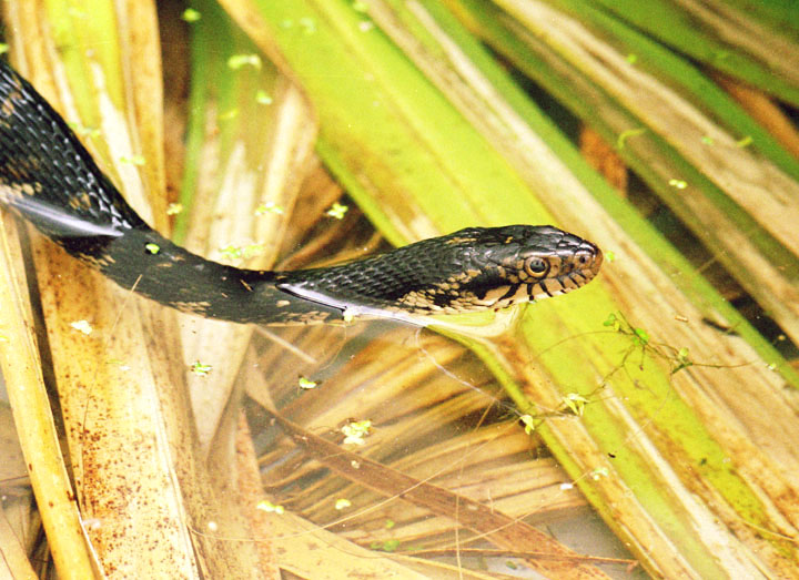

 This one was pretty shy, which is good because it means it will seek shelter when danger threatens, but it makes my job a bit tougher. I wanted a scale shot and had the dime handy, but the frog wasn’t taking direction well and kept hopping further away, making me place the dime in a new position ahead of it in the hopes that it would cross it. Eventually, with many false starts, I got what I was after, even though the flash angle wasn’t ideal. Based on the size there’s a good chance it’s a form of chorus frog, which are much smaller than the either of the treefrog species.


 I got my timing down the other day, and caught a set of lady beetle eggs as they hatched. The eggs are 1.2mm in length – yes, I have a loupe with a micrometer scale – so the details you’re seeing here are pretty fine. As you can see, the larva are visible through the translucent shells.
 Now, for some pointers. Both of these images were obtained with non-standard means. I used a Mamiya 45mm f2.8 lens intended for the M645 series of medium-format cameras, mounted to my Canon EOS Digital Rebel (300D) camera by means of a reversing ring. This is a simple and very inexpensive metal ring that has the standard Canon lens mount on one side, and threads to fit the filter mount of the Mamiya lens on the other; this means the lens mounts backward onto the camera body. By using a wide-angle focal length like 45 or 35mm, you produce a very-high magnification macro lens with a surprisingly low amount of distortion. You can do this with any make of wider-angle lens, but the best results that I’ve achieved by far have been with the Mamiyas. In my cases here, I boosted the magnification even more by using them on a 20mm extension tube, between the adapter ring and camera.

 It is possible to buy adapters specifically for mounting M645 lenses to EOS bodies, but they’re more expensive than they really need to be, unless you have a camera that requires focus confirmation through the lens (every camera that I’ve seen allows this to be shut off in the custom functions, but my knowledge is by no means exhaustive.) I took the cheap route, however. I drilled out a Mamiya lens-base cap so it was more of a ring, and mounted it with epoxy to a reversing ring of a matching size – total cost about six dollars. The reversing ring is easily distinguished in The Girlfriend’s photo here, being darker than the base cap, while the base cap is reflecting my arm faintly right at image center; everything else is the Mamiya lens itself (actually, the Mamiya extension tube is sits between the base cap and the silver ring, and the manual/auto switch is visible right alongside my thumb.) If you do this, it helps to make a few reference points before gluing the bits together, so the lens is oriented the way you want it when it mounts to the camera.