And so we get to part two of the recent beach trip photos and anecdotes, but I can’t say it’s the second half, because I have more pictures to feature here than I did on the previous post. And they’re not going to be in chronological order just to mess with the anal people.
 I made a brief mention of this earlier, but while we had good weather for the three-day weekend trip, the days were disturbingly hot, peaking around 36 °c (97 °f,) which was enough to cut short some of our planned activities. On the day we were in Southport, we didn’t walk around as much as we’d aimed to, though my bothersome foot contributed to this, and on the day we went to Fort Fisher, we skipped hiking down the beach strand. We got enough done and it was certainly a nice getaway, but yeah, too damn hot…
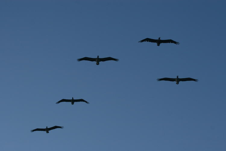
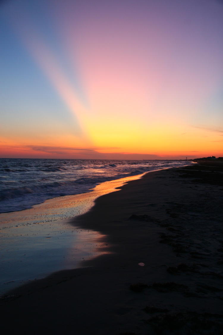
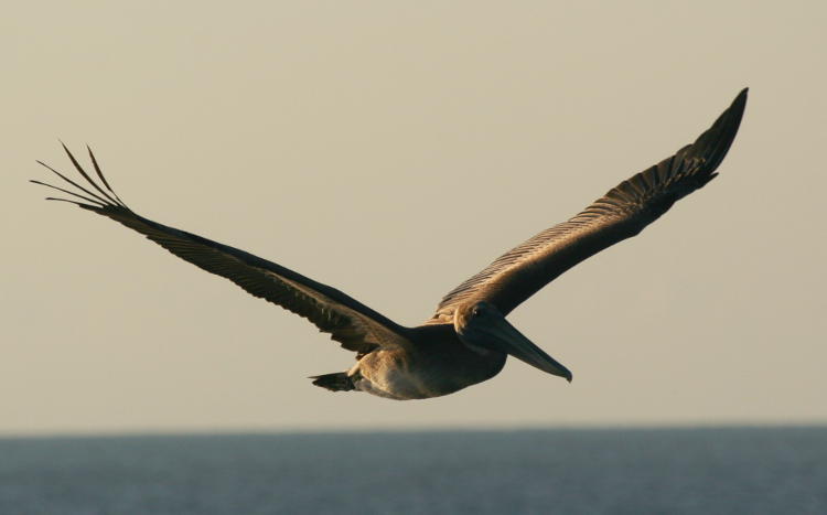
On the second evening, however, we trotted down to the beach for sunset (the previous night’s sunset occurred while we were on the road towards a decent seafood restaurant.) And since the rising sun was shrouded behind beach houses, this meant that the setting sun would be out over the water – I’m easy, I’ll take either. As it lowered the sun reflected off of the windows of a nearby house, making it appear as if it was brilliantly lit inside, and I snapped this as a large flight of pelicans passed overhead.
Clouds down on the horizon were going to prevent any chance of a green flash occurring, but they added a lot of character to the sky, and as you’ll see, it worked pretty well.
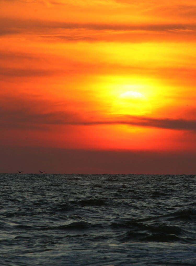
Rather than completely shrouding the sun, the clouds were thin enough to become very tempestuous in appearance while still letting the shape of the sun peek through – look close, and you can see most of the circle. It can be hard to judge what exactly is going to happen at such times, even though it might appear (like here) that the sun is going to disappear behind a cloud bank. So I just kept firing away as it descended, or the Earth turned – whatever.

The actual effect as the sun ‘touched down’ turned out pretty cool, producing a very fluid, attenuated appearance. And because of atmospheric distortion, the chances are the sun was already below the horizon, geometrically anyway, when this photo was taken – light tends to get seriously bent at the more oblique angles that occur at sunrise and sunset.
But admittedly, as the last vestiges disappeared from view, the humidity/clouds were a little too thick to show much of anything. We stuck around, though, both because I knew that the twilight (‘blue hour’ is coming to be a more frequently used term) might do something cool, and because I was going in for a short swim. The water was fantastic, and while the surf off of Oak Island wasn’t going to produce any nice boogie-boardable waves or thick curlers, it also means that it’s a nice beach for anyone, kids and adults.
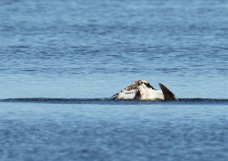
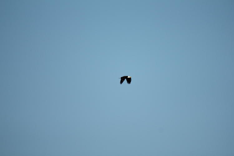
There’s a very popular regional airport just inland from the intracoastal waterway, which placed it a handful of kilometers from us, and they host sightseeing tours and skydiving activities, which we saw on multiple occasions on our brief stay. And something else.
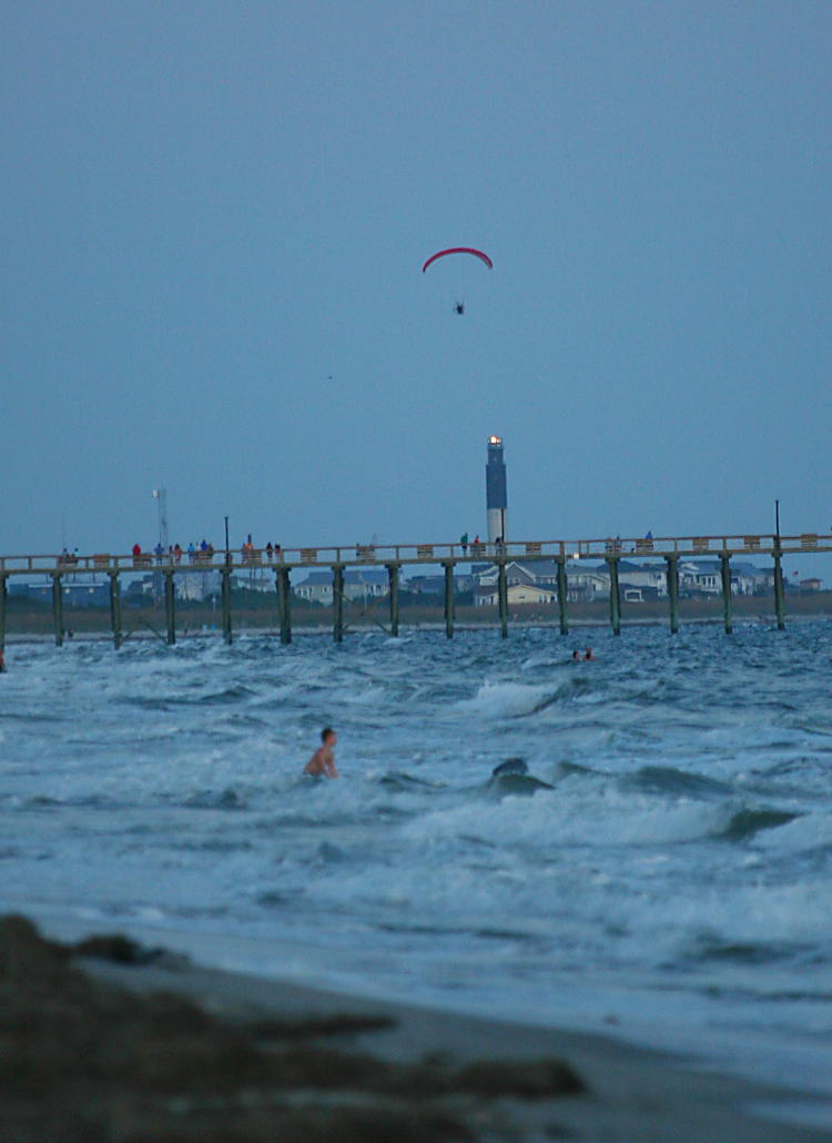
Looking east away from the sunset, we could see a handful of skydivers coming down towards the beach, and one that seemed to hang in the air for an unreasonably long time – this turned out to be because it was not a skydiver but a paraglider: basically someone with a parachute and a propeller strapped to their back (well, it has a motor, too.) This is definitely something that I have to try someday, and probably the closest I’ll get to being a pilot. You know, unless my legions of readers start buying a few more damn prints! Anyway, I couldn’t make this out for sure through the viewfinder, being several kilometers distant, but a close examination of the sharper photos revealed the cage around the propeller, perhaps faintly visible here. And cooperatively in line with Oak Island lighthouse, so it appears that they knew where I’d be shooting from. Slightly creepy, that.
Meanwhile, the sky developed apace.

A massive cloud bank somewhere well over the horizon, many kilometers off, split the sky in a manner that almost mirrored the waterline (I tried marching back and forth, but couldn’t get the perspective right to line them up.) It might appear that this is caused by that little bump in the clouds on the horizon, but the real culprit was much farther away and many times higher, I’m sure, especially since it lasted until the light finally faded from the sky. This display definitely garnered The Girlfriend’s approval (I was pretty cool with it myself.)
I probably should have shot some video right here, because as the foam from the breakers washed ashore, the sand reflected the colors of the sky for moments before the water sank in enough and turned the shore dark again, often occurring in patches and odd geometric shapes – you can just see one remaining spot, in the half-second before it vanished, to the right of the wet sand line here.
One more, as we departed the beach – it was just about the only foreground subject available other than the beach itself.

So you can effectively place everything, the last Storytime post photos were shot only a few minutes after this as we walked back to our room.
The next day we drove up around the big loop and back down to Fort Fisher (it would have been a lot less driving and a little less time to take the ferry, but as I said it wasn’t running.) Whenever we’re in the regions, we always have to hit the North Carolina Aquariums, of which there are three: Roanoke Island nears Nags Head, Pine Knoll Shores near Morehead City, and here at Fort Fisher – you know you can follow along with the mapping service of your choice, right? The unfortunate thing about aquariums, from a nature photography perspective, is how hard it is to get any kind of decent photos. The light is usually dim, both in and out of the tanks, and the glass produces a lot of distortion that’s difficult to avoid. So most times, what you end up with is not too impressive.

This image underwent some slight tweaking to counter its shortcomings from just those shooting conditions mentioned above – I really didn’t attempt many shots at all. But I will also add, make sure that you shoot whatever ID is available while you’re present, because it will save you the efforts that I just had to go through to pin a species on this; I’m fairly certain this is a lined seahorse (Hippocampus erectus,) and a female at that, due to the absence of the brood pouch at the base of the tail – yes, it’s the males who carry the young after the female introduces the eggs into his pouch. Stop looking at me like that – I didn’t design ’em.
I also have to feature a starfish that was attached to the glass, because it’s the sharpest thing that I could shoot and anyway, it was a starfish that kickstarted my efforts to photograph aquatic subjects without underwater cameras and scuba gear and all that.
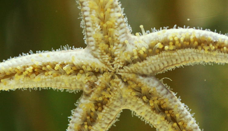
I am tentatively identifying this as a common starfish (Asterias rubens,) and it looked a lot like my initial subject so many years back. Mostly, I just like all of the cool anatomical details – I wish I had pseudopods (actually, there are no ‘pseudopods’ here; the pale yellow protrusions down the center of each arm are simply called, ‘tube feet.’)
So, okay. Many years back, I lamented that I was spending too much time doing insect photographs, because that’s what I was finding most often, before I finally decided to embrace this state of affairs and concentrate on them – not entirely, but I have expended a bit of effort into refining and expanding on my arthropods. This reputation precedes me now, because even indoors at the base of a huge viewing tank, I was able to find an impressive insect specimen – there was a moment of doubt before we determined that it was outside of the tank, on the glass within easy reach, instead of some aquatic species within. After checking to see if an employee wanted to escort my find outdoors (they didn’t,) I scooped it up and carried it out to the outdoor cafeteria area myself, drawing absolutely no attention in doing so even though I walked past countless kids with a pretty damn big insect; everyone’s attention was on the tanks and such. Probably a great place for pickpockets, provided they’re after, I dunno, Pokemon cards or something. Once outside, I handed it, actually them, over to The Girlfriend so I could do some detail shots.
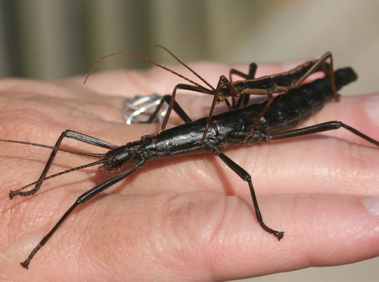
This is a mating pair of southern two-striped walkingsticks (Anisomorpha buprestoides.) The Girlfriend’s been taking her cues from me lately and handling some things she normally wouldn’t even have considered – as long as I do it first, anyway. And while I was pleased to capture them in the act, just about every photo of such species that I found shows the exact same thing – apparently this is a common sight. Either they’re the horniest little devils to come along, or mating season causes them to become much more visible.
[Actually, it would seem to be the latter. Also, several of the colloquial names for them include the word “devil,” which I did not know as I typed the above, and the potential reason for that is forthcoming.]
I’m used to scooping up arthropods gently so as not to injure them or provoke a defensive response, which is probably good, because I only found out afterward that this species can spray a caustic substance that can damage the cornea. The Girlfriend did not react as negatively to this information as I imagined she would, but then again, I haven’t been to sleep yet…
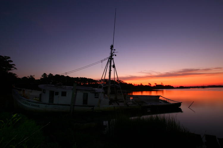
And so now, we’ll backtrack a day. On our way over the bridge across the intracoastal waterway, I reflected that it might just face the right way for a decent sunrise shot, and almost concurrent with this thought, spotted a shipwreck near shore – actually a swamped and abandoned fishing trawler. Intrigued by the photographic possibilities, I pulled up a mapping service later on and realized that it might be very possible to reach the wreck. Still later (after the visit to Southport,) we followed an access road down to a small shipyard and asked permission to cut through down to the wreck; the guys we spoke to were amused at our asking, since they admitted that everyone went down there anyway. Access to the boat was easy, and I began considering it for the next morning.
Bright and early – no, dark and early – we drove out to the same spot and I made my careful way through weeds and rubble to set up the tripod. The first set of shots, very long exposures by first light, were assisted by my pocket flashlight adding a little fill light to the ship, which came out pretty well, if I do say so.
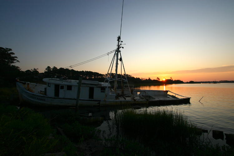
Once again, I was using my phone as both a sunrise plotter and a compass to determine exactly where the sun would appear – not quite along the river as I’d preferred, but I’d cope. As it broke the horizon, there wasn’t a strong foreground element to work with, so I just used the semi-distant marina.

A word about conditions. For the most part, it was as quiet and serene as it appears, with the faintest breeze and a twittering of awakening plovers along the water’s edge nearby. Fishing boats would race down the river every few minutes, though, and the little biting gnats, typically called no-see-ums, were horrendous. We had repellent on after the first couple of minutes, but the little fuckers were undeterred, finding the regions where the repellent stopped, like right at the hairline or up on my bald wisdom spot. Not the most comfortable of mornings.
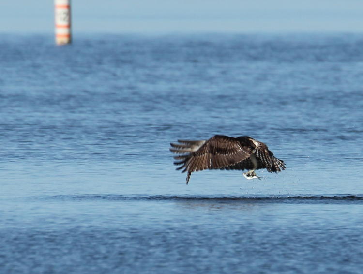
On our way back towards the motel room, we decided to stop by the pier we’d been seeing for the past two days and determine what it cost to go out onto it. Turns out, it was free and open, and we’d missed an opportunity to watch the sunrise from a point where we’d actually see it on the water. It wasn’t that long after sunrise, so we still had a nice low angle to work with.
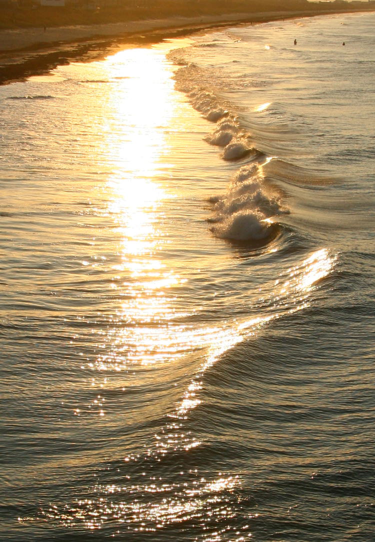
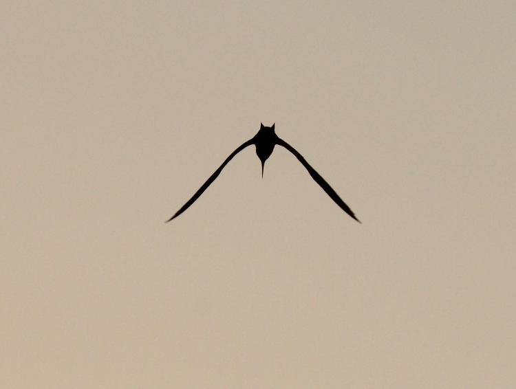
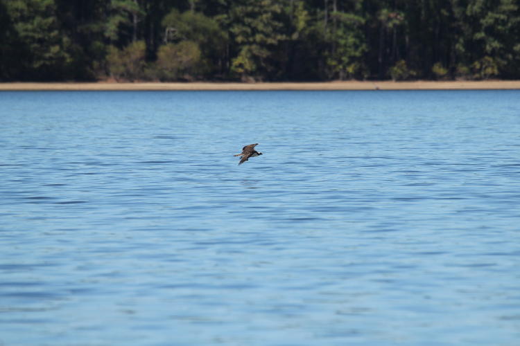
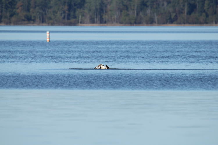
This, as I said in the earlier post, was Yaupon Beach Fishing Pier, and it extended well out over the water, past the breakers, with a decently high perspective. In minutes, we’d determined that it was a great vantage to watch pelicans, because it actually cut across their preferred glide paths near the breakers (which push the wind into small updrafts that help their glides,) so they would detour just around the end or up over the pier itself.
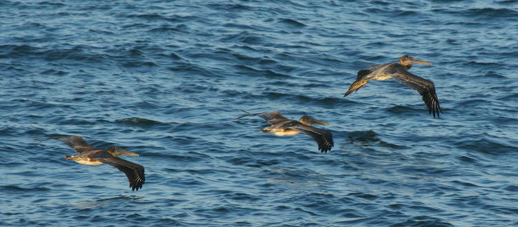
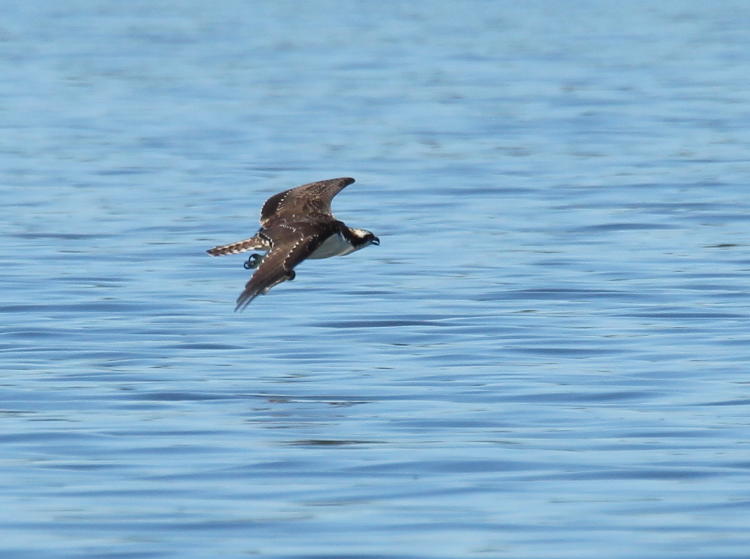
We still had stuff planned for the day, as well as the return drive, so we didn’t spend long, which was a shame because I’ve long been after nice, detailed shots of brown pelicans (Pelecanus occidentalis.) Nonetheless, in a half-hour I snapped quite a few dozen frames as they passed, and managed a couple of nice portraits.
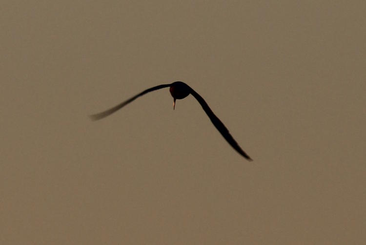
I like the one above, partially because of the light angle, and partially because of that little glimmer from the eye, but I would have liked the sky to be a better color. Pick pick pick, I know.
Meanwhile, The Girlfriend prefers the one below more, which I don’t disagree with (not if I know what’s good for me.)

A quick note here, since I was shooting with the white balance set for full daylight, so no compensation, which kept the golden morning light on the feathers, setting it off nicely against the sky. Also, that stippling along the belly is pretty cool – I’d never seen it before.
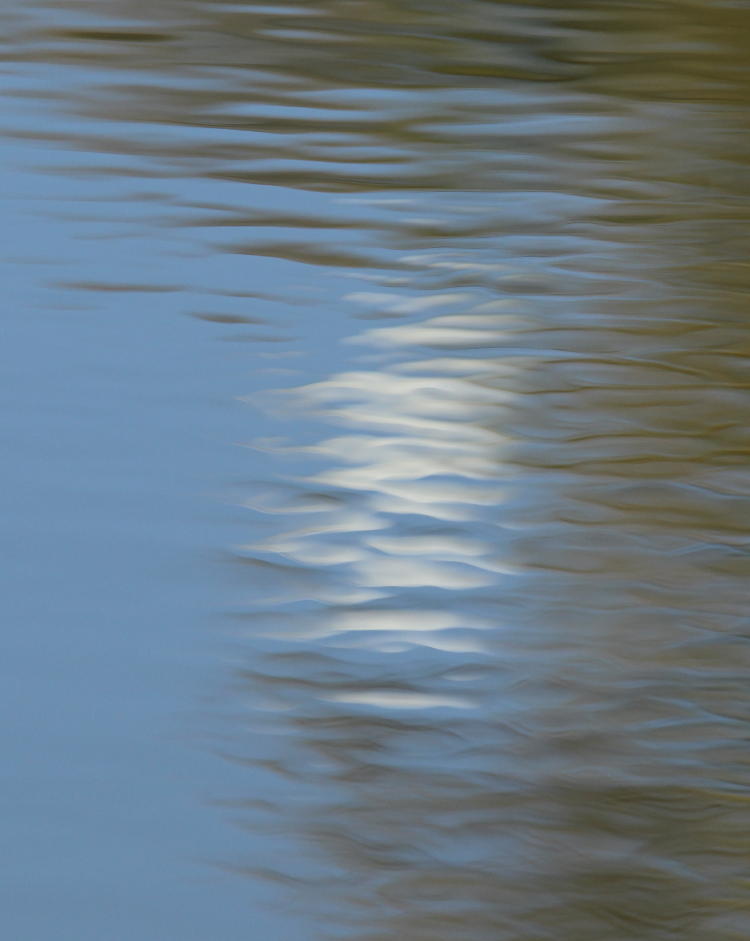
But I’ll close with my favorite, a nice little abstract. I’d seen the pelican approaching almost dead on to me, and I followed it carefully with the lens, tracking it as it rose and banked back and forth, undecided on where it wanted to be. This eventually carried it to within a smidgen of the sun itself, and I fired away as it passed close, to be rewarded with this lovely composition. With the semi-erratic flight path, it’s doubtful that I would have realized how close it would pass to the sun in time to raise the camera, had I not already been following it – I couldn’t call this an anticipated shot, but I’d been watching for something to happen. Works for me.


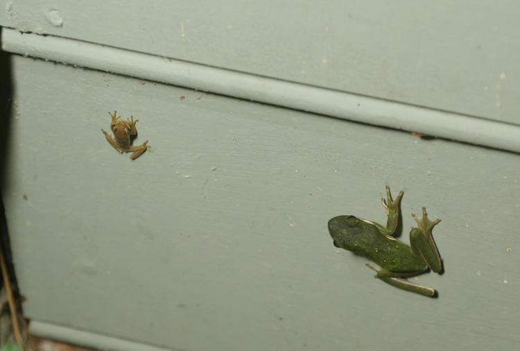
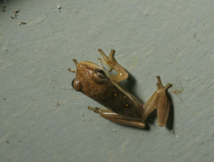
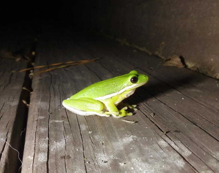
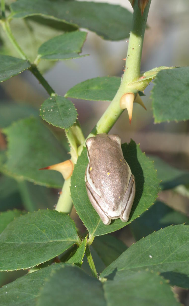
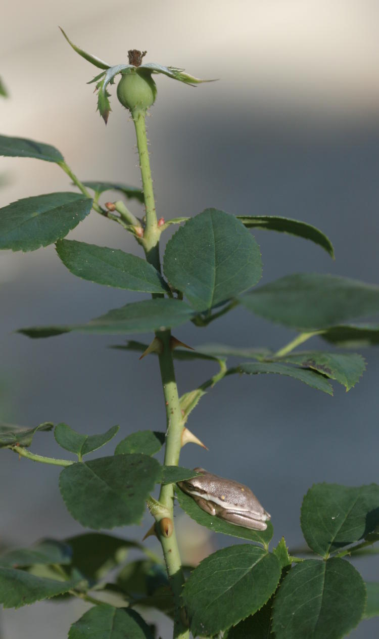
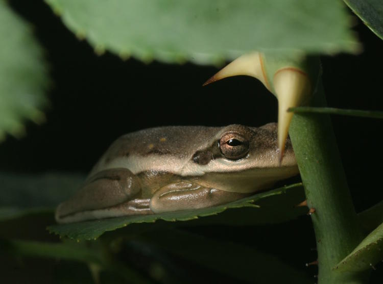
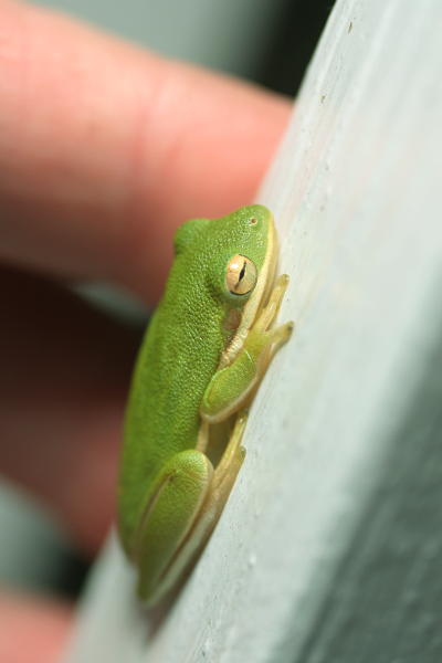 Yes, it’s another green treefrog (Hyla cinerea,) but I’m cool with that, because I was hoping to get them established in the area and it looks like it’s working. The combination of higher temperatures and rain seems to have brought this one out, possibly assisted by our porch light being on, which was certainly attracting its share of insects. I had to do a scale shot with the fingers of my left hand in the background, but because the aperture on the Mamiya 80mm macro lens is manually controlled with a spring-loaded lever operated by my left hand, this meant that I was shooting wide open at f4, so depth dropped a bit. Still, I think I effectively demonstrated that this is a juvenile, roughly half the length of an adult (I did not measure it, but I’m estimating it at about 25mm in body length.) It was pretty patient with me as I got a variety of angles, including going in for the portrait.
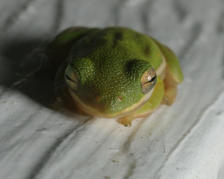


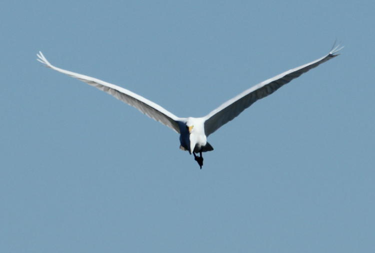


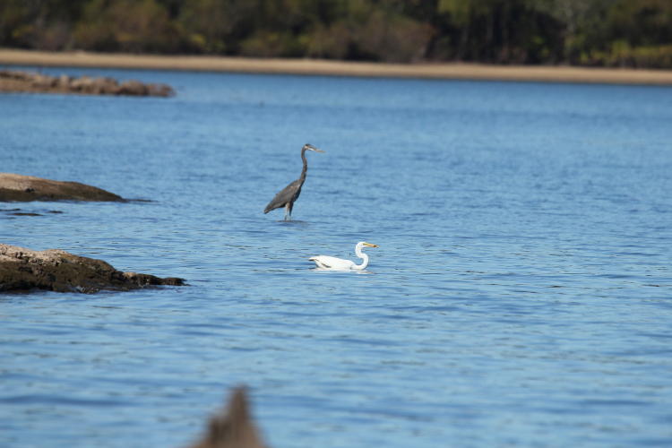
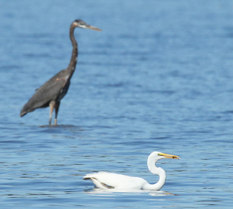

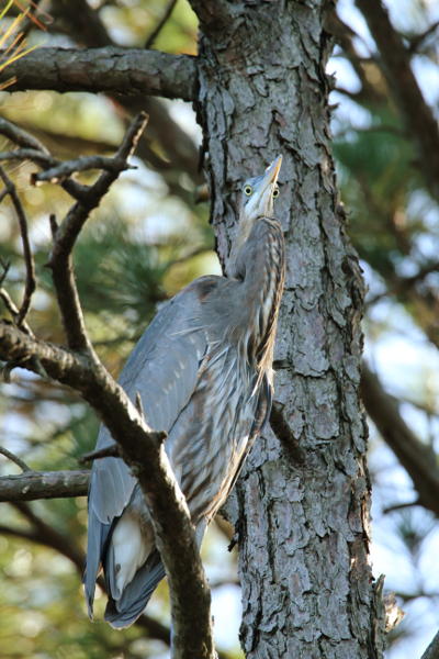 And so we work our way to the big finish, as usual. At one point we were surprised by a great blue heron taking flight from a tree very close by – we hadn’t spotted it before, but it tolerated our approach only so long before croaking its obvious displeasure as it flew off. It didn’t go very far though, and I marked its landing point right alongside our intended path back, so we stalked it slowly. As we got close, it got down to a simple drill: a couple of small and unobtrusive steps, fire off a frame or two. A couple steps more, another couple of frames, all the while keeping the cameras and long lenses aligned largely towards the bird to prevent flashing them around in radically changing profiles, essentially minimizing the movement of these as well as ourselves. We had pretty much gotten directly underneath the heron, no more than ten meters off, when it eventually got fed up again and moved further off, again with the hoarse croaking alarm call of the species, but we’d snapped more than enough frames by then. This one here is full-frame at 600mm, but the best bit is seen in detail below, cropped a bit tighter. And I’m certainly not complaining about the focus on this one.