So, back in high school and just afterward, I was a big fan of OMNI magazine, starting from the very first issue. It was a great blend of science news, artwork, science fiction short stories, excellent brain games, and interesting examinations of speculative and theoretical advancements – I have to credit it with introducing me to several great writers, among them Dean Ing, whose stories expressed physics in fantastic and imaginative ways, if somewhat implausible. Within its pages I found the first tests of the mercury ion engine, a then-experimental thruster for space probes which also found its way into the Star Wars universe; the TIE in TIE fighter stands for Twin Ion Engine, believe it or not.
Anyway, one of the regular topics was UFO reports, which at that time I still followed casually, though the ardent fascination of my adolescent years had by then waned in the face of obvious sensationalism throughout too much of the media devoted to the topic. As time wore on and I concerned myself with making a living, I read fewer and fewer issues, until picking one up one day several years later and finding it much thinner and devoted almost entirely to the same sensationalism over UFOS that had made me start drifting away from the subject. Not a lot longer after that, OMNI ceased publication.
So when I heard it was going to reboot as an online magazine, I had mixed feelings about it. Were the editors still enthused about glorifying UFO reports, or did they realize that had probably helped the death of the first incarnation? Would there still be emphasis on quality writing and innovative art? But it drifted from my mind, and I didn’t see anything past the initial site until just now, when I found it within my bookmarks and started skimming the contents. And it didn’t take long to come across the post, ‘How Ufologist Stanton Friedman Debunked Isaac Asimov and Arthur C. Clarke.’
On top of my disappointment came a sense of deep foreboding, for two distinct reasons. The first was, I am very much aware of Stanton Friedman and his efforts to promote the idea that we are being visited by extra-terrestrial intelligence, and they’re not very impressive, nor is Friedman, physicist though he is, a thorough scientist in this regard. More amusingly, however, is that debunker is an epithet among UFO proponents, without fail applied disparagingly to anyone and everyone that displays any skepticism or lack of total belief in the concept of visiting aliens. Double-standards are a common thing among UFO proponents, however, so this wasn’t particularly surprising; regardless, the post (and the site itself) wasn’t showing much promise to me.
The content lived down to this promise, I’m sorry to say. Obviously written by a fan of Friedman’s, it went into numerous instances where Friedman apparently scored some telling point against not just the writers named, but other skeptical sources as well, holding him up as a champion of the truth of alien visitation and a deft debater within the field.
There’s just one catch, and it’s one that is so frequently lost within the topic itself, and countless other topics of paranormality and conspiracy and religion and so on: science is not established, assisted, or advanced by debate. Whether someone is personally convinced or not has no bearing on the facts, and the one overriding benefit of scientific endeavors is that we produce something that we can use. You see, philosophers may want to debate about the meaning of ‘consciousness’ or the nuances of modal logic, and theologians might like hashing out the ‘true’ nature of the resurrection, and literati clearly enjoy trying to convince one another that they know what the underlying message of any text really is, but science has the goal of giving us new tools that produce objective and measurable results. So all of the blather about UFOs, every last case study and new examination of photos, never even approaches the simplest of scientific criteria: what have we learned?
If we take, for instance, one of the accounts named (incorrectly) in the post, the Trindade photos, the very first thing that we find is that there is no agreement, or even consensus, on them being authentic or not, despite the fact that they were produced during a supposedly scientific venture (that somehow lacked any of the routine controls that would define, “scientific.”) And it is worth noting that there is no way to completely establish authenticity over hoax; we can only consider a level of likelihood. But even assuming, just for the sake of argument, that they are authentic, what do they tell us? Well, that there was an object of this shape in the sky. No size information, no distance or airspeed – none of this is possible without triangulation, at least. And of course, we’re hell and gone away from establishing even a method of propulsion, much less an extra-terrestrial intelligence, way much less where such intelligence might hail from. The number of questions left unanswered is staggering, and even the shape is left to assumption; a cylinder may look like a circle when seen from the end, or a square when seen from the side so, again, what can we definitively say about it?
[I have to add that the Trindade photos, seen by many UFO proponents as “great evidence,” are ridiculously unconvincing to anyone with even rudimentary photographic knowledge. Aside from being trivially easy to fake, there’s the simple matter that the object, supposedly photographed against the overcast sky, is not silhouetted as we should expect – if you question this, take a look at even a silver-bodied jetliner against the clouds and tell me how bright it appears, much less show me a photo of it.]
A hallmark of science, as well as our judicial system, is the attempt to establish things beyond a reasonable doubt (the weakness in there is that ‘reasonable’ is an entirely subjective term.) There’s the simple matter that if there are multiple scenarios in which something could have occurred, various ways to produce the same effect, then the scientific method entails eliminating as many as possible. The goal is to establish that the evidence could come from only one source, but that’s often impossible, so the next best choice is to obtain the greatest probability of a single cause. And all science is provisional, able to be overturned by finding contradictory evidence. Moreover, there is no ‘default’ explanation in the face of lacking evidence, a mistake countless people make – science does not support the practice of throwing something out there and accepting it as long as nothing disproves it. For instance, “dark matter” is a term for a gravitational anomaly, the concentration of attraction as if there is a huge mass in a particular location yet nothing that we can otherwise detect. There are numerous suggestions for what causes this, but none that are considered likely, much less default. Without firm evidence, the scientific answer is simply, “We don’t know yet.”
UFO proponents cannot grasp this idea, preferring to accept the posit that aliens exist, and see any factor whatsoever that can be twisted to fit as confirming evidence, unable and unwilling to consider how many other ways the same factors can come about without aliens – theologians, and just the few religious folk who apply some thought to their beliefs, do the exact same thing with a default “god.” True enough, there are investigators within the UFO field that make the effort to examine the cases with at least a passing semblance of scientific inquiry; without exception, these are the people who have earned that ‘debunker’ epithet, because casting any doubt at all on the foregone conclusion of the proponents, even raising the questions, is an indication of an enemy to them. It’s amusing, because the frequent demand from proponents is that the scientific community (as well as the government) takes these cases seriously, but when it does happen, they somehow find it unacceptable to maintain the same criteria that’s used for all other discoveries and research.
Back to the article itself. Friedman, despite his lack of scientific standards and objectivity, is adept at one particular thing: sophistry, the art of spinning subtly misleading arguments that make no useful point. And that’s the only thing to be seen within the post.
Data, numbers and logic are the cards in this fact-vs-fiction game, and Friedman insisted that the rules used are straight and consistent. “People ask the wrong questions,” he said. “The question isn’t ‘Is every UFO somebody’s spacecraft?” The answer is ‘Of course not.’ The real question is, “Are any UFO’s somebody else’s spacecraft?’ and the answer is ‘Yes.’ It’s like asking ‘Is everyone over seven feet tall?’ Of course not. ‘Is no one over seven feet tall? Of course not. One can easily get into trouble by asking the wrong question, because then you treat every sighting equally.” One could certainly get into trouble trying to pass off conclusions to Stanton Friedman which had not been thought out.
It should come as no surprise that Friedman does not often directly debate anyone, instead preferring the tactic (like I’m doing here, unfortunately) of arguing against selected statements. Because, of course, we can measure the height of people and definitively establish that someone is over seven feet tall; we have numerous examples of such. We have no examples of extra-terrestrial life – that’s what Friedman is trying to prove. But you don’t prove anything with analogies, especially ones not even remotely related to the topic at hand. Should we instead ask, “Is there anyone born with three thousand arms?”, nobody would contest a negative answer, but to establish a positive answer, we’re going to want to see it, aren’t we? Friedman’s demonstrated attitude is that we should assume it could happen; after all, it’s just silly to have high standards of evidence for something extraordinary like that.
He also adores playing word games, appealing to suggestion and assumption rather than expending any real effort in establishing something concrete to work with:
“As writers, surely they didn’t or haven’t worked on classified government sponsored programs. I worked on classified programs for 14 years and I am certain that secrets can be kept. As I have often noted, 80 percent of the engineers and scientists responding to the question, ‘Do you think the government has revealed all it knows about UFO’s?’ said, ‘No’ .”
[By the way, I am correcting the post’s mangling of quotation marks as I go]
Notice that we don’t have any information presented at all, just his personal assurance that the government can keep a secret and the belief among those unnamed ‘engineers and scientists’ that it might know more than it has revealed. I’ll be forthright with you: I am 90% sure that the US military complex has not revealed everything it knows about UFOs, and just as sure that it has not revealed everything it knows about dogs – that’s the nature of security concerns. But so what? My certainty yet remains anecdotal, unable to be supported empirically, and unknown information is just that; there is nothing that tells us, one way or another, what this information must be. And it’s unfortunate that I have to point this out, but ‘UFO’ is not synonymous with ‘extra-terrestrial life.’ A fucking leaf can be a UFO, as can any Russian, Chinese, or American aircraft that never received a positive ID.
Friedman also likes picking the easy factors to rebut while ignoring the pertinent ones. When J. Allen Hynek made the comment that he considered space travel to be impossible, Friedman chose to counter with the available energy of nuclear fusion, as if this was the only factor that Hynek (or anyone else) was considering. Ignoring for the time being that fusion is not an easy source to tap (requiring, in every instance we can find, an enormous amount of energy or mass to start,) there’s the simple fact that the distances between stars is vast, and even traveling at the speed of light (which is presently considered to require infinite energy,) it would take more than four years to travel to our closest stellar neighbor. Imagine the resources necessary to sustain a living body that long, and how much mass that requires. And as proof that this has occurred, we have shitty photographs and eyewitness accounts of aliens remarkably like the latest science-fiction movies (seriously; this trend is more common than you might think.) Energy is a red-herring in this case, not arguing the salient points at all.
Friedman also displays a two-faced approach extremely common among proponents, and quite amusing all by itself:
The jury may still be out on the final verdict, but a widely-documented, real contact would certainly firm the evidence. What would happen to this planet and its people should this occur? Does the government give any serious thought or planning for this contingency?
“Practically none. I would like to see psychiatrists, religious leaders, psychologists, and god forbid, the military, thinking about what this means. First, we’d have to get over the ego business and recognize we’re not the only life in the universe, and probably not the most intelligent.”
You did see the part above where he tries to imply that the government knows more than it lets on, right? So what now makes him assume that this particular aspect hasn’t been tackled already? Does he think that they’ll keep their knowledge of ET life a secret, but post their procedures for contact on the bulletin board? Or does he not really believe the shit he’s throwing around?
It’s also entertaining that he feels that numerous professionals should be devoting their time to this contingency as if it were imminent, ignoring, one supposes, all of the other issues that presently exist and provide a real benefit in addressing. Going deeper into this, we have the common lament among proponents that people need to be doing more (the old “take me seriously” canard,) without ever addressing what it is that should be done: “The government should be looking into this!” Into what, this crappy photo of an indistinct object? The ‘eyewitness’ accounts of someone who claims to have been abducted? What else can one do but interview them? Should we be posting the composite sketches on lamp posts, “Have you seen this alien?” I’m always at a loss as to what anyone thinks should be done that isn’t being done already by countless groups that are absolutely desperate for real evidence but somehow keep failing to find any.
Moreover, there is a vacuum of useful information. Friedman’s compatriots are incapable of providing any info about what alien life is or would be like, and so we are left only to speculate about not just their approaches and attitudes, but our own in the face of an event no one has ever experienced before. Given, however, the notable number of people who believe that they’ve had contact, it hardly seems like humans as a whole are going to freak out or anything.
Ignored in all this, surprise surprise, is the amount of real effort that working scientists have put into the topic – only, they concentrated on the most likely scenarios, such as picking up distant signals from extra-terrestrial intelligence rather than expecting them to drop by unannounced. SETI is a real program, with members that can actually think, and they recognize that long-distance communication is thousands of times easier than long-distance travel. Safer, too, as the possibility of finding alien life that’s hostile to direct contact, in countless different ways, cannot be ruled out. They also recognize that any such life is unlikely to be anything at all like us, and devote their time to puzzling out the most probable method and ‘language’ used. Again, in a vacuum of solid information; we may find out that our speculations were dead wrong, but without useful info we cannot correct this, or even know how wrong it might be.
Two particular areas of concern which Friedman felt could be addressed by anyone interested in the subject, deal with information and access to it. People need to put pressure on the Air Defense Command and other government groups to reveal the highly classified information in their files.
Yeah ’cause, you know, the government is going to cave when they see the real desires of the people. There’s nothing like an online petition to show the government we mean business. Lobbyists and special-interest groups could save themselves a hell of a lot of money if they’d follow that proven-to-work example…
Again, we see the self-assurance that the information is actually there, just waiting to be revealed – but how this is known somehow is never established, nor worth the effort it seems. While Friedman may want to assure us that the government can keep a secret, the UFO field abounds with the informants that breach their security clearances to provide just the barest hint of suppressed info – not enough to act on, of course, but still enough to start the proponents whining again. And the bare fact that not one of them has ever substantiated their claims in even the tiniest of manners seems to keep escaping notice.
Curiously, however, these alien visitations are taking place in public throughout the world, so one would assume that even civilians could gather the same information as the mean ol’ government (ignoring the fatuous idea that every government the world over would be equally capable and equally motivated in maintaining these secrets.) So, yeah, get on that, guys.
Friedman recommended a Centralized UFO Research Facility which anyone in the country could call while observing a UFO. This would tie together local, regional and national sources to record and comment on sightings, beginning with those groups which have been privately conducting this work for years on their own.
We’ve done that already, but I guess not everyone’s heard about Project Blue Book, or the independent and civilian University of Colorado Scientific Study of UFOs, often called the Condon Report. Had Friedman looked into either one of these, he would probably be far less enamored of the topic, since the thousands of reports examined by the two agencies, as well as the thousands more examined independently, yielded virtually no useful information at all, and absolutely nothing regarding ET life.
Sorry, I have to be disingenuous at times just for giggles. Because like all proponents, Friedman is somehow convinced outside of any serious evidence, and pointedly refuses to either understand how and why science works, or accept an answer that he doesn’t want to hear. If any study or investigation fails to support the idea of alien visitation, it will be seen as flawed at best, but very often the accusations of disinformation campaigns start getting thrown around, with just as much supporting evidence as the original UFO reports – alien visitation simply must be occurring, so if we can’t find any evidence of such, then that’s evidence that someone is hiding it all! The overwhelming possibility that we have no evidence for extra-terrestrial visitation because it just hasn’t occurred is an idea that simply cannot be entertained.
In the decades since the term ‘UFO’ was coined, we have made no progress whatsoever on that front: no consensus on even types of visiting vehicles, much less a physical artifact, much less an actual alien, much less any knowledge of where they’re from or how they got here; even those few reports that claim to provide some form of information, such as Betty Hill’s ‘star map,’ haven’t lead anywhere. In the same amount of time, we have eradicated smallpox and almost eradicated polio, we have discovered plate tectonics, DNA, and countless subatomic particles and properties, we have sent planetary probes to all of the nearest planets and even out to the thinnest regions of our system, and we are even cataloging the number and types of planets around nearby stars. And we now have cameras at the fingertips of the vast majority of world population, as well as instantaneous communication among a large portion of it. And yet, the field of UFOs has, inexplicably, made no progress at all. The aforementioned Trindade photos were taken in nineteen-fifty-fucking-goddamn-eight, still cherished by UFO proponents because they cannot achieve the simple goal of something better. You can also compare the various dates for sightings listed in this article – offered as a bare bit of counter-balance from the same online magazine, found as I was typing this post – and note how they seem to line up with two of the three ‘active periods’ for UFOs, the late 1950s and the early 1970s, coinciding remarkably with the periods of media attention to the topic (the third is the early 1980s, easily the weakest of the three however.) Present activity consists of countless re-investigations of old reports and the always-breathless promise that something earth-shattering is going to be revealed, which somehow never manifests.
Science moves on, providing new discoveries and insights every day, improving our knowledge base and indeed our quality of living. Meanwhile, UFO proponents keep trying to polish the rickety edifice of alien visitation in abject denial that the field has never produced one quantifiable and supportable element that would justify even being defined as ‘alien visitation.’ Like Friedman’s points within the article, supposition and wishful-thinking are the only cornerstones to be found, buttressed with insistence and the surety that real evidence exists somewhere, almost certainly being withheld because, ‘reasons.’ Had, for instance, information science progressed with the pace of UFO discoveries, this post would have had to have been published as a mimeograph…
* * *
A few serious investigators in the field:
Robert Sheaffer
Tim Printy (see also this post)
James Oberg (the author of the second article linked)
Potentially Related Posts:




















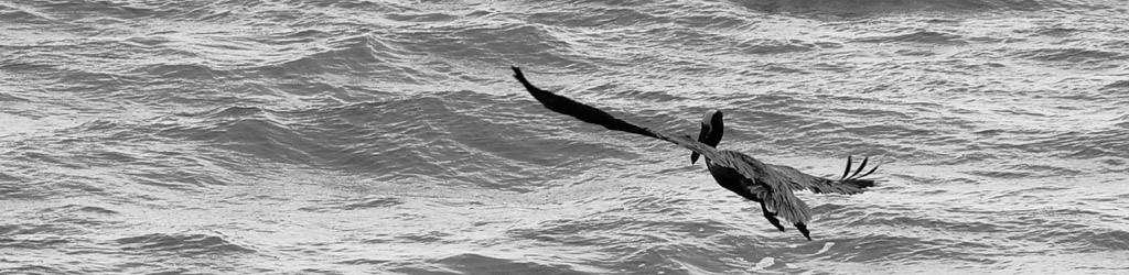


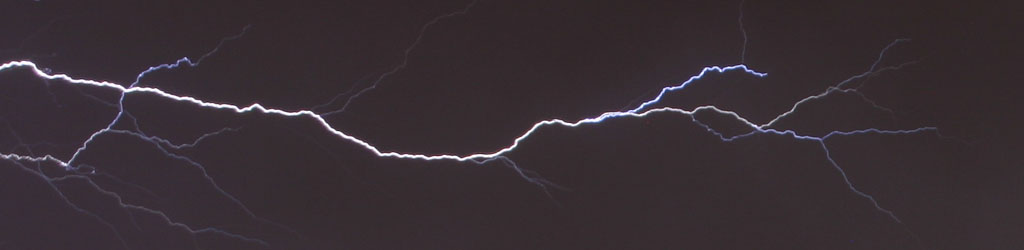
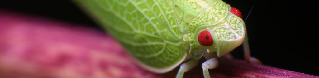

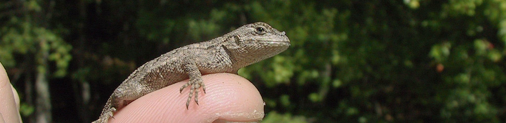

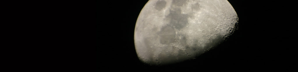
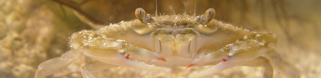

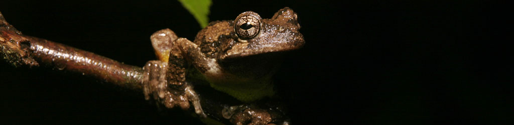





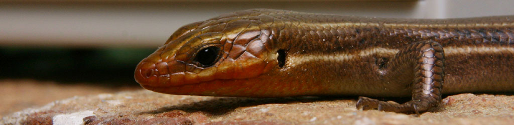
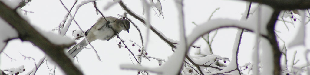
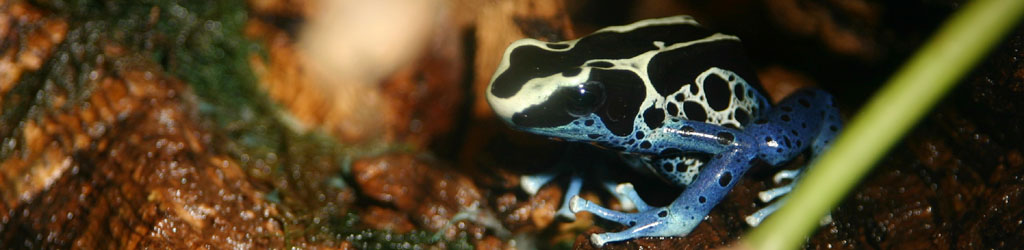











 This image was shot with a consumer zoom lens, a Canon 75-300mm f4-5.6 Image Stabilized lens. It wasn’t the equipment that provided the pic, but being in the right place, patience, luck, perseverance, and picking the settings that would work the best –
 I can look on this day and think, Yeah, now the daylight will be returning, even though it’s so gradual there’s really nothing remarkable about today, and nothing will be noticeable for weeks. As for the return of warm enough weather to provide shooting subjects? That’s a couple of months away – we’re not even halfway through the ‘dead season’ for most of the subjects I tackle. Can I look forward to perhaps doing some nice winter snowfield shots? Mayyyyybe, but as I said, the snowfalls here are sporadic, and when they’re good enough to make lovely shots they’re also heavy enough to make the roads treacherous, and there aren’t many options within walking distance.


 Just stopping to consider the various aspects of it leads to countless further questions, and
  I have a couple more posts in the lineup right now, but I think I only have time for one this morning, so we’ll just have to see when the others arrive. It’s a shame, because one is pretty damn interesting, but I doubt I can do it justice if I rush it, so we’ll go with something more visceral and less thoughtful at the moment.
 It’s gotten cold again and there isn’t a lot to photograph and truth be told I’m not even trying, so we’re going back to May with this one. I’ve had it sitting in the blog folder for all this time (yet it’s far from the oldest photo in there,) because I was doing too many mantises back then. Yeah, I’m finally admitting it, I had a wild and hedonistic youth, if by ‘youth’ you mean just over 1% earlier in my personal timeline, and by ‘hedonistic’ you mean… well, whatever you like, because it appears I don’t even know what it means normally, but probably not a lot to do with blogging about mantids. I’m fairly certain it originated with that, though. You know, back when the ancient Latins were inscribing mud tablets with illustrations of Mantodea and hanging them on the privy walls…