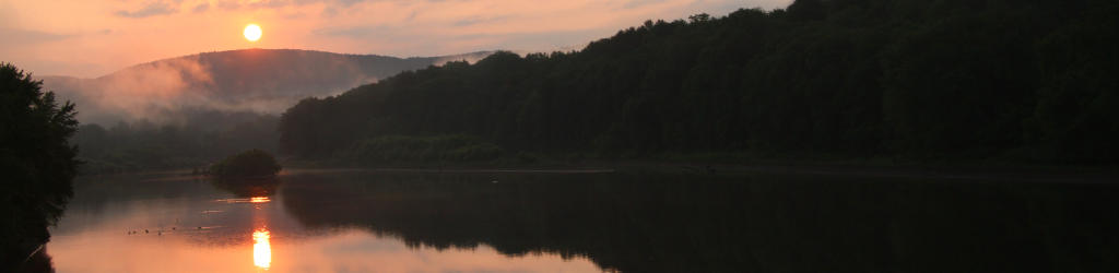
I stumbled across an article recently that told of a potential new psychiatric disorder, orthorexia nervosa, an unhealthy obsession with healthy eating. Or to put it in more blunt (Al-like) terms, being too fucking neurotic over what one eats. Now, I’m among the first to believe the psychiatric professions can be over-exuberant in describing and diagnosing new disorders – the fields do not, and can not, produce the inarguable results and unmistakeable evidence that empirical fields such as archaeology can – and what even constitutes a ‘disorder’ is an area without delineations, all shades of grey. But I don’t really have a hard time believing this one, since I see the key elements of it on an almost-daily basis; this is especially telling since I’m a trimmed beard away from being a hermit. Now, I don’t expect nor encourage anyone to take my word on anything here – in fact, I will state this right up front: go look this shit up for yourself. Get informed. But the functional part of this is seeking real info in the first place, not assuming that your knowledge is already complete, nor that your preferred sources of info are necessarily accurate. What I hope to do here is introduce some perspective to illustrate why this is even necessary.
A little background. My first job out of school was in a natural food store, one that my folks eventually purchased and ran for a while (though I quickly moved on to other things myself.) I had direct immersion into various aspects of the healthy food ‘experience,’ and plenty of contact with pretty much the entire spectrum of behavior and outlooks. And while I earlier credited a youth bible camp as fostering a lot of my current emphasis on critical-thinking, the time spent with people focused on, and downright obsessed with, the idea of healthy eating also bears a lot of the credit for my skepticism; the vast majority of information freely distributed in such circles ranges from misunderstanding of published scientific results to complete and utter fucking bullshit.
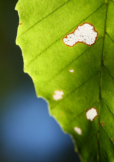
I can’t put all of the blame on the healthfood mavens, however, because a large part of it also stems from the human tendency to go overboard, as well as the ridiculous reliance on fads and trends. Two specific, timely examples: sugar and gluten.
Not long ago I found an article from a dietician who lamented that processed sugar is not a toxin, in any way, and he was extremely tired of having to repeat that. I could identify, because I’ve been reminding (or outright informing) people of this for decades. Processed sugar is almost entirely glucose and sucrose, which our bodies routinely use for their energy needs; they are, in point of fact, absolutely necessary for us to live, and processed sugar is among the most efficient ways of introducing these into the body, since the body needs expend virtually no effort in refining these molecules for introduction into the useful parts of the system. Sugar is not especially bad for the teeth; most of the enamel-destroying acids comes from starches, actually. And sugar is not especially fattening. Drinking a soda made with sugar will not automatically add fat to your system. The difficulty – the only difficulty – with processed sugar is that we like it, and can easily seek out foods with a lot of it. If we eat these foods to excess (key words here,) then we may put on more weight than is ideal. That’s it.
The ability to interpret those words correctly and without hyperbole is what mankind is rather inept at. Bare truth: taking the sugar out of soft drinks does not make them any healthier, or any less dangerous to us, by more than a tiny fraction, since they have so few dietary benefits in the first place. There are studies indicating that sugar substitutes actually produce worse effects on our system than the sugars would have. The primary thing to take away from this is very simple: don’t eat anything to excess, because there is no key ingredient that makes anything healthy or unhealthy.
I’ll use that cue to sidetrack slightly, and address the idea of toxins. While it’s not quite safe to say that toxins don’t exist – biologists use the word to describe elements that some species produce specifically to inflict on other species, in either defense or obtaining food – the idea that any substance we might encounter (outside of insects or reptiles) is toxic is, well, completely misunderstood. An article in National Geographic a few years back explained it quite simply: toxicity is not a matter of substance, but of dosage. Everything can be toxic if we receive enough of it – even water, even oxygen. But the dosages, and even the chemical bonds formed in certain circumstances, dictate how bad, or good, the effect on us is. Both chlorine and sodium are pretty nasty substances; exposure to either in concentrated and unaltered form can kill us very quickly. But sodium chloride, otherwise known as table salt, is actually necessary for the functioning of our bodies. Excessive salt (mostly sodium) can lead to various reactions such as hypertension, which in the long run increases our chances of heart issues, and very excessive amounts will clog the kidneys and lead to death very quickly, which is why drinking seawater is bad. But there’s no way to consider either chlorine or sodium a “toxin” because they’re both necessary for our continued health.
And so we come back to gluten. Gluten is just a pair of proteins found in cereal grains – “true gluten” being found only in wheat, while similar protein combinations can be found in other grains. During bread formation, gluten binds the dough together in an elastic way, allowing for the stretching, Silly-Putty-like consistency of dough and the even distribution of small pockets of CO2, the by-product of yeast that makes all those little holes in bread. Without gluten, the CO2 production forms a big bubble in the dough, which tears easily and collapses, so producing rising bread without gluten is tricky. It is not a toxin, by any stretch, and the only hazard to gluten is if you have a specific intolerance, such as an allergy, to it. That’s it. There’s nothing else. No study has ever found an inherent problem with gluten within human systems overall, nor even very serious adverse effects. Extreme reactions can happen with severe allergies, but most people who even exhibit the intolerance get the horrifying health issue of an upset tummy from it. If you’ve eaten bread all your life without issue, feel free to continue to do so, despite the plethora of products and food preparers trumpeting their remarkable “gluten-free” properties.
This really is an important aspect of it all, though, and deserves a lot of attention. The majority of people don’t read studies. The majority of people don’t even look up “gluten” when they go on a gluten-free diet, much less get advised to do so by someone qualified, like a doctor or dietician. They hear the hype, they see the grocery stores carrying more and more products advertising their lack of gluten, and think, “Holy shit, if everyone is reacting to it, it must be really fucking bad for me!” And this is the drastic misunderstanding of hype and marketing that occurs constantly, because of course the more people who think (I feel bad using that word here) in this way, the more the food producers are going to jump on the bandwagon and heave out products that pander to knee-jerk consumerism. No federal source has mandated a reduction in gluten for any reason whatsoever; no study has determined that a reduction in gluten has any effect on our lifespans. The rising number of allergies (to lots of substances) which sparked a few companies producing gluten-free alternatives for pretzel-lovers snowballed, through blind consumerism, into this pathetically ignorant fad. Seriously, don’t believe me – I readily admit it sounds stupid, and not something that our technological species should have succumbed to – and look it up for yourself.
I have to insert a vital point in here, sparked by my attempts to find an article mentioned previously. Online research requires a little discretion, and the ability to spot when someone is vomiting up utter bullshit. Simple rule: if it’s in popular media, especially if it’s a YouTube video, accuracy is completely up for grabs, but likely drops below even a 50/50 chance. Actual scientific papers, the ones where people have to show their work and then it gets vetted by a large number of other people experienced within the field, is about as trustworthy as we can get – and even that has some issues. However, if your work is utter shit, you’ll never get published in scientific journals – but you can make a video or send some press release to whatever media outlet likes sensationalist stories, and never have to worry about whether facts are involved or not. And this happens quite frequently. If in doubt about your media source, do a search within on stories about UFOs or Bigfoot; a positive hit tells you accuracy and solid info is not their forté…
There is (at the very least here in the states, but I suspect throughout Europe as well) a strong emphasis on ‘healthy eating,’ which is a topic that’s as widely variable as it is hard to define – that right there is a significant clue. Once again, it has a lot to do with not understanding what recommendations really are, but owes no small credit to fear-mongering and blatant exaggeration (see above.) To begin with, let’s step back and examine what the goal is to eating healthy in the first place. Extended lifespan, and not dying young? Fair enough. The problem is, there’s no magic formula to accomplish this. First off, there are so many variables in human lives that no single element, not even a remarkably-restricted diet, is capable of accomplishing this. The healthiest diet ever presented, for whatever definition you choose to use there, cannot prevent us from getting cancer (much less being killed in an auto accident.) And the worst diet ever conceived, same criteria again, isn’t guaranteed to kill us within a few years or even decades. Health, aside from being very hard to define, relies on a ridiculous number of factors, diet being only one of them. When anyone thinks they’re quoting from a study that says that red meat, for instance, is bad for us, they’re usually not noticing that the study has found excessive consumption is correlated with increased tendencies toward a specific health issue, such as colon cancer. What this actually means is, it’s probably not a good idea to eat red meat at every meal. It does not say that red meat will give you cancer, much less that avoiding red meat will provide a cancer-free life. These distinctions might seem obvious, but it’s not hard at all to find people who have utterly failed to interpret these correctly.
Actually, it’s hard to find someone who has read the damn study in the first place – usually, they’re just parroting the interpretation of a study that they received from some source they trusted; perhaps some daytime talk show, maybe a health-food niche magazine, possibly even something their friend said. As soon as any one of them makes any of the mistakes outlined above (or any other example thereof,) then we’re no longer dealing with real information at all. Naturally, such mistakes can be made at every repetition as well, so it takes very little time for real information to become tainted, twisted, or spun out of control.
Some of that is intentional, as well. Those who gain money from their own ‘healthy’ alternative foods have plenty of reason to promote the dire consequences of not buying their product, unsurprisingly, but even those who have nothing to gain can be remarkably exaggerative. Despite the fact that our lives are longer than ever now, and so many debilitating illnesses have all but vanished, we live in a culture where danger stalks us at every turn, from fluoride in our drinking water to high-tension power cables overhead. While it is true enough that the bran and germ portions of wheat, so often removed to make smoother, better-tasting flour, are more nutritive than the white endosperm, somehow this has been taken to mean that the skins of all vegetables are more nutritious, and that “processed food” has no redeeming value. Cooking does indeed break down a few beneficial vitamins, but what’s left behind is not a totally inert substance, much less something that is actively bad for our health. This bizarre fixation on binary thinking springs up a lot – if it’s not good for us, it’s bad; if it’s not healthy food, it’s unhealthy. This is obvious nonsense, but the attitude is pathetically quite common. There is no such thing as a ‘healthy’ food, and really, no supportable ability to even plot foods on a useful graph of health. Our bodies process all foods to extract that which is useful for us and discard the rest, and we discard every day. Moreover, everyone’s system is different in subtle, and sometimes overt, ways – I personally have developed sensitivities to peanut-butter and oregano, which makes them less-than-ideal for me (mostly due to adverse affects on my digestion, and not necessarily being harmful,) but these probably have no impact on you.
We can denote statistical averages for a lot of things, including primary diets and general longevity, or instances of some kind of cancer, but these are most often only tendencies, and not translatable to ‘healthy’ or ‘unhealthy’ in a functional manner. Moreover, such statistics cannot account for the countless variables that exist that may also be skewing the numbers, which include environment, genetics, and even just random variation. But we’re not a species that likes such vague results; we want to be able to apply a useful label to things just to avoid ambiguity. The attempt to do so, however, can just as often result in a label which is completely incorrect.
To say nothing whatsoever of seeing only the facts that we want to. Any of us can seek out and find studies that support our pre-existing viewpoint, that proves us right – even though we should be trying to find things that prove us wrong, just to see if they really exist. On top of that, we are (for some reason) infatuated with victimhood; if we feel bad, if we do not have the advantages that we believe we should have, it’s not our fault if we can find some element that caused it. This appears among far more topics than simply food. But hey, if we get a virus that knocks us down for a few days, it’s not simply a random occurrence or contact with someone infectious, but the fault of the food preparers who sacrificed our health for the sake of profits. There really is this idea that, were it not for outside influences, we would be in perfect health, as if such a thing actually existed. This is complete horseshit – not just the abstract concept of perfect health, but also that we are by default healthy. There is no equilibrium to be found, no ground state of being (despite all the averages we might calculate); life is constant change, and not just ours, but the myriad forms surrounding us as well. A virus may pop up that dodges our natural immune system, and we may take a few days to overcome it – that’s just how it goes. Some days, tension or air quality or all sorts of other factors might cause us to develop a headache – this cannot be taken to mean that we have done something wrong, or that we never would have had a headache if it weren’t for those damn fluorescent lights.
We cannot ignore the “more is better” attitude either. While it is almost certainly true that exercising is better than a sedentary lifestyle, this does not mean that conditioning for a marathon makes it even better – there are no superlatives, no absolutes, to be found. And the improvements, in most cases, probably amount to only a few percentage points, again, among the countless different factors encountered throughout our lives. We would consider it ironic that we get struck by a car and killed while pursuing our health, yet this is simply a demonstration that controlling our health is only partially within our grasp. There are many, many things we cannot change, or even account for, so fixating on any collection is next to meaningless.
We can also ask, again, what the goal truly is. An extended lifespan is a distinct possibility, but why, exactly, are we extending it? Is there some kind of record to set? Is there some reward that comes when we die? If we spend our lives obsessed with the effort of extending them, what are we accomplishing? Perhaps using the time we actually have to, you know, live our lives is something to consider? And probably makes us more entertaining at parties. I’m not going to espouse the idea of justified foolhardiness, but at the same time, I cannot espouse the idea of living in constant fear of the inevitable, either. Again, this isn’t a black-or-white decision – there’s a lot of middle ground.
The extent that this grips people is sometimes astonishing, as indicated by the potential new disorder mentioned in the opening paragraph. I’ve seen enough of this myself, and it’s also easy to find with some online searching, usually without even trying. For instance, this woman appears to live in constant fear of anything that a manufacturer might do, including thinking white glue will actually poison her children through casual skin contact (her demonstration of this, using one of the more potent natural oils, is hilarious. Hey, I cry while chopping onions – that means I’m absorbing onion juices through the knife blade, right?!?!) But if we buy into all of the fear-mongering, without ever asking ourselves if it even makes sense, that’s not a healthy approach either. Stress really can affect our health, much more so than white glue, than sugar, than bread; believing that ‘toxins’ lie in wait around every corner is hardly a mellow approach.
Anecdotal evidence is rampant within such lifestyles, and in fact, just about the only thing that is trusted. There’s something amusing about this, since anecdotal evidence is only slightly more trustworthy than reading chicken entrails. Stomach bothering you? Oh, it must be because you ate high-fructose corn syrup. Here, drink this tea. Did it go away? That’s the healing power of the tea! Of course, nearly every minor stomach ailment will go away on its own within a day, but the tea will get the credit if someone wants to believe in the power of the tea. Placebos work on the human trait where we can feel better if we expect to feel better, and worse if we expect that too. And of course, any potential correlation is seized upon, whether it exists or not. A doctor told me once that most cases of “food poisoning” are anything but – the bacteria that causes it are exceedingly rare and usually cannot survive basic food preparation, much less get reintroduced at some point along the line. But we eat two to three times a day, so any virus that causes abdominal distress in any way gets linked to the last meal. In this particular case, the culprit was kinetosis anyway…
Back in that natural food store, I worked with a woman who bought all of the health fad stuff wholesale; natural fibers for clothes, no microwaved food, no pharmaceuticals, and more herbs than you can shake a stick at. Her daughter lived the same way, but her sons didn’t buy into the lifestyle at all. Her daughter died at a young age of cancer, while her sons suffered no major maladies at all. This is, of course, just as anecdotal as any other account you might find, but think about how this must strike the person dedicating all of their life to ‘healthy’ approaches. What went wrong? What little, unaccounted-for toxin snuck past the defenses? How could this have been prevented? If you really believe that we are by default healthy, then how much more paranoid can this actually make you? If you want to find something to blame, it will be found – perhaps driving past the chemical plant daily, or eating school lunches while growing up. Does this really help anything at all? Can this possibly be considered a good lifestyle?
The professional advice, the stuff that can apply to nearly everyone, has remained the same for decades: eat a balanced diet and exercise. That’s really all that’s necessary, because it counteracts the tendencies that we have not to. It’s not a high bar to reach, and serves no purpose in repeatedly being pushed higher. Just chill. Trusting those who sell hype for a living, believing that our advanced society is brimming with dangers and toxins and carcinogens, is not just irrational, it’s paranoia. Nobody needs that. And if you want to let your diet go for a day and have a little junk food, this isn’t going to affect you in any measurable way – our bodies are remarkably adaptive and hardly so fragile that a Twinkie is going to crash the system.
Coming up: A further examination of some related factors, that I split off because this was already going too long ;-)


 Last year, I was making it a point to post more than I had any year earlier, and did indeed reach that mark, just a few days past this date last year. It is safe to say that I won’t be setting any records this year, since with this one I am 44 posts away, and I don’t see me knocking out, like, three posts a day from here on.
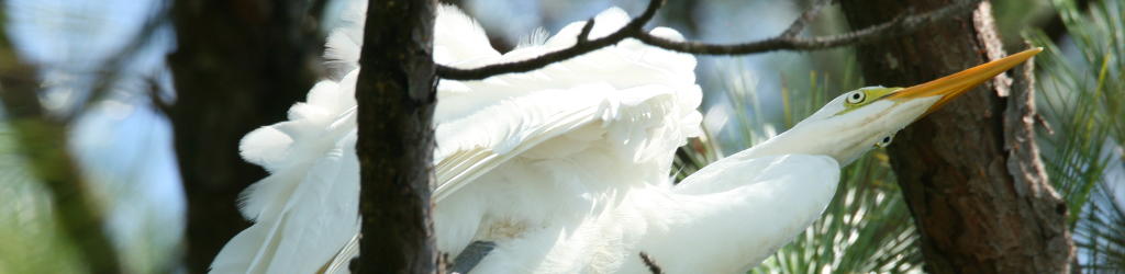
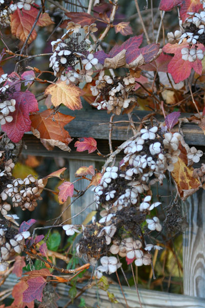 But I can put up a couple of images between long-winded posts, like this oak-leaf hydrangea (Hydrangea quercifolia) found at the botanical garden. I don’t think I’ve ever seen one in late fall, and I really like the effect – the leaves have a rich variety of colors, almost like those cheesy plastic fall decorations you can get at lame stores, only real and alive. I might have to look into planting some of these around here in the spring, since they seem to do well in shade. That’s kind of a prerequisite with this house, where large portions of the property get no direct sunlight, or little patches falling between trees that traverse the yard during the day (the patches, not the trees – those apparently only walk around when I’m not looking.) I have been making lists of plants that don’t need much sunlight to flesh out my vegetation options.
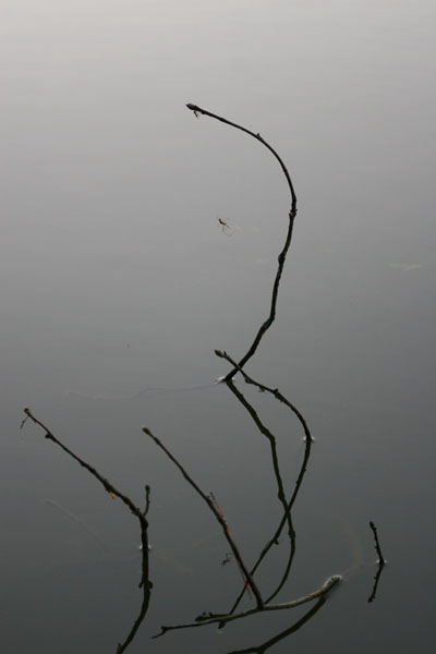 I’m continually impressed with the cold-weather hardiness of spiders. Last winter, I kept observing tiny green lynx spiders that would vanish with the snow and ice storms, only to reappear as soon as the stuff had melted. And while wandering around looking for pics recently, there were virtually no arthropods to be seen, even in the botanical garden (I spotted two, instead of the typical dozens,) but these branches clawing their way from a still pond sported a few very active long-jawed orb weavers (Tetragnatha.) There’s only one visible in this image, even if you think you see another – that’s just the reflection in the cooperatively placid water. And as tiny as it is in the pic, it’s hard to miss, isn’t it? Framing and contrast, framing and contrast…
 As my own example, I give you a warm christmas eve day, 2006, at the


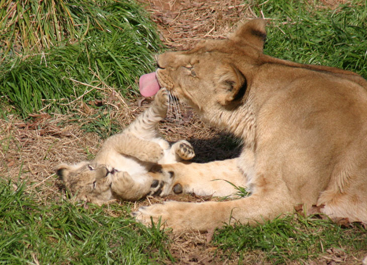
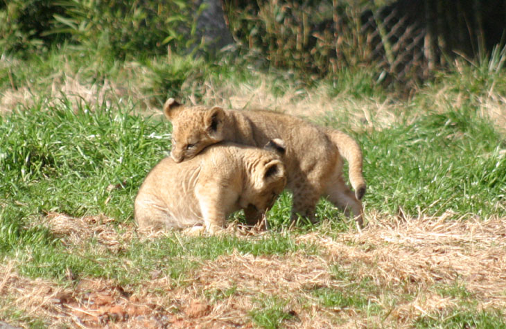
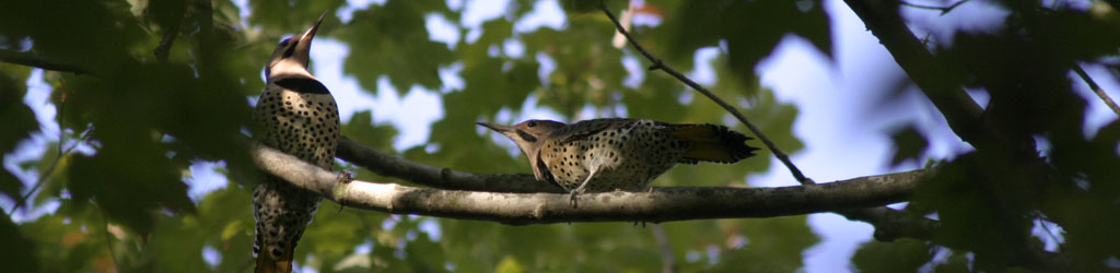
 This is exactly what it appears to be – a very affectionate nuzzling, including some gentle nibbling on one another. I was there with The Girlfriend and The Younger Sprog, and you can imagine the reactions at this point, as well as the frantic instructions to, “Look! Look!” and, “Get it! Get it!” They could hear the shutter snapping as well as I could, or at least they should have been able to, but it’s possible that normal sensory functions were somewhat overwhelmed at that point. They were, naturally, getting their own shots as all this was taking place.
 Among the many reasons why my photography, and thus my posting, has slowed down so much is the temperature, which like most of the rest of the country has dropped significantly. The triops tank on the porch, which was no longer showing any activity anyway, had formed several thin sheets of exploratory ice crystals extending down into the depths – cool enough (a ha ha) when viewed within the water, but much more distinct when removed. Yet the real reason I’m commenting is that, unless you’re a rare individual, you will have no problem seeing a face in this image, at the very least now that I’ve mentioned it.

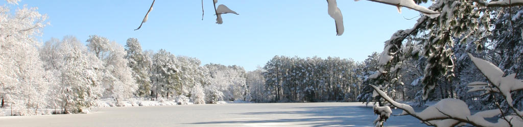
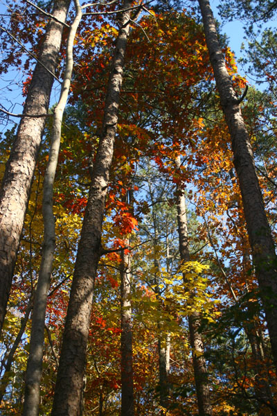 This autumn has proven to be one that I’ve rarely had the chance to take advantage of: a fairly good display of colors, peaking during clear weather, with no storms or even high winds to strip the leaves from the trees. So while this area has few vantages that provide the best display of colors – generally something that overlooks rolling hills with a wide variety of deciduous trees – I have to say I bagged a decent selection of images, from several different locales.
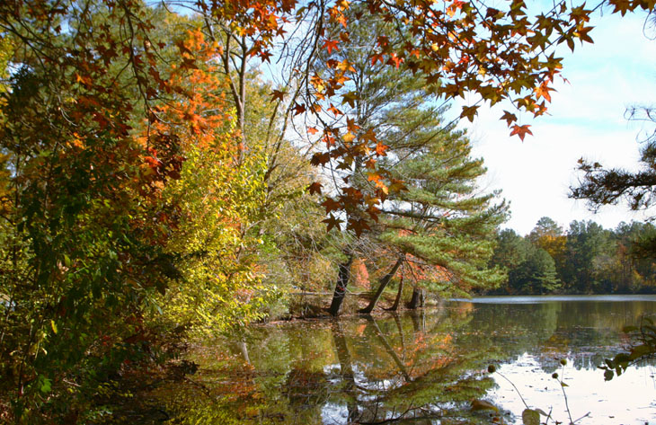
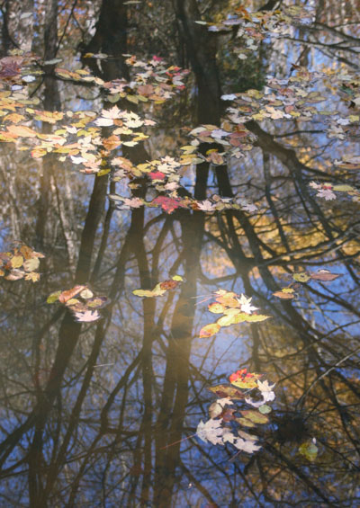 I am probably a little too hooked on using reflections and floating leaves, but hey, I like ’em. The idea of ‘peak’ colors is a little misleading; there is often a point where you can see the maximum amount of colors, but usually a number of species have hit their most colorful much earlier, while most others are still green, and these early bloomers greet ‘peak’ with empty branches. Sometimes this can be worked into the composition, sometimes it’s a patch of distracting, somewhat anachronistic bare trunks. For this one, I decided to use those branches as a backdrop for the leaves passing by, and the blue sky and yellow leaves set off one another nicely.
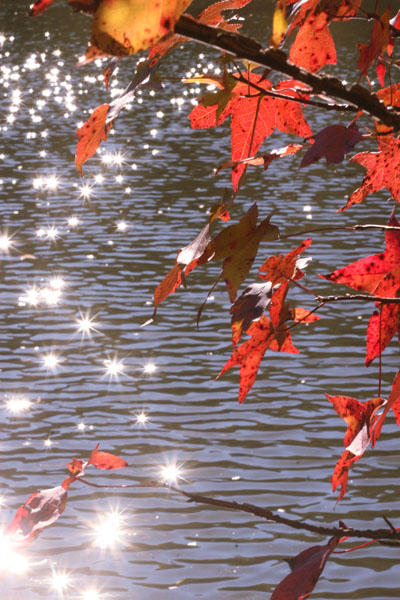 So while I’m on the subject of reflections, we’ll look at another variation. The reflection of sunlight near the horizon off of rippling water or wet sand is called a glittertrail, and naturally is a useful element in itself. A very small aperture (in this case f22) turns these little spots of intense light into starbursts. I liked the color intensity of the backlit leaves, but didn’t know what else to do with them until I shifted too far to the side and started blinding myself with the glittertrail – aha! I really wanted a stronger, more prominent leaf for this composition, but the wind was pretty stiff this day and whipping the leaves madly (which also contributed to the well-spaced sparkles off the water,) so this is what I got. If it motivates you to try a variation, fantastic – remember me when the royalties come rolling in.
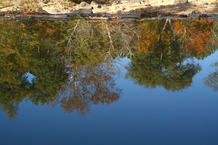
 That’s so much better, right? Uh, no? This is actually looking down from a small hill at the reflection of the trees and sky in the inordinately still water above a spillway, the lip of which forms the edge between the trees and the bright rocks, which are on the riverbed well beyond the reflection and the spillway itself. Here’s a variation that makes it a little more obvious, though I imagine it might still seem a bit mind-bending until the perspective falls into place.
 So while out shooting during yesterday’s session, a large leaf dropped and perched atop my camera, and the indefatigable Al Bugg (yes, same first name, and yes, we’re often not sure which one of us we’re addressing in conversation) captured the portrait. That’s the ‘heavy kit’ I’m wearing, everything on belt packs with supportive suspenders – ready for just about anything. Go ahead and laugh.
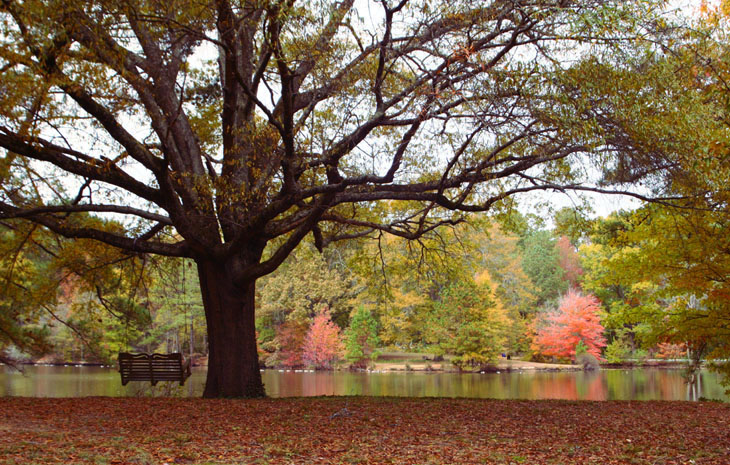

 So, okay. I went out yesterday to check out the nature trails behind
 The sky was perfectly clear after the previous day’s rain storms, and the low angle of the wintering sun produced not only very high contrast conditions, but a significant amount of glare when facing anywhere remotely eastward, so some compositions, that might have been quite compelling in other conditions, were simply out of the question. There are ways, however, of using such light angles. Magnolia trees tend to lose their leaves early, and the bigleaf magnolia (Magnolia macrophylla) wasn’t far from dropping these like so many of the others already littering the ground beneath, so within a few days this opportunity would have been gone. Some trees are already bare and many in the process of changing colors, while quite a few, as seen in the steps shot, are still quite green.
 Background is an important factor, and one that is amazingly easy to change at this time of year. A very small adjustment of shooting position – left or right, higher or lower – can drastically affect just what is going to appear in the background, and the ability to enhance your subject can make the difference between a basic shot and an interesting one. Is there a color or shape that will work with the subject better? Is there something clashing that needs to be eliminated? Thinking in terms of the entire frame, and being aware of what’s beyond the subject, can help a lot. While this one was relatively simple to achieve, I’ve gone flat on the ground or stood on fences and rocks to change the appearance of the background (and affect the light angle as well) – minor efforts to create major differences. And yes, this has often meant getting dirty, damp, or worse, and sometimes I bring along kneepads and a ground cloth (a small section of waterproof tarp) when I expect to be doing a lot of it, but I’m also not too concerned with how I look to others, or how uncomfortable I might be afterwards, if I get a shot that I like.
 I decided, since i was in the immediate vicinity, to hit the garden proper once more. North Carolina is one of the few states where predatory plants are native, so the botanical garden, dedicated to native species, features a variety of Venus flytraps, sundews, and pitcher plants. The pitcher plants always host some resident wasps, and I’m in the process of determining what these are and how they live. The reason being, I’ve seen more than a few pitcher plants that are plugged with grass or leaves, and some that feature a hole chewed into the trumpet well down the body. Pitcher plants have slippery insides, an attractive smell, and a pool of sticky nectar at the bottom that attracts the insects that will nourish the plant with their death, but it appears some arthropod has circumvented this trait for their own purposes, probably in protecting the larvae. Right now I’m just not sure if it’s actually the wasp species seen here, or of the wasp preys on the species that attacks the pitcher plant. So I’ll just leave this image here while I work on the details.
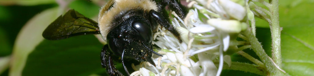
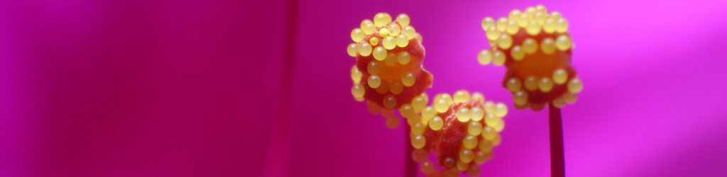
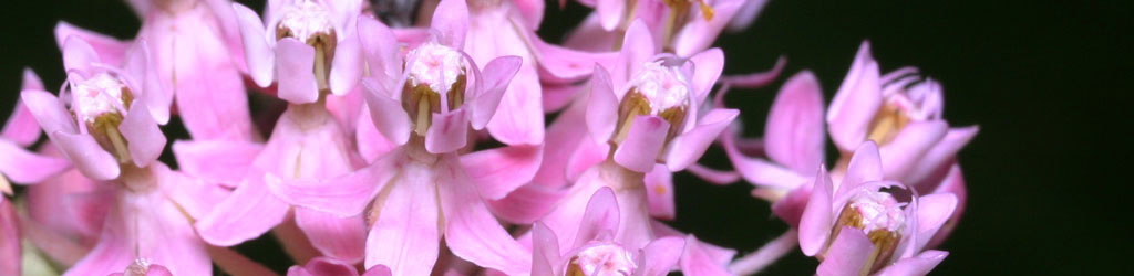
 I also got another image of the same flowering plant that appeared in that earlier post, though not the same blossoms of course. This time I was thoughtful enough to look for the identifying plaque, but there was none, so I still cannot tell you what species this actually is. But the light was at a more useful angle this time, so the interiors were better illuminated, meaning that one of the bumblebees had to burrow in quite deeply to stay in the shadows – that dark spot in the lower blossom is a bee, while the other scampered around on the outside of the petals, knowing there was nectar to be had but not terribly sure how to reach it. C’mon, their brains are the size of a booger, they have to screw up from time to time…
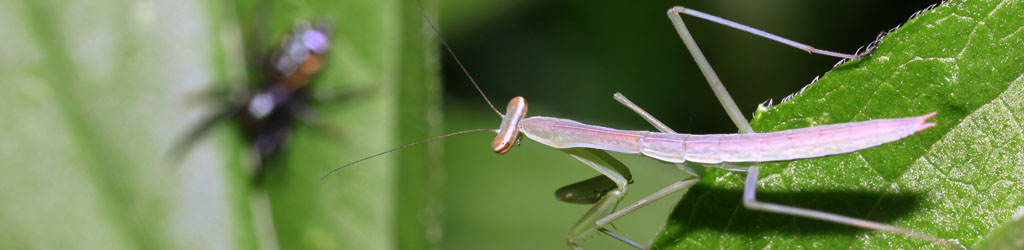
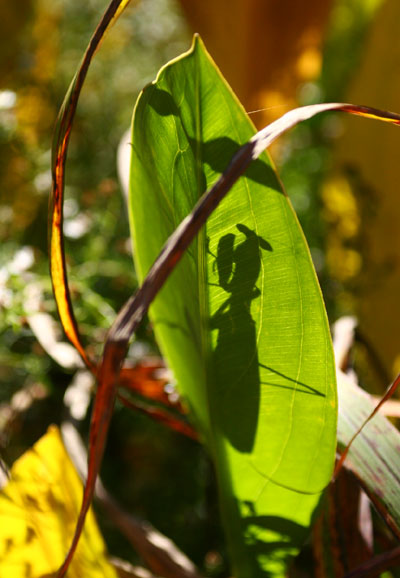 So when I spotted the shadow on the large leaf in passing, you know I was chuffed. Not an hour earlier I had been thinking that the mantids had been scarce in the garden that year, and I lost my opportunities for those shots at home back in July; it was very cooperative of this one to pose so distinctly in the center of the leaf, probably still warming herself after the crisp night. While my framing here makes it quite prominent, this was actually found in a crowded, complicated stand of various plants and was not obvious; I almost missed it entirely in passing. Interestingly, the light angle is not as it seems, as is indicated by by looking at the top right of the leaf, above the crossing brown frond; that thread sticking out up there is her antenna, the same one throwing the fine shadow across the leaf.
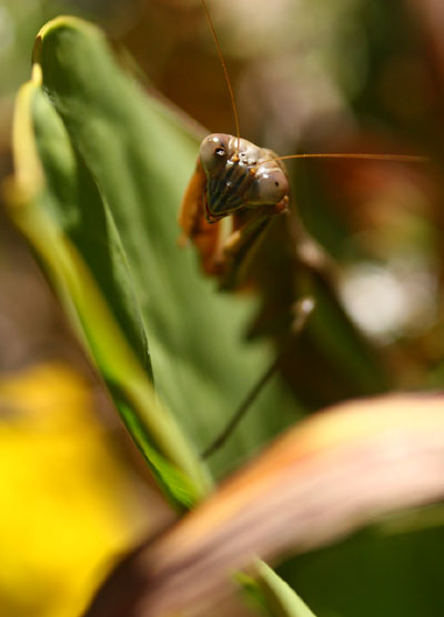 No, I did not get multiple frames of the mantis shadow and neglect getting the mantis herself (I just had some space to fill up alongside.) This is, most likely, a Chinese mantis (Tenodera aridifolia sinensis,) the most common species around here, and the largest – this one is not quite as long as my hand, and I’m guessing female from the size and girth. Yes, she’s got some kind of injury to her right eye cluster, and in a less-than-ideal location too, since it quite possibly affects her depth-perception right up front where it’s most useful in nabbing prey. Yet she’s more than big enough, so either it’s recent or it didn’t have too detrimental an affect on her. Unless I miss my guess she’ll be producing an egg sac soon, which will overwinter and hatch out the young somewhere around