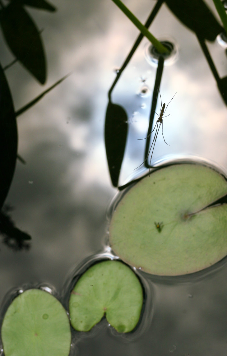
For September, we have a little composition I threw together out of odds and ends that were lying around. A long-jawed orb weaver spider, common near water sources, sits suspended in its web above a small ornamental pond, framed against the reflection of a cloud-shrouded sun – but I’m belaboring the obvious, aren’t I? Yet you have to appreciate a spider with such a wide disparity in the lengths of its own legs.
That, however, is less than September deserves, so we’ll add another; admittedly, we’re going back to July for this one, but I won’t tell if you don’t.
As much as this might appear to be from playing around with cheesy photo editing filters, it’s actually straight from the camera, albeit a tight crop from a particular frame. It was one of a sequence of images taken during the Outer Banks trip, another being the second image here when the breeze had turned the blossom more. Given the dark water background, the camera had set an exposure that badly over-exposed the white blossom in direct sunlight, but curiously, the faintest edges of the details can still be made out. Coupled with the bleached buds and the defocused background, it becomes very impressionistic.
This is, I think, the entire image, showing how the dark water dominated the frame and dictated the exposure – since cameras are always set to render a mid-tone from the light reaching the exposure meter, anything dark will be brightened up, and the small white flower, too small to affect the rest of the frame, got bleached out. This is why a good photographer pays attention to the overall brightness of the frame and compensates accordingly (which is why the image on that other post looks so much better.) But for our purposes here, it’s a neat effect.
And I said I think it’s the entire frame, above, because I don’t remember for sure, and discarded the master image after resizing and cropping it for this post. This was really the only use it could be put to, and not too compelling at that. But while you have been occupied with this post, my associates have been ransacking your house.
So, while sorting photos, I had the opportunity to look again at an image I’ve featured here a short while back, and noticed some small details within the frame. Going in for a closer look didn’t clarify things too much, but I’ll give you a zoomed example to let you try for yourself.
This is, again, a trunk of driftwood on the beach at Jekyll Island, with a crab feasting on a fish head off the edge of the frame. What I’m referring to are those little bits of candy corn that feature prominently in this crop, the tan and brown shiny things adhering mostly to the top surface of the crack in the driftwood. I really don’t know what these are.
For reference, they’re probably about 3-6mm in size. I didn’t get a better look at them because I’d found the crab through idle curiosity with a flashlight, and did not take note of the other features within the crevice. It seems clear that the wood would become fully submerged at high tide, which gives me a clue as to what they might be, but right now it’s just a guess.
If you look at the photo on this post, you’ll see a lot of vaguely similar somethings, only green, little globules of jelly-like substance. Those are all little anemones, often called ‘triffids’ I’m told, and this is what they look like in their retracted, protective state. Allowed to sit submerged and undisturbed for a short period of time, they ‘blossom’ into something like this, or for another view, like this.
If memory serves, I was well up from the low-tide waterline, but again, the presence of the crab and fish head told me that the trunk would submerge at high tide, and possibly retain more than a little water after the tide shifted below it again. But it also seemed evident that the trunk would sit for hours of each day out in the open air, and while the crab could choose to abandon the crevice, any anemones could not, So, can they survive that long without water? Or am I completely mistaken?
Since I’m two states away from this area now, somebody needs to drop down there and take a look for me, preferably as the tide is coming in so they can locate the log first, they see what happens as it becomes flooded. It’s right where the driftwood becomes thickest up on the north beach, about a kilometer east of the fishing pier. Let me know what you find.
I decided to make this one the topic of my next podcast during an outing with a student, and so the images that accompany it have come from the same outing, in many cases illustrating something that I talk about in the audio. It’s not possible to spoil anything on this one, so feel free to browse ahead while my mellifluous voice (or something) purrs on in the background.
Walkabout podcast – The mindset of a nature photographer
Meanwhile, there is a reason why I opened with the image above, and if you’re having difficulty determining what it is, the audio might help.
The outing was once again to the NC Botanical Gardens which, being routinely tended, was in better shape that numerous other locations after this long heat wave – my own yard looks terrible. And we had a good measure of success because of this, almost frighteningly so. There are a few staple subjects that I often watch for during my visits, and a few others that are seasonal, so we had a short list of goals. But it’s important to have the right idea of ‘goals’ in nature photography, because too much of it depends on luck and conditions – it’s okay to feel like you accomplished something if you meet the goals, but it’s probably a bad idea to feel like you’ve failed if you don’t – it’s not like the subjects are definitely there and it only takes skill to spot them. Sometimes, there just isn’t enough to photograph.
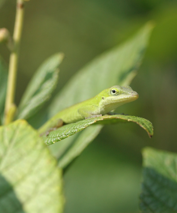
We got an early start with a juvenile green anole (Anolis carolinensis,) that cooperatively paused on a plant just below eye-level that provided a couple of different angles to shoot from.
This particular image was the product of wanting to snag a specific trait, a catchlight – it’s that little reflection of sunlight from the eye, and it helps a lot to provide ‘life’ and vibrancy to any animal species caught by the camera. Most animals don’t like having the sun in their eyes, though, so the opportunities for this are often exceedingly brief, and my reptile subject here was no exception – I have a lot of images lacking it, and it took a bit of patience waiting with the camera held in place up to my eye until the lizard happened to glance in the right direction.
By the way, the anoles are one of my staples for the botanical garden, since it is a great habitat for them and the only dependable one in the immediate area – I have yet to see any in the yard, and only occasionally spot one at the nearby pond. Since this happened within the first fifteen minutes of the excursion, I considered this a good start, and it went from there.
A little later on, another visitor mentioned seeing a snake curled in the low branches of a tree not far away, and we headed off in that direction to see if we could spot it. It eluded us (possibly by holding still, but that’s still elusion, right?) so I used the opportunity to talk about what to expect. There are only a few snake species that can commonly be found in trees in this area, including black rat snakes and rough green snakes, the latter being extremely well-suited to such habitats. It had been a while since either of us had seen a rough green snake, but as I pointed out, the thick and varied bushes and weeds in the immediate area were ideal habitats for them.
It hadn’t been three minutes since I’d uttered this when one demonstrated both the habitat and the camouflage – if you’ve haven’t seen it in the opening image, feel free to check again now that you know what you’re looking for, but here it is in a more direct composition.
Yes, of course I waited for it to extend its tongue – listen to the bit about patience. This is a rough green snake (Opheodrys aestivus,) and they’re smaller in diameter than your little finger – also harmless, since I routinely have to point this out. This one was very clearly prowling for food, a behavior that can be recognized with experience, and it was more intent on that than on worrying about us being too close. We stayed around for a while to see what would happen because, even though we both got plenty of good portrait and habitat shots, there are always more images that can be achieved; in this case, we witnessed it striking at (and missing) a katydid that it had stalked. Had it captured this meal, we would have been ready for a whole storytelling sequence of images.
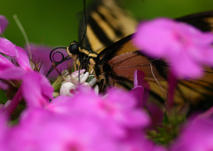
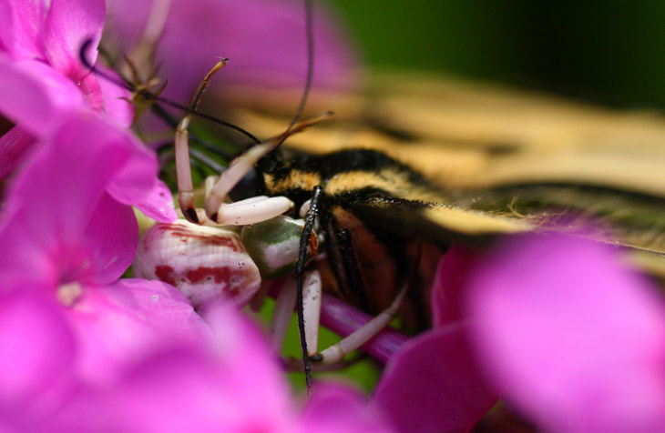
As we entered another part of the garden, I mentioned a couple of my goals for the area, knowing the conditions were right. One of those was a crab spider, which tend to lie in wait within flower blossoms and strike at the pollinators that come calling. It’s one of the many reasons why I’ve been trying to cultivate a good selection of flowers at home, with wretched luck, but the botanical garden is close enough. And so, just a few minutes after announcing these potential targets, I saw a swallowtail butterfly perched atop a flower cluster – only it wasn’t behaving in a typical manner. Leaning close, my suspicions were confirmed, though the position of the flower (and the garden proscriptions against stepping off the paths) made my shooting angles quite limited. Nonetheless, I got what I was after.
Even as direct as I could make this shot, you have to look closely to realize that the eastern tiger swallowtail butterfly (Papilio glaucus) is being held by a crab spider, most likely a white-banded crab spider (Misumenoides formosipes.) Here’s another view, actually taken an hour earlier (we did an extended circuit of the gardens,) that shows the spider a little better – I opened with the latter one because it shows the butterfly more dramatically.
Swallowtails, or indeed most butterflies, don’t hold still on flowers, and don’t sit with their wings extended out flat, so the behavior was the immediate clue to begin looking for something else. And even with this, it took a specific angle to see the spider that I was 99% certain was there.
Pleased with this, I started to mention another species that I had intentions of capturing as I stepped away. The word weren’t even out of my mouth as I spied the next one, not three meters from the crab spider and swallowtail:
This is a green lynx spider (Peucetia viridans) perched atop a newly-created egg sac – this can be determined by the sac’s pale green color, which will fade to brown within a few days. The knowledge of this color change, instead of being determined through observation, was obtained from Jim Kramer after his observations – networking is also a great way to learn traits and behavior.
By the way, more views of green lynx spiders can be seen here, such as what they look like before creating an egg sac, and the aftermath can be found here.
The luck we were having over finding subjects was noticeable, but deserves a bit of perspective. First off, I had the goals mostly because I already knew such species could be found in these areas and conditions, so actually finding them isn’t surprising in any way, even when it’s quite possible not to see anything. More, it was the spoken announcements followed closely by finding the very subjects discussed that seemed remarkable, and that’s just coincidental timing. I’m not superstitious, but I went ahead and played the game anyway, asking my student what subject we should request next; his wise choice was one of the mimic moths such as the clearwing moth seen here (and I’m pretty sure that’s the same species of flower, and definitely the same locale, as the crab spider lair above.) Since I’d just seen one on the last visit not two weeks previously, I felt our chances were good and boldly proclaimed our intentions of finding one. Alas, the luck did not hold and I could claim no special powers of prognostication or arthropod telekinesis; I did eventually spot one in passing, but so briefly that no photographs were possible. That’s what you get for being cocky.
[Did you like that? After drawing an unwarranted conclusion that something more than coincidence was at work, this was dismissed by implying that something directed or intended was still at work, only this time to thwart the magic – while being no less magic. We really are a weird species capable of deriving a supposed pattern from just about any circumstances.]
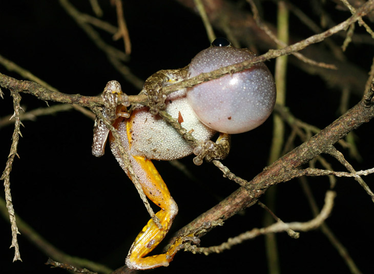
Which is not to say that we ran out of subjects to photograph – the swallowtail shots from the previous post were also from the same outing, and we got dozens more between us. So I’ll close with yet another, a slightly-targeted find. This little grey treefrog (Hyla chrysoscelis or Hyla versicolor, not sure which since the only way to distinguish is by their call,) was found in the same location that I had seen one during my previous trip – except it’s clearly not the same one, and the habitat is only vaguely conducive to their presence, meaning I can be in such areas time and time again and not see any such frogs. So I consider finding it more a matter of serendipity, even though I was looking closely for just this kind of subject.
Anyway, I hope the advice is useful, but just bear in mind that it may take time to develop the attitudes and behaviors to the point where you use them consistently, without even thinking about it. Good luck!
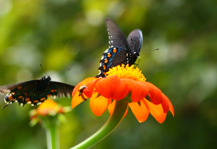
People have the impression that, because they’re pretty and flippy-floppy and all that jazz, butterflies are innocent and carefree creatures, but it takes close observation to see their darker side (as it were.) Judging from the speed and angle of approach, the one on the left was no doubt up to something nefarious when I captured this image, and it was only my presence that thwarted its evil plans. Had there been no observers, who knows what could have transpired?
Seriously, who can tell what happens when no one’s looking? It’s one of those philosophical conundrums. But like so many popular topics, with a complete lack of information it’s okay to speculate wildly and then derive satisfaction from it, so let’s go ahead with the idea that butterflies are obnoxious little shits in reality, and all that dainty stuff that we see is just an act for our benefit. Can you prove that’s not the case? All right, then…
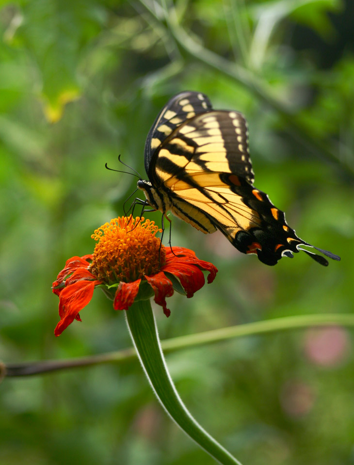
Identifying these individuals from the photo alone could be a little tricky, because there are several species that have almost the same markings. However, the eastern tiger swallowtail (Papilio glaucus) is well-known not only to frequent the area, but to have a dark phase that looks like this. The males however (and some of the females, apparently rival gangmembers,) have a markedly different, yellow color scheme, and these were easy to observe in the immediate area as well, so we’ll consider these all the same species. They were all having a grand ol’ time at my expense in the botanical garden, since I had picked a few good blossoms and shooting angles and waited patiently for any to arrive, but none chose to visit my selected flowers (or indeed any) while I waited. I had not moved very far off after giving up, however, when they appeared and posed, you know, daintily (yeah right) on the flowers, probably waving their antennae in a derisive manner that they hoped I wouldn’t be able to interpret. This happened more than once, so I’m quite certain it was no accident. I told you: little shits…
I was going to let this go at that, but my inquisitive/speculative nature got the best of me, plus I like fostering this in others. So we’ll take a brief look at the subject of the species’ namesake itself, that swallow tail (the two little ‘paddles’ extending from the hindwings,) and wonder what purpose this actually serves. There was a recent study that demonstrated how nearly-identical features on luna moths served to confound the sonar capabilities of bats, which would certainly be good evolutionary survival trait. Except that, swallowtail butterflies are strictly diurnal, while bats are strictly nocturnal, so it seems an unlikely explanation for the feature in swallowtails even though it would work fine for the nocturnal luna moths. But they still may be distantly related. First off, the thing that sparked the appearance of an additional appendage, however small, in that location on the hindwing is almost certainly a genetic mutation from some point in the distant past – it might be prone to appearing in just that location, or it might be the kind of thing that appears at any point along the wings. However, it can’t be something that negatively affects the flight characteristics of the species – either the swallowtails or the luna moths – because that would be selected out, so at the very least we have to assume that it falls in some aerodynamic ‘sweet spot’ that doesn’t induce undesirable drag; while it’s possible that it helps the flight, it seems likely then that a lot of other species would develop the same trait.
Neutral traits can develop, courtesy of a mutation that neither helps nor hinders the species, and thus provides nothing for natural selection to act upon in either direction. These have a tendency to be rare and with little impact, however, because every addition to the development of any individual takes additional energy and resources too, so even the tiny advantage of the ones that did not have it would, over time, cause them to dominate. Which brings us to the other kinds of advantages that these might serve, which are sexual selection and warning displays. The colors of this species serve in both ways, the brighter colors attracting potential mates in a manner that says, “Look how healthy I am!” (which is the same way we distinguish healthy fruits ourselves,) while the sharply contrasting colors serve to be memorable to the predators that tried to eat them and found that they tasted like poop, which is a known defense of most swallowtails and numerous other contrasty species (a few, however, have the coloration to mimic the species that taste like poop, the lazy cheaters.)
Except that, the tails are invariably black, so not showing off either bright colors or warning displays, and about the best that could be said is they’re a kind of ‘conspicuous consumption’ trait similar to peacock tails, demonstrating that the individual is so badass that it can take extra development resources and perhaps even a hit to its flying ability because it isn’t negatively affected by them – kinda like the way drug gangs sport ‘Hello Kitty’ tattoos (they do that, right?) It remains possible that the motion of the tail from an approaching male is highly visible to a female in mating mode, who can judge his, um, ‘worth’ without inquiries over shoe size. If you know what I’m saying.
All of this is mere speculation, since no one’s done a definitive study on those tails yet so, you know, put whatever faith in the suggestions that your desires call for. But keep a watchful eye on the little bastards anyway…
No, this is unlikely to be a regular thing – there’s no way I want to commit to that – but it’s a sample of the conditions today and I have a few minutes, so…
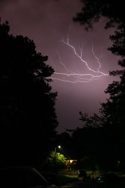
After about two months, seriously, with no rain except for what the hurricane drove inland, the trend broke last night – and naturally, I had to be out in it getting completely soaked; thankfully, this was not with camera equipment. This morning the rain returned, which is fine since we badly need the water, and this time it brought a nice little electrical storm. I have no lightning images this time around, mostly because it was daylight so the shutter cannot be locked open waiting for a strike to occur (well, it can, but the result will be a solid white picture,) but also because the storm was centered almost directly overhead, not only making it dangerous to be out someplace, it was pouring and this obscures everything except the very closest strikes. So the image seen here is from back in July, and was a casual effort during another close storm that did not bring any rain – again, it wasn’t prudent to do a proper session, so this was captured by bracing the camera against the front porch railing and simply holding the shutter open. Not too bad for that, really – could easily have been worse, especially with the opportunity for camera shake. I include it solely for visual accompaniment.
But this morning, as the thunder became strident, I stepped out onto the front porch (the same location as this image) with the little audio recorder in hand, and captured a sample of ambient noise right in the neighborhood, including the crows flying through. It’s a nice little ambient sound file that captures the lingering thunder echoes pretty well, I have to admit.
Ambient thunderstorm
I didn’t even fade in the ends, so you can play this on a continuous loop for background noise or whatever. Or you can if you know how to download the audio, which isn’t hard. If you want it and cannot figure out how to do it, let me know and I’ll give you a pointer to the file location where you can download it directly.
Now, I have to admit this is a slightly edited file, trimmed a little for length, but more importantly for timing. You see, almost as soon as I’d activated the recorder (which takes a few seconds to initialize,) there was a very close strike, and right at the beginning of the recording came the thunder, which was impressive. I include it here just for the experience, but do not have your volume up too high – this maxes out the levels. I’m pleased that I captured it, but it would have been nicer had it come a little further into the recording, you know?
A very close strike
Notice how the echoes linger and roll around – always the best part of a thunderstorm. Well, okay, second best after the impressive visual displays.
And if you want an image to couple with this one, go here – it was a comparable experience.
Sometimes, what it takes is a nice little illustration to put something in perspective, and Randall Munroe of xkcd is our man for this example. There is a ridiculous amount of propaganda around regarding climate change, with countless claims and excuses and pretty much just pitiful whining that it isn’t happening, or humans aren’t the cause of it, or the spikes are expected and part of a normal cycle, and on and on and on. In my experience, nobody ever sticks to just one argument, but jumps to the newest popular denial every time their previous one is shown to be horseshit – despite the fact that, in a lot of cases, the new argument is contradictory to their old one. Once they start saying that humans aren’t the cause, for instance, then they’re tacitly admitting that it is happening. In an ideal world, this would mean admitting that they were wrong, even just to themselves, and perhaps a careful examination of the evidence (or just the wish for evidence) that led them astray. However, like Jenny McCarthy and her stance on vaccines and autism, very often the details change routinely while the conclusion never wavers, which only tells us that there is a vested, emotional interest in the conclusion underneath everything, and whatever can be found to bolster it is seized upon as long as it still sounds good; once the majority of people begin to find it batshit, then it’s time for a new rationale. Which, in this as well as too many other cases, doesn’t bear any relation to rational.
Randall, however, did a simple little illustration of the infamous ‘hockey stick,’ the diagram of the sudden change in global average temperatures. And by the way, I need to emphasize that: Global. Average. Temperatures. A few cold days in our local winter, especially compared against last year or whatever, does not make or break a trend, and has infinitesimal bearing on the global climate overall. Funny, though, I kept listening all throughout the summer, but those arguments that we weren’t experiencing hotter temperatures somehow weren’t to be found. It’s amazing how little it takes to shut an idiot up…
Credit: Randall Munroe of xkcd, Creative Commons License 2.5 Anyway, take a look at that chart, which is quite long just to illustrate the nature of periodic cycles, and ice ages, and all that. Sure, plenty of people will deny that it’s based on solid scientific studies and all that shit, because they have to – feel free to ask them which studies they’re dismissing, and over what details; none of them actually know. They don’t ever look at any studies whatsoever – their sources are virtually always some pundit, and they just repeat the same words without comprehension like a parrot. And with the same tendency to drop their shit all over the place.
And so we come to part two of the Georgia trip, waking up early on Jekyll Island. I’ve been planning this one since the last trip, three years ago. So sit back and get comfy while I take you directly out there.
Walkabout podcast – Out at sunrise
This Google Earth placemark will take you right to the shooting locale of my images here (provided you have Google Earth installed on your system.) While this one will take you all the way down to Negritos, Ecuador, and a lighthouse at the westernmost point of South America which is, nevertheless, still east of Jekyll Island.
I’ve mentioned this before but will say it again: for sunrise and sunset shots, bracketing the exposure heavily is highly recommended, and by this I mean, taking several frames both over and under exposed from what the camera’s exposure meter is reading;this page may help you to understand it better. The sky colors may appear significantly different depending on the exposure, and you will likely find that the best results come from a setting other than what the exposure meter would produce by itself. And, as I stress in the podcast, your white balance should be set only to Daylight.
Most of the trunks on this beach sit just within the high tide line, so being there after the tide receded, and before anyone had any chance to introduce their own footprints, meant the beach was smooth and clean, much more pleasing to the eye for compositions like this. And this means that it’s fairly important to plan out your images before you put your own footprints into the shot (this is, unsurprisingly, much more important with things like snow.) This day, the sand was still slightly damp, not having been dried by the sun yet, and going barefoot meant that I was even less likely to leave behind noticeable footprints; what I did leave, when they were noticeable at all, looked a lot more appropriate to such scenes than the sandal prints. Just a little forethought.
Locations and conditions like this provide a lot of options for compositions, and it’s easy to frame dozens of different approaches in the space of a few minutes. Be warned, though, that the colors change faster than you might imagine, so you may still have to be on your toes when the sky produces something really dramatic. If you’ve waited until you see the conditions in the opening photo before finding a good foreground, for instance, you’re probably going to miss the shot. Be ready ahead of time, have all the camera settings where you want them (including contrast and saturation,) and know how to change them quickly if you decide that the shots will benefit from higher saturation or a lower ISO. And a tripod isn’t a bad idea.
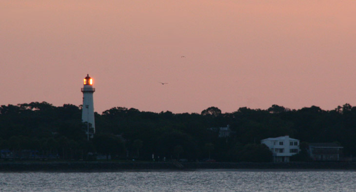
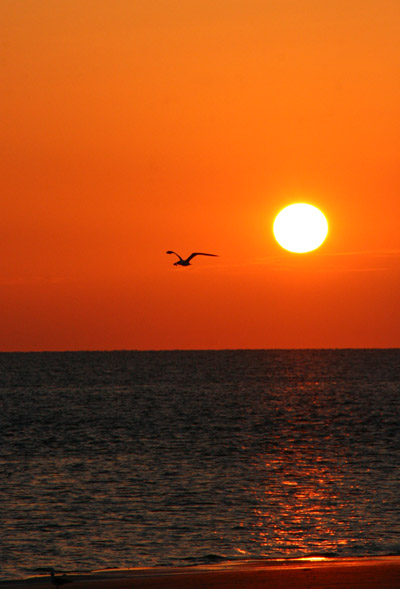
As I looked out across the sound, the light at St Simon’s lighthouse had been extinguished, but the glass panels surrounding it were still positioned right to produce sharp reflections from the low sun.
I would have liked the birds in the shot to be a little more prominent, but ya take whatcha get, and the background sky was a nicely moody hue. I was a little too west of the lighthouse to catch any of the sunlight colors on the tower itself but, you know, there’s always next time.
I mention how good this time of day is for portraiture, and I present to you an example, a self-portrait taken without the use of a smutphone or selfie-stick, just a timer. I was the only one around, so that’s who I had to work with, but even that wasn’t quite enough to ruin the shot. Note the color cast visible on everything that the sun was shining upon. And yes, I detoured well to the side to keep footprints out of the foreground, approaching from behind my sitting position. Forethought.
I did manage to get a little more cooperation from the birds as the morning progressed, but not as many frames as I would have liked. When a bird is flapping, only certain wing positions (like this one) look good in the air, but timing the shot to catch the wings right there is next to impossible. Or at the very least, beyond my present abilities. So while I was firing off a lot of frames in the hopes of capturing more than a few with a photogenic angle, a lot fewer of them actually showed this than I thought they might. Most especially, don’t just hold the shutter down and let the frame-per-second rate of the camera do the work, since it’s entirely possible that it runs at the same rate as the flapping (or any other repetitive action) and you just get a sequence of the exact same pose. Be sure to pause, and if you have something flapping slower, try to time the shot precisely.
By the way, subjects like this often benefit from shooting a little wider, a shorter focal length than ‘good composition’ might dictate. The reason for this is, as the bird tracks sideways, the elements in the frame are changing, and being able to nail the bird with some leading space ahead of it, and the sun and the water and the glitter trail, even the beachline, all precisely where you want them in the frame in the fraction of a second is, to say the least, demanding. So shoot a little wider, leaving more space around everything, then crop it down to your desired effect.
This image was taken only three minutes after the previous, so the conditions were not significantly lighter, but the framing was slightly different, producing a different exposure and rendition of the colors. The unfortunate part of this was the high contrast nature of the water texture, disguising the egret’s beak and almost completely hiding the one tern in the air in front of the egret (did you see it?) Naturally, I wasn’t aware of how this would look until I had unloaded the memory card at home, and by then I was a couple of days and five hundred kilometers too late to do anything about it. Notice, though, the illustration of a trait I’d mentioned in the previous podcast, the lack of any waves or breakers. This might have been the timing of the tides – you can see some faint waves from the visit three years ago – but for the most part the surf off of Jekyll appears to be pretty calm. Good for some things, but not as dramatic for photos.
I’m going a bit out of order with this one, since it was shot earlier than all but the predawn image that opened the post. Shining my flashlight on a whim into a crevice within a large trunk, I found this crab feasting merrily on a fish head that had been brought in and left by the tides. Fishing boats drop a lot of chum into the water as bait just off the coast here, and lots of species take advantage of it. I’m not sure, but I suspect this is a purple marsh crab (Sesarma reticulatum.) The direct flash angle didn’t help at all, letting the complicated details all blend together too much, but there was no other way I was going to light the scene within the crevice.
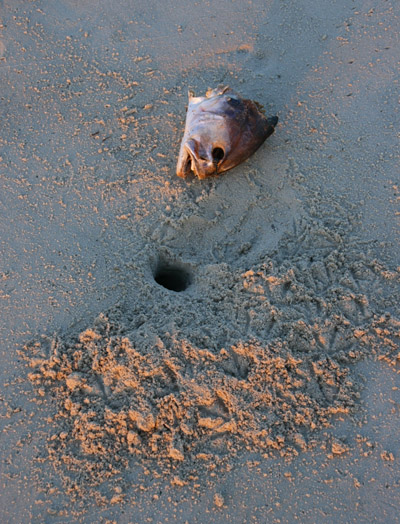
This is a little bit different story. I’d initially shot this with a flash too, before the sun was up, but returned to it afterwards to take advantage of natural light, which did a vastly better job of rendering the scene. I have little doubt that the large crab who made that burrow did not just happen to find a fish head on its doorstep, but chose to make a new burrow where a lasting meal would be handy. At least until the seabirds made off with it – you can see the footprints of the first marauder in the fresh sand. Again, note the low light angle and the color cast, something that also worked well for the month-end abstract for August. If you want texture details, sidelighting is the key, and a low sun is excellent for providing that. But if you can’t use the sun, then an off-camera flash unit can do the trick too, and will usually provide a lot more angle options.
This is another view of the same crab seen earlier as a teaser, with a different scale aspect – those are sand grains sitting atop the carapace. I should have fired off the flash to fill in for those shadow areas left by the sunlight, but I honestly didn’t think to – I suspect I thought that the reflection from the sand would have been sufficient. Either way, I failed, and it could have been better, but for a quick shot snagged before the crab could scamper off, I’m not going to complain too much. Without the ability to corral it within a certain area, I had only a slim opportunity to even get this close before I would lose the subject. Next time, I’ll bring a shallow tray to set up a natural-looking surface and do some nice detail shots of the crabs I can capture.
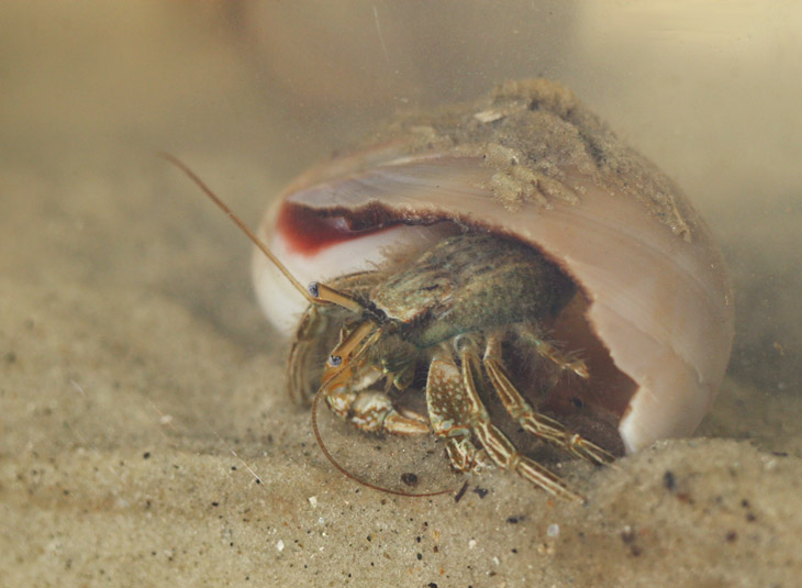
I’m going to tentatively identify this one as a thinstripe hermit crab (Clibanarius vittatus,) since it looks a lot like the ones I used to find in Florida, even though one source doesn’t peg them as appearing by the barrier islands of Georgia – feel free to correct me, anyone with good info. This is one of the ones that inadvertently rode back to the motel room in my pocket, and so got to be photographed in the macro aquarium later that morning.
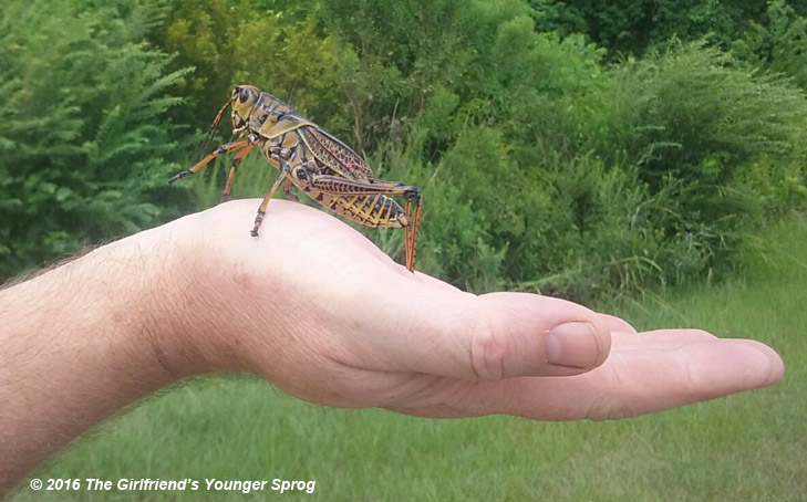
As the day wore on, we’d traveled back to the Savannah area and visited the Savannah National Wildlife Refuge (I keep calling it the Savannah River refuge, but that’s not the correct title,) the place where I’d gotten several pleasing alligator shots, one of which is visible in the rotating header images if you wait long enough or are lucky. This time around, there was almost nothing to be seen, but I did capture an eastern lubber grasshopper (Romalea microptera,) which The Girlfriend’s Younger Sprog shot on my hand with her phone – I, obviously, was unable to wield a camera to do my own photos.
Curiously, while perched initially on my hand without being restrained, it chose to start biting me, but why this might be I haven’t the faintest. I flinched reflexively, just from the size of the thing, but there really wasn’t the slightest danger from those mouthparts.
Later that evening, I went exploring around Our Hosts’ property again to see what could be found. The first was this green anole (Anolis carolinensis) snoozing on a tree branch, which was good because it took about 15 minutes before the camera lens was warm enough not to fog up in the rainforest conditions, after sitting in the air conditioning for too long.
I think the little guy at right is a bird-voiced treefrog (Hyla avivoca,) but the variety of photos and markings that I’ve seen for that species make this tentative at best – it’s the closest I can come to pinning down an ID, anyway. It wasn’t calling when I spotted it, so that avenue of confirmation wasn’t open to me.
However, what I was really after, besides my continuing quest for scorpions, was a cottonmouth, sometimes called a water moccasin, but the number of species that are called ‘moccasins’ is wide and varied, so we’ll go with the scientific name of Agkistrodon piscivorus, and you’re on your own regarding that pronunciation. I failed to see one, but I did see three other snakes of two different species, so I can’t consider the night a failure.
The specimen above had me suspect that I’d finally found one, until I carefully leaned in a little closer and could see the markings better; instead, this is a southern banded water snake (Nerodia fasciata,) and completely harmless, despite having the same habitat and behavior as a cottonmouth, save for the open-mouth threat display that the latter has at times (which is where it gets its name.) This is a small one, less than 40 cm long and perhaps slightly larger in diameter than my thumb, and while the headlamp confused it, it was starting to get suspicious after a minute or two and slowly slipped off into the undergrowth.
Not far away I found another, the second specimen of this species seen that evening – the first had slipped into the water before I brought the camera to bear, and the resulting photo of it was sufficient only for a positive ID and not for blog use. Below is a northern water snake (Nerodia sipedon,) seen a few times elsewhere on this blog.
This one was a massive specimen, about as thick as my wrist in the midsection, and had just emerged from the water and so was still glistening – snakes look so much more vibrant in color when wet. You can tell from the raised head that this one was also suspicious, though the bright headlamp kept it from knowing exactly how close I was to it. This species usually does not hesitate to bite when they feel threatened, but the provocation mostly requires actual contact or at least being within a handspan distance, and I was slightly more than that (probably about a meter, to be honest.) It was funny, because I was distinctly searching for a venomous snake, and each time I spotted one there was a quick thrill, dismissed when I found out I was facing a harmless species (granted, someone else’s definition of ‘harmless’ might be different from mine, but I’ve been bitten more times than I can count.) I also need to note that a handful of frog and snake pics would normally be considered a decent night’s work, but there are over 530 frames between the first image in this post and this one, so that’s a damn good haul for a day. How many of them are true keepers? Well, a lot less, but still…
And I close with a photo from Our Female Host, for reasons unknown shooting the same sunrise on the beach by the motel room (a few kilometers away from where I was) with her goddamn smutphone. Given that, it’s a pretty good shot anyway – it just could have been better…
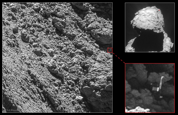
Image Credit: ESA, Rosetta, MPS, OSIRIS; UPD/LAM/IAA/SSO/INTA/UPM/DASP/IDA/Navcam Courtesy of Astronomy Picture of the Day, we have actual images of the Philae lander in its resting place on Comet C67/P Churyumov-Gerasimenko, and you definitely will want to not only click on that link, but on the image therein to see the full-resolution version. If you recall, about 22 months ago, the washing-machine-sized lander was launched from its ‘mother ship,’ the Rosetta probe, to land directly on the surface of the comet. Only the anchoring systems failed to activate, and the lander bounced multiple times before coming to rest in an awkward and unknown location. This is not surprising when you know the physics of it; mass and weight are two different things, the latter being governed by gravity (itself a factor of mass.) The small size of the comet nucleus means it has a ridiculously low gravity to attract anything to its surface, so despite its size, Philae effectively weighed the same as 1/4 of a sheet of paper here on Earth. I’m not kidding – I’m actually exaggerating slightly. With hard materials and no wind resistance, it was able to bounce quite high under the impact of its own touchdown – according to an article on Universe Today, perhaps higher than 3 kilometers. Had it touched down any faster, it might simply have escaped into open space. And as can be seen from the photos, the chances of finding a smooth and ‘level’ landing spot were incredibly slim. A lot of this has to do, again, with the negligible mass of Churyumov-Gerasimenko; it simply doesn’t have the gravity to smooth out its very substrate. And of course, no wind, no rain, no disturbances of any kind (save for pesky landers) to cause anything to settle further. Much of this material is simply accumulation of dust and ice from space, captured in casual passing contact with the weak gravity of the nucleus.
There was no ability to witness the touchdown, either by video onboard Philae or remotely from Rosetta, so no one was quite sure what happened, but a lot could be inferred from the data that started coming back. For one, the batteries aboard Philae died quickly, meaning they were not being recharged by the surrounding solar panels, giving some indication that Philae had dropped into a shadowy area – this was later confirmed by one of the cameras getting photos of a massive overhang. By triangulating the signals as the comet turned and Rosetta kept pace, the rough area of Philae’s location could be determined. Eventually, it was spotted in shadow, awkwardly tipped onto its side. As that article from Universe Today shows, it is pointed to our left, one of its three legs highly visible at top, another very faintly visible by the end of its foot at lower right.
Or so they say – I’m always suspicious of photos where I have to be told what I’m seeing, but you’re welcome to compare the diagrams of Philae’s construction with the photo. To me, it looks a lot more like a broad-headed robot, with its back to us, climbing the rocks. And not an experienced one, either, because it’s blindly putting one hand up on top of a rock surface that it cannot see, always a bad move for climbers, because it might mean plopping a hand directly atop a snake basking on the rock. Sure, maybe most comets don’t host snakes with a venom that could be dangerous to robots, but is that a chance worth taking?
I’ve had this one kicking around in the folder, oh, since a few days after this June post, so I figured it needed to appear to help keep things happening until I come back with a follow-up to the Jekyll trip post. This is another Copes grey treefrog (Hyla chrysoscelis) captured in mid call of course, showing off the lemon-yellow inner thighs. I think this was the last time we actually had rain.
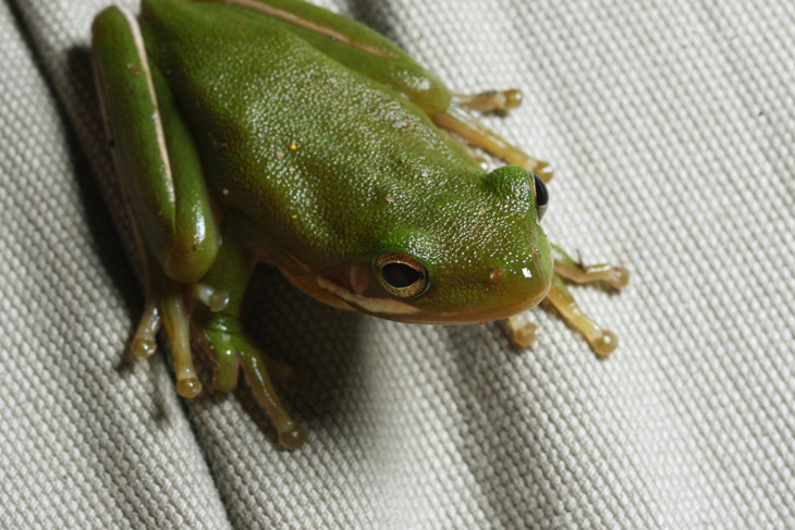
Okay, that’s not true – the tropical storm that drove in a week ago gave us two days of light rain, but it had been a while, and we’re back to sweltering hot days and crumbling plants. And as I type this I remember another set of images, captured back on Tuesday as I removed the cover from the grill.
Tucked up well underneath the cover was this green treefrog (Hyla cinerea,) who obviously couldn’t remain there because I was about to fire up the grill. I was surprised to see it, since we don’t see many green treefrogs in the immediate area. I suspected it was the one I had brought home from the garden shop a few weeks earlier, but a careful comparison of the irises between the two sets of pictures tells me they’re different individuals. I was about to capture it to move it towards the backyard pond, but it was already stirring because of my proximity and obviously sketchy behavior with the camera, and it leapt away as I tried to grab it. This led to a few moments of scrambling around to try and move it to a safe location, and during that time it paused briefly on the leg of my shorts, after urinating on my hand of course. Eventually, it made its way under the steps, which was safe from potential burns or getting smoked out, and I could continue with preparing dinner.
I debated a little about tackling this one, since the entire post would belabor the irrelevance of the pursuit and thus the further irrelevance of the post that addressed it, but then I remembered that this is a blog and exactly what it’s intended for. And so, the wall of text below. Any insights into rational examination and critical thinking that might be gained are purely accidental and should in no way detract from the pointlessness of the topic.
So, the catholic church has, against all expectations (oh yeah – sarcasm is a necessary condiment here,) approved the canonization of Anjezë Gonxhe Bojaxhiu, AKA mother teresa, thereby making her a saint in their eyes. That sounds a little snarky, but the truth is, the catholic church is the only one that concerns itself with sainthood and the properties that this is supposed to delineate. To say that catholicism is rigidly structured is bending understatement unmercifully, something that a few people have pointed out over the years, and the practice and structure of beatification and canonization is a curious one. It’s become even more curious with the recent changes to the processes, themselves raising interesting questions about what is actually taking place.
Beatification, despite sounding like something Tyler Durden would do, is basically a recognition that some particular deceased figure – virtually always a major figure within the church itself – has been accepted into heaven. Not only is this considered a major accomplishment/privilege/entitlement, it is bestowed only by the holy see, an ‘administrative’ branch of the papacy. Those familiar with other branches of christianity may find it curious that achieving heaven receives so much attention – one would think that a lot of people should be managing this – but the primary point is both veneration, the recognition by the catholic church that this is a major player, and most especially it’s the first, necessary step towards canonization and the pronouncement of sainthood. The church itself changed the beatification process back in the 1600s, taking the power away from bishops and locking it solely within the holy see, but under pope john paul ii, the process was changed again – while he was pope, more figures received beatification than in the entire history of the papacy after the power was removed from the bishops’ hands; over 1,300 people achieved this lofty entitlement.
Then we get to the process of canonization. Originally, one could only become a saint if they had been martyred for their beliefs, but some centuries back it was changed to include figures of great impact – and some time later, figures of lesser impact. By all accounts within the church, this recognition/selection requires a rigorous examination of the person’s sanctity, actions, and most especially the attribution of their impact through a post-mortem miracle. This is where it gets the most interesting.
Now, believe it or not, I’m wholly behind the idea of miracles being used to establish anyone’s special status, or indeed as evidence of any supernatural power whatsoever – in fact, that’s pretty much what I would require as evidence in the first place. But it all depends on what, exactly, a miracle is, doesn’t it? The popular conception is some physical occurrence that could not possibly take place under normal physics, or at least a circumstance so enormously improbable as to lend a lot of weight in that direction. When we’re talking supernatural influences and the power of an omnipotent being, not only is this not too much to ask, it’s really the only thing that could establish such traits in the first place. But in the vast majority of cases, miracles claimed by any religious folk hew a lot closer to moderately unlikely scenarios – a little better than finding a parking space right in front of the store, but not a lot better.
In the case of canonization, the miracle must take place after someone prays to the figure in question – again, this is never a living person. The evidence – mostly testimony, because little of physical evidence is ever available – is presented to the holy see for their judgment. If they consider the evidence is adequate, then everything is golden. Let’s pause for a second and consider the idea that there must be a kind of trial to determine if supernatural intervention really did take place – you know, despite the concept of infinite power and ability. The fact that a question could even be raised should make one wonder what the definition of miracle really is, or should be.
In the particular case of mother teresa, the miracle was the spontaneous curing of a woman’s cancerous tumor with the proximity of a locket associated with teresa. Only, it wasn’t actually cancer, but a cyst. For which the woman was receiving medical attention at the time. Not even the woman’s husband attests to the miraculous cure, much less the doctors. Spontaneous remissions do indeed take place; medical science has thousands of documented cases, even with cancers. As for remissions following treatment, well, that’s what medicine is supposed to do – that’s why we use it. So the idea of this being a miracle that establishes the divine nature of teresa seems pretty damn weak – but it was good enough for the holy see.
Moreover, another of john paul ii’s changes was the reduction in power, scope, and purpose of the office of advocatus diaboli, or devil’s advocate; this was the ‘skeptical’ side of the canonization process, the office tasked with questioning whether miracles really did take place, and/or whether the individual had actually lived up to the standards of sainthood. Notably, after these changes the number of saints approved by the church simply exploded, especially with, as seen above, some pretty loose standards for declaring ‘miracles.’
We’ll pause again and digest this for a second. We are being asked to believe (no, actually, we’re not; the nature of churches is that we’re told to and expected to believe) that the standards for declaring miracles and piety were formerly too high, and that real miracles were being dismissed because of unrealistic standards. Within the church, mind you. How such mistakes could have been made, and how it was determined afterward, is left to the imagination – and has to be, because how exactly does one prove supernatural influence when by definition and nature it provides no evidence?
It’s nice that only one miracle is required, out of… how many people praying for them to occur? No one knows, I suspect, nor even tries to count. Doing so would produce a statistical value that places such things enormously below, for instance, not just routine medical treatment, but even spontaneous remissions. This token effort, taken by teresa’s soul after she died, thus achieves the highest accolade the catholic church can bestow.
Let’s step back and perform a simple comparison with the scientific method, just for shits and giggles. Any scientific study must openly demonstrate and document all of the steps that were taken to ensure that the results were not caused by some other influence; in other words, the tentative conclusion of any paper or study, or even the suggestion of the possibility, must show at least some effort to eradicate any mistakes. You know, like the office of devil’s advocate that was pretty much dismissed by the catholic church. That’s just for initial publication. Then, it goes through peer review, and then duplication, and then expansion and refinement. The purpose of all of this is not to establish some scientists’ names as venerable or whatever, but to derive something of lasting value and impact – advancement, to put it bluntly. New medicine, new technology, better procedures, more useful practices. Something we can use. And despite all of that stuff listed above, that’s the acid test: it must work. Everything that we use right now, the computer you’re reading this on to the painkiller you took after getting home from work, went through this process, in most cases countless processes, to establish themselves as useful to us. That’s the point of doing it all, isn’t it? Why announce a new ‘scientific discovery’ if there’s no use it can be put to, and it doesn’t work when we try? One can call it rigorous if they like, but it’s not – it’s simply necessary.
Which brings us to what sainthood really accomplishes. Certainly, someone being cured of any kind of illness is a great thing – no argument from me. Even if it’s a tiny statistical nubbin of them, that’s more than without, right? Worthy of great praise? Well, no – great praise should follow great accomplishments, not sporadic flukes. Again, how many people prayed for cures and whatnot and received nothing? Why? What happened there?
Maybe we should put it down to god’s plan, as I’m sure is the very next argument that would be proposed – it’s a great favorite, after all. But then this raises the question of what prayer, or even teresa’s marvelous interventions, are actually accomplishing. Are we claiming that the plan was changed by teresa or the person praying? I don’t have to point out all the errors and presumptions here, do I? But if the plan remains the same, then what is teresa, or any prayer, supposed to be doing?
Yet, there’s a much worse aspect lying just under the surface, ignored very often by the devout. Making any claim at all that praying to teresa might accomplish something can have vast negative effects, even if it’s accurate. People that believe that there can be divine intervention may be (and very often are) willing to ignore the conventional treatments or actions, the same ones that work thousands of times better every day; the churches (and by this I mean far more than simply the catholic church) don’t exactly make the effort to point out the capriciousness and random nature of such claimed miracles. If anyone wants to pray along with utilizing the proven effective methods of treatment, fine, go nuts, no harm done. But instead of? Is any church, anywhere, responsible enough, caring enough, honest enough, to make this distinction clear?
Further, there’s the psychological aspect that occurs with that capricious and random number of ‘cures’ through intercessory prayer. In effect, “Why didn’t teresa/god/quetzalcoatl grace me with a cure? Why am I forsaken?” And while the most frequent answer, again, is that whole ‘god’s plan’ copout, there’s also the accusation, sometimes unspoken but not always, of not being devout enough, of failing somehow, or being undeserving. Immersed in a culture of god’s importance, and most especially that judicial nature, this isn’t minor baggage; it can be pretty destructive to someone’s perceived self-image. And it has another unintended consequence, which we’ll touch on in just a moment.
I’ve played around with disingenuous questions in this post, but with good reason: if I simply pointed out my conclusions, a lot of people would make assumptions that I was being automatically dismissive, or biased or whatever. And I’ll continue with one more, which is the question of what the catholic church needs with a gamut of new saints. Were there too few for people to pray to? Were these saints, existing outside of time and space, somehow backlogged with prayer requests? No, this couldn’t be the case, because the church isn’t actually bestowing amazing powers on mortal souls, but simply recognizing their existence; the only change might be getting attention to these saints so people could pray to a greater selection. I will leave the speculations on the value of this to the reader. Either way, though, we should be seeing a much greater number of catholics recovering from life-threatening illnesses, as well as surviving plane crashes and getting ideal parking spots, from this rapidly-expanded cadre of saints. That must be the value of these efforts, right?
No, I’m not fooled. There’s no doubt in my mind that the catholic church is involved in nothing more than a massive PR campaign, attempting to make their beliefs and structure appear relevant and pertinent to as many people as possible. While there is an overwhelming amount of evidence that mother teresa was a horrible person, victimizing the poor and desperate in order to promote both piety and her strange idea of grace through suffering, that wasn’t enough to keep her from the ranks of the utmost within the church. She garnered millions of dollars in donations, ostensibly for the care of the ill and destitute in India, though nobody really knows where the hell this money went; it certainly did not go into her many hospitals. And neither did she; in her failing health, she opted to get treated in California rather than her native Kolkata. Even the mayor of that city himself cannot credit her with any improvements over the decades that she was active.
Note, too, that while the church has found her exemplary in her faith, this did not affect her own illness in any way – she received no miraculous cures, and died as doctors and our vast experience with healthcare predicted; her health history was exactly as we would expect from someone her age, unaltered by anything untoward or even unusual. So I guess the church really does need more saints, as the one(s) she chose to pray too didn’t do much of anything for her.
But here’s where the efforts of the church backfire a bit. Because the lack of real results, the dearth of cures and benefits and even a reason to believe that praying to some saint accomplishes anything at all, is what starts the ball rolling; that’s often the very first step to disbelief. Big promises can only result in big payoffs – or big failures. But I don’t expect anyone to take my word for it – I just encourage everyone to look sharply and critically at anything and everything. Go ahead and watch for the upsurge in catholic recoveries and survivals. Just, you know, in addition to the proven effective treatments.


 This is, I think, the entire image, showing how the dark water dominated the frame and dictated the exposure – since cameras are always set to render a mid-tone from the light reaching the exposure meter, anything dark will be brightened up, and the small white flower, too small to affect the rest of the frame, got bleached out. This is why a good photographer pays attention to the overall brightness of the frame and compensates accordingly (which is why the image on that other post looks so much better.) But for our purposes here, it’s a neat effect.
 Swallowtails, or indeed most butterflies, don’t hold still on flowers, and don’t sit with their wings extended out flat, so the behavior was the immediate clue to begin looking for something else. And even with this, it took a specific angle to see the spider that I was 99% certain was there.
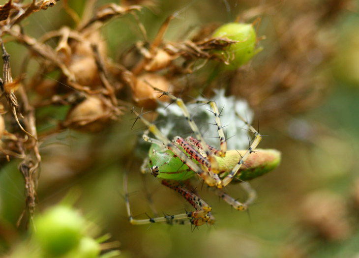

 After about two months, seriously, with no rain except for what the hurricane drove inland, the trend broke last night – and naturally, I had to be out in it getting completely soaked; thankfully, this was not with camera equipment. This morning the rain returned, which is fine since we badly need the water, and this time it brought a nice little electrical storm. I have no lightning images this time around, mostly because it was daylight so the shutter cannot be locked open waiting for a strike to occur (well, it can, but the result will be a solid white picture,) but also because the storm was centered almost directly overhead, not only making it dangerous to be out someplace, it was pouring and this obscures everything except the very closest strikes. So the image seen here is from back in July, and was a casual effort during another close storm that did not bring any rain – again, it wasn’t prudent to do a proper session, so this was captured by bracing the camera against the front porch railing and simply holding the shutter open. Not too bad for that, really – could easily have been worse, especially with the opportunity for camera shake. I include it solely for visual accompaniment.

 I’ve mentioned this before but will say it again: for sunrise and sunset shots, bracketing the exposure heavily is highly recommended, and by this I mean, taking several frames both over and under exposed from what the camera’s exposure meter is reading;

 I did manage to get a little more cooperation from the birds as the morning progressed, but not as many frames as I would have liked. When a bird is flapping, only certain wing positions (like this one) look good in the air, but timing the shot to catch the wings right there is next to impossible. Or at the very least, beyond my present abilities. So while I was firing off a lot of frames in the hopes of capturing more than a few with a photogenic angle, a lot fewer of them actually showed this than I thought they might. Most especially, don’t just hold the shutter down and let the frame-per-second rate of the camera do the work, since it’s entirely possible that it runs at the same rate as the flapping (or any other repetitive action) and you just get a sequence of the exact same pose. Be sure to pause, and if you have something flapping slower, try to time the shot precisely.
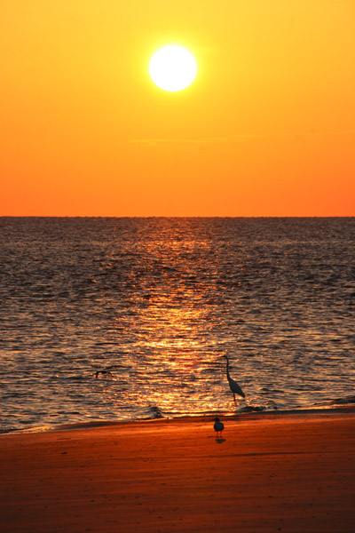 This image was taken only three minutes after the previous, so the conditions were not significantly lighter, but the framing was slightly different, producing a different exposure and rendition of the colors. The unfortunate part of this was the high contrast nature of the water texture, disguising the egret’s beak and almost completely hiding the one tern in the air in front of the egret (did you see it?) Naturally, I wasn’t aware of how this would look until I had unloaded the memory card at home, and by then I was a couple of days and five hundred kilometers too late to do anything about it. Notice, though, the illustration of a trait I’d mentioned in the previous podcast, the lack of any waves or breakers. This might have been the timing of the tides – you can see some faint waves from the visit
 This is a little bit different story. I’d initially shot this with a flash too, before the sun was up, but returned to it afterwards to take advantage of natural light, which did a vastly better job of rendering the scene. I have little doubt that the large crab who made that burrow did not just happen to find a fish head on its doorstep, but chose to make a new burrow where a lasting meal would be handy. At least until the seabirds made off with it – you can see the footprints of the first marauder in the fresh sand. Again, note the low light angle and the color cast, something that also worked well for the

 I think the little guy at right is a bird-voiced treefrog (Hyla avivoca,) but the variety of photos and markings that I’ve seen for that species make this tentative at best – it’s the closest I can come to pinning down an ID, anyway. It wasn’t calling when I spotted it, so that avenue of confirmation wasn’t open to me.
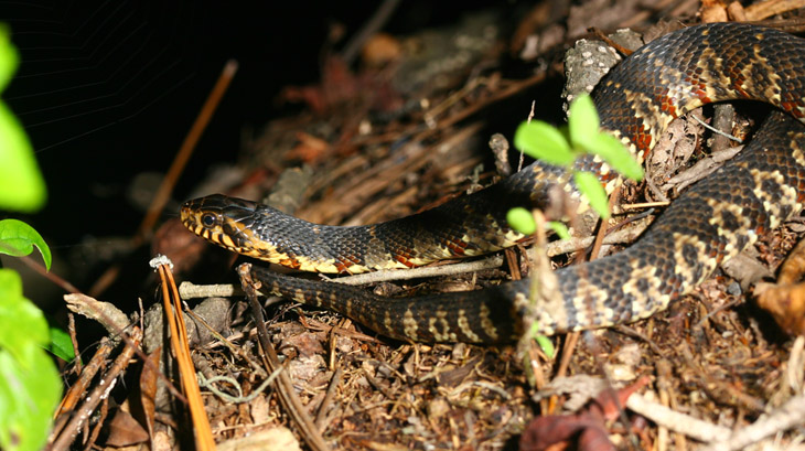 The specimen above had me suspect that I’d finally found one, until I carefully leaned in a little closer and could see the markings better; instead, this is a southern banded water snake (Nerodia fasciata,) and completely harmless, despite having the same habitat and behavior as a cottonmouth, save for the open-mouth threat display that the latter has at times (which is where it gets its name.) This is a small one, less than 40 cm long and perhaps slightly larger in diameter than my thumb, and while the headlamp confused it, it was starting to get suspicious after a minute or two and slowly slipped off into the undergrowth.
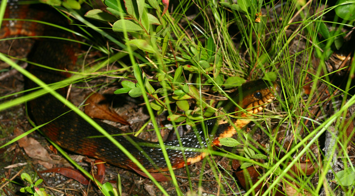


 Tucked up well underneath the cover was this green treefrog (Hyla cinerea,) who obviously couldn’t remain there because I was about to fire up the grill. I was surprised to see it, since we don’t see many green treefrogs in the immediate area. I suspected it was the one I had brought home from the garden shop