Over the past several weeks, I’ve been setting aside various monochrome experiments for an eventual post which, so it appears, has now arrived at Gate 12. Take care when removing items from the overhead bins…

This green heron from several weeks back was reduced to only the red channel, and if I remember right, I didn’t even need to tweak the contrast for this one – it worked out fine on its own.
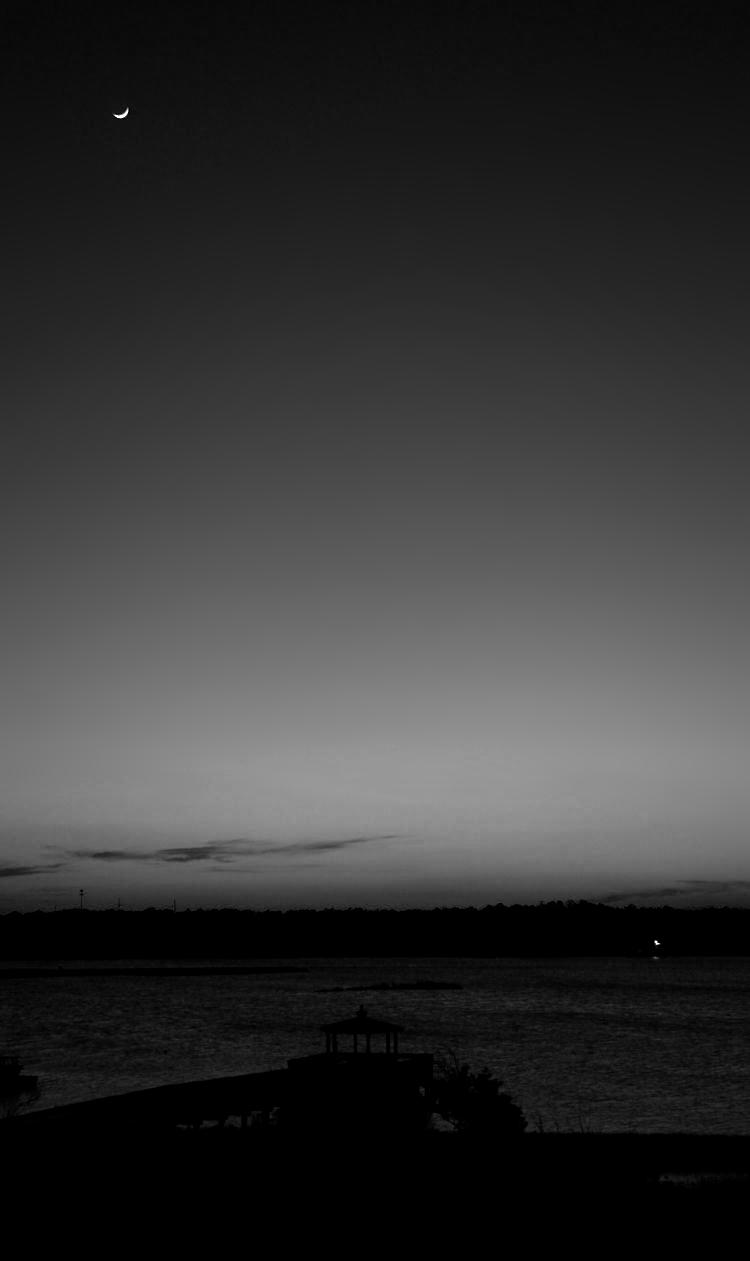
How about the moon at sunset?

This one’s from not too long ago, but this time the green channel. You might think the red channel would be better, given the sullen orange hues at the horizon, but actually they’re too bright in the red channel; the green channel had enough presence down there for a muted effect with more cloud detail.
And yeah, it’s not sunset really, but post-sunset twilight. Might as well get it right.

Actually, this one was prepared last year at some point, and never got used. I had a water iris image from this year that I tweaked, but then noticed this one in the folder and felt it looked better. I no longer recall what method was used, but I suspect this is another green channel image.

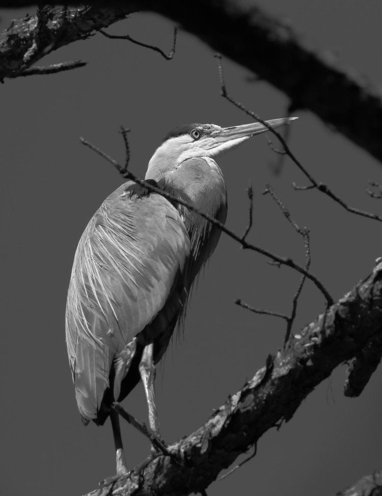
Also not too old, just a little pre-vacation, and this one I converted to greyscale without clipping any color channels, but then very specifically tweaked the curves (which in greyscale is simply selective contrast) to achieve the effect seen here, differentiating the various colors and shades of the plumage. One of these days I may do an instructional video about using the Curves function in Photoshop/GIMP.
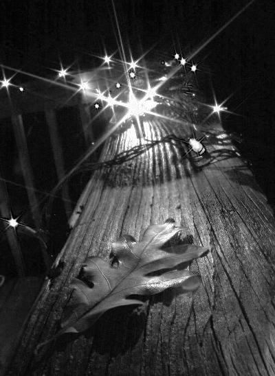
 The original of this one is from a long time ago, and I’m not even sure I haven’t tackled it in monochrome before, but here it is, again if need be. Given the distinct colors and contrast of the holiday lights, it lends itself to seeing what happens in the various color channels, and in this case a comparison was in order. So, to the right we have the red channel, which provides a nice glow on the railing and leaf, but somehow gets a strange dark halo around some of the lights – this would seem to indicate that the only color right at those spots was cyan, the opposite of red in the RGB palette.
And now the contrasting image.
 This is the green channel, and you can see how different lights gained more prominence. I did the blue channel too, but it was far more muted, the railing going way too dark. The blue channel is often the least impressive during channel clipping, but there are exceptions. Curiously, the leaf seems to be better defined in green.

Now we get a little tricky (original here, by the way.) The red channel was too bright and lacking in definition in several places, while the green and the blue channels both had their foibles – so this is a combination of both. Essentially, the green sat ‘on top of’ the blue, so I adjusted its opacity down, in essence making it slightly transparent, so it retained some of its contrast qualities while allowing the blue’s to peek through as well. It meant the sun came through with a distinctive shape but the waves got some nice darker-edged definition.

Another blended one, only this time the red and green channels – pink flower with a bright green baby katydid on it, so either channel tended to be too contrasty by themselves. I do like the way the antennae and even the legs mimic the flow of the petals.
And the last and most recent, from just a few days ago.

This is only the blue channel, which this time produced the right contrast level, but it’s a tight crop to abstractify it and bring more attention to the wing detail – you can see that the depth of field is pretty short. But this one might become a print someday.
Anyway, that’s our monochrome fix for a while, at least until I get enough images that seem to benefit from the treatment – or go digging for more. You know, I have a whole file drawer full of slides…


