As I said, I have a handful of photos from 2018 that never made it to posts, plus I might add a couple more from even earlier that have just been sitting in that folder – dunno yet, we’re still in the first sentence. And yes, I know you’ve probably had it up to here with all of the “Let’s look back” shit that’s all over the place, but what do you want me to do in the slow season? “Let’s look forward to some of the photos that I’ll be taking later on this year:”
.
.
Doesn’t work, does it? Okay then.
Now, I can tell you that another trip to North Topsail Beach is in the planning stages, so there’s a good chance some of those will appear around late May to early June. Beyond that, there’s nothing specifically planned, though a mountain trip is in discussion. It’s been ten years since The Girlfriend and I hit Florida, which is too long, but I’m not sure if such a trip is viable this year or not. Get out your Ouija board and see if you can figure it out before we do.
 January
Let’s start with the big winter storm that struck a year ago, and an image that never fit into the post-storm post – too similar to another, and nothing in particular to say about it. There’s still nothing in particular to say about it, really – I don’t even know what kind of plant this is, but the little indigo berries stood out nicely. I still suspect we’re due for another big winter storm at some point, though nothing is forecast as of yet. We’ll just have to see.
 February
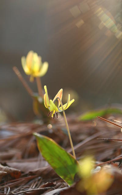
Three weeks further on brought us some remarkably warm weather, for a short while anyway, and during a froggy outing I sprawled on the ground to get this trio of yellow trout lilies (Erythronium americanum) that were venturing up through the ubiquitous pine needles – the sun not only added a little backlight glow, but some accent rays. It would be easy to get the impression that we had an early spring, and that impression would be ever so wrong – the season consisted of warm spells interspersed with more freezes that lasted through the normal spring season for North Carolina, which stunted a lot of plants that were just as fooled as everyone else, but did at least kill off the normal hatching of ‘inchworms’ that tended to decimate one of our rose bushes, so that did well this past year. But yeah, even as we approached our beach trip in May we were wondering if spring had truly settled in – it had, finally, but that’s pretty late for us. My first year in NC after moving down from central New York, I was waiting for the apartment complex to open the pool, and it was a month late as far as I was concerned; it was scheduled for the first of May, and the weather had been so warm that I was hoping it’d be the first of April. Just so you know, on a good year in NY you might be able to go swimming by mid-May, but generally the water wasn’t pleasant until June. I don’t miss that.
But while we’re at it, here’s another photo from the same outing, another where I went down low for the personal perspective. The conditions were incredibly muddy, so I was propped on my elbows with the rest of my body raised out of contact with the muck. One of these days I’ll start my own line of nature photographers’ outerwear, with waterproof reinforced knees, elbows, and seats. And lots of pockets.

Can’t tell you what species this is (because you don’t have clearance) – I’m leaning towards cricket frog, one of the Acris genus, but northern or southern variant is beyond my ability to determine from the photos I got. Only about 20mm in length, this one was exceedingly well-camouflaged against the debris at the water’s edge, and I only spotted it because I’d seen it hop there at my approach.
 April
April
Wait a second, what happened to March? Well, in March the weather was still being spastic, and I published everything that passed muster back then, so nothing was sitting unused in the blog folder. Thus we’re jumping to April. It’s not the only time it’s gonna happen either.
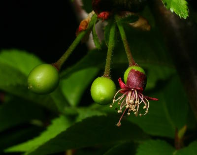
Despite the conditions, most of the plants still kept largely to schedule, and in April The Girlfriend’s weeping cherry tree even started producing fruit, as seen here – I wasn’t even sure there was anything around to pollinate it, but there’s the evidence. The birds, however, were not at all taken by surprise, and the cherries (tiny little ornamental things, no use for any decent sundae) vanished virtually overnight.
The wretched and hateful longneedle pines were not at all hampered by the weather, and produced copious amounts of pollen that got all over everything, even wafting through the screens and coating everything on our back porch. Below, a smallish wolf spider (genus Lycosidae) sports what passes for spring fashion around here.

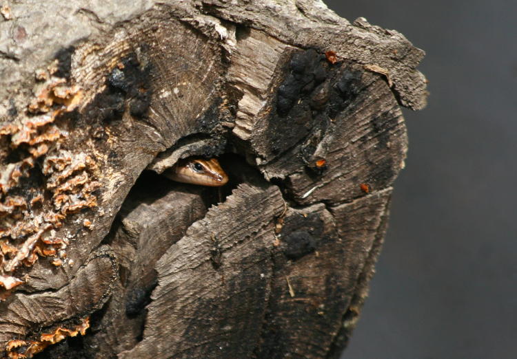
But wait! Let’s not forget the American five-lined skink (Plestiodon fasciatus) that sought shelter within a log crevice, then peeked out again a couple of minutes later while I waited patiently. Had I been able to hold still long enough, it may have ventured out farther, since reptiles are not terribly high on the reasoning scale; the skink was more attuned to my motion than my appearance, and stillness spells safety to them no matter how close I might have been. With a rarer species, or a more compelling setting at least, I might have exercised my patience more, but I have enough photos of skinks and simply moved on before I passed the lizard’s test.
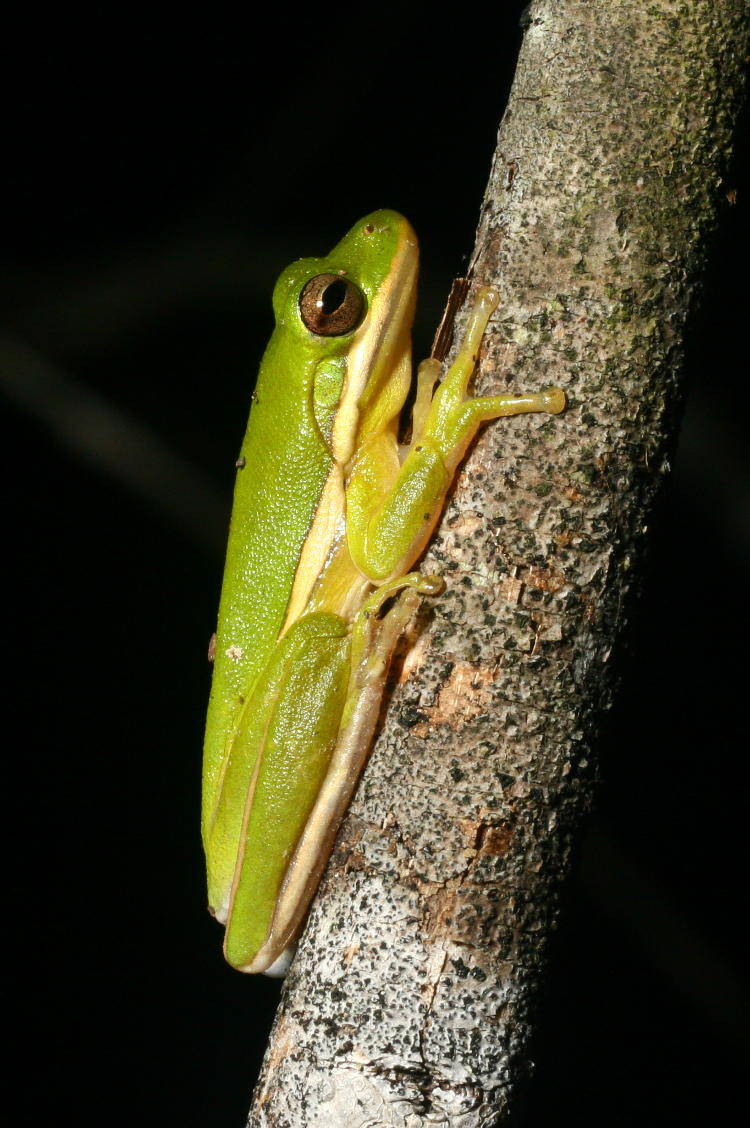
May

So with these, a little story – just never got around to posting this at the time. During the frenetic Cinco de Mayo celebrations around here, I ventured over to the pond and was chasing a few calling Copes grey treefrogs (Hyla chrysoscelis,) including this one which paused at my close approach and sat there with flaccid throat pouch, probably not impressing any females in the area. Remembering that another pond not far off usually played host to the green treefrogs (Hyla cinerea,) I drove over there and started chasing subjects therein – not quite as active as other times that I’ve visited, but I still found a few models.
In fact, during this session I took the 50,000th image with the Canon 30D, but did not realize this until much later.

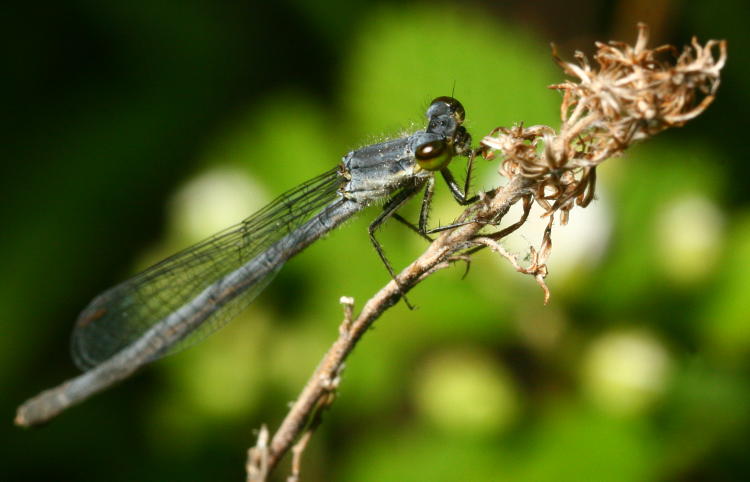
A small damselfly, possibly a female Eastern forktail (Ischnura verticalis,) was asleep on a dried flower, so I was able to lean in close without spooking it off. Overall length was probably around 25mm if I remember correctly. Tiny, anyway. What gets me now is, what the hell is that in the background? It certainly looks funky at this level of defocus, but I never took note of it while there.
By this point the weather was normal and I was in my typical shorts and water sandals, with the headlamp for night work. I was being careful where I walked, partially because of the possibility of snakes, but mostly due to the wild nature of the undergrowth bordering the pond. Nonetheless, I missed a thick dried stalk of a raspberry bush, and raked it along my leg. I’m out in such conditions often enough that I’m kind of used to this, and felt the stinging but shrugged it off.
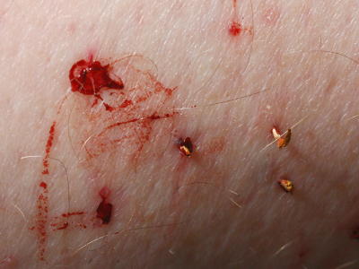 A few minutes later, the stinging was still going on, and I glanced down to notice more than the expected thin lines of scratches on my calf – there were, in fact, several trickles of blood. Nothing I could do about it at the time, and I didn’t bend down to see it in detail, but I made a mental note not to wade too deeply and chance infecting the wounds with whatever might be in the water. On arriving home a bit later on, the plethora of embedded thorns became a bit more obvious, and I had to go into the bathroom for an extraction session.
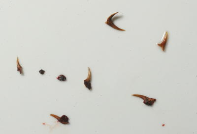 It turned out to be a nice little collection, not counting those which might have been brushed off earlier as I continued to walk around, or got into the car. This just goes to show you how dedicated I am to bringing you these wonderful photos and narratives (which, naturally, I then didn’t even bother with.)
July

Yep, no June stuff, but we have a leftover from July, a juvenile Chinese mantis (Tenodera sinensis) clearing water from its eyes after I misted it. Notice the nicely interlaced spines on the forelegs, providing an inescapable grip, which makes this habit all the more disturbing; mantids will clear moisture from their eyes and drink it in parched conditions (which by then we had reached,) but doing so with those wickedly-barbed forelegs seems to be just asking for eye damage.
But I still like the water drops. Someday, I’ll ‘shop in a smutphone for giggles…
September
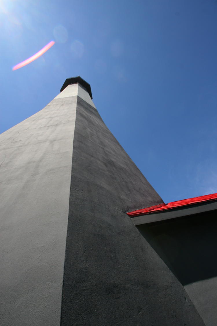
I had plenty of images from the Georgia trip, so I skipped these, but what the hell. Here we have the Tybee Island lighthouse from below, trying to make the most of the very wide 10mm focal length, but shooting up with such a wide angle is simply asking for sun flare – I just didn’t really expect it to be so distinct.
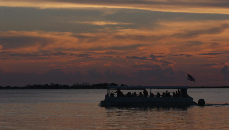
While below, a shot of what I believe was a sunset dolphin tour – I would have greatly preferred the roof line to have fallen either above or below the horizon instead of blending in like this. However, the crowded conditions and moody silhouette make me think irresistibly of something like a refugee boat – not quite the effect I was after. And I can’t imagine any reason why people would be fleeing America, either. Can you?
May 2017

Wait, hold on – 19 months ago? But yeah, it’s my blog and I’ll do what I want. This one from the first North Topsail Beach trip never made it into a post, but I like it a lot due to the color register and have been waiting for the right opportunity to use it – maybe this isn’t ‘right,’ but here it is anyway. The sun was just beyond the horizon yet turning the high-altitude clouds red, and this cast a pink glow across the entire landscape. The scattered clouds contributed a lot to the effect, since I have images from similar conditions without the clouds and they’re far less dynamic.
July 2016
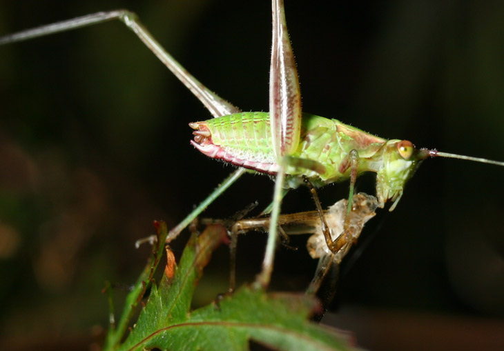
I have this one marked as a composite though I don’t recall doing it, but then again it was two-and-a-half years ago and we’re lucky I can remember my house number. I figure I combined two for maximum sharpness to help illustrate what I considered a curious action. This is a katydid nymph, and katydids are vegetarian – or at least I thought they were. Yet this one is consuming a molted exoskeleton, which I suspect is its own. So does it count as cannibalism if you’re only eating a discarded skin? How about if it’s your own? Is this a particularly ‘green’ form of recycling? Please remit answers to the address below.
October 2015
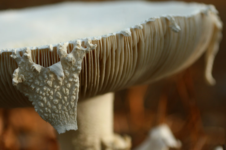
Okay, you’re welcome to accuse me of reaching now, but I still like this image and just never took an opportunity to post it. But one chilly fall morning I found a patch of larger mushrooms and chose one for a low angle approach; the little tatter is a great focal point in my opinion. Most mushrooms (that I’ve seen, anyway) erupt as kind of a sphere first, before this unfolds like an umbrella into the top shield (there are likely proper terms for these that I’m not going to bother looking up,) and this was a remaining fragment of that past state, like a poorly-cut pastry crust. The dappled sunlight communicates the conditions fairly well, I believe.
Anyway, I think that’ll do it for the year-end retrospective. There remains nothing to shoot around here, but if someone gives me a photo challenge or assignment I’ll be happy to tackle it in my free time – I would suggest the Caribbean or Belize or something, and I’ll let you know where you can send the tickets. Won’t even charge you for meals.


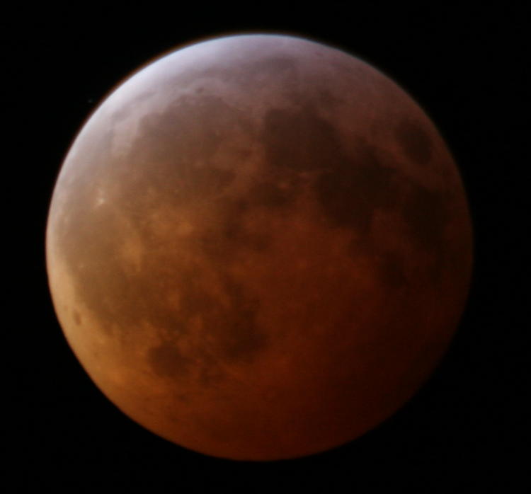
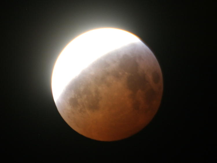
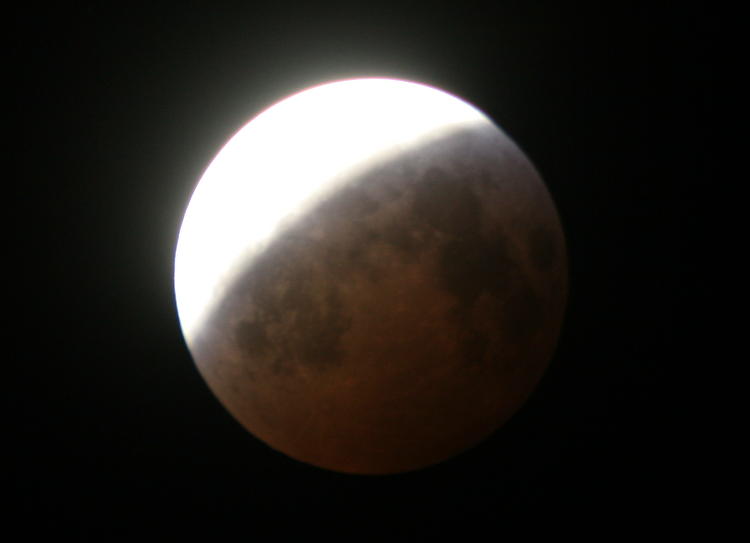
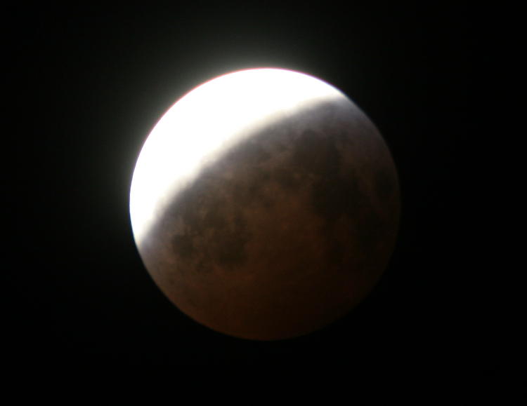
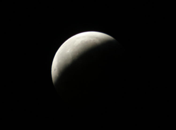
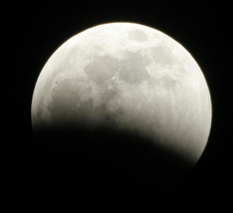
 And seeing it in person? Not very likely, unless you had at least a decent set of binoculars or a telescope and were paying close attention. I edited one of my frames of the total eclipse here to give a rough idea of what it looked like to the naked eye – of course, back away from the screen enough until you can hide it under your thumb to get a more accurate size estimate. The meteoroid, by the way, was estimated to be quite small, perhaps about melon-sized, and to have left a crater 7-10 meters in diameter, which is roughly the footprint of a smaller house. So actually pretty cool to have been visible at all from 800,000 kilometers away.