Mr Bugg and I had a sunset outing to Jordan Lake yesterday, which was unsuccessful in capturing a sunset – it occurred, but not in the slightest bit photogenically. Before that, we were checking out what kind of other activity was available, which also wasn’t much, and mostly too distant for the efforts. But I’ll include a couple of frames for the sake of it.
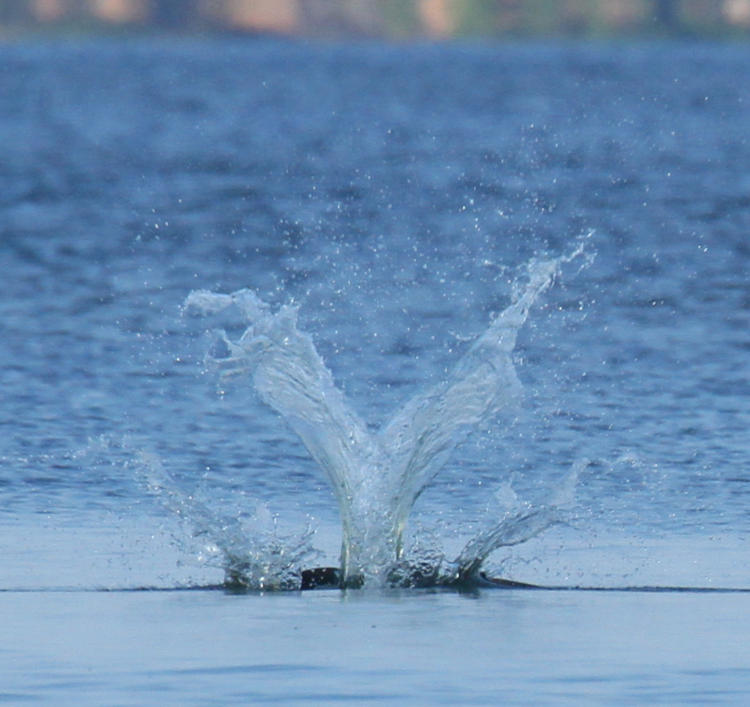
This is the splash of an osprey (Pandion haliaetus) entering the water, perhaps the sharpest that I’ve captured (so far,) and with only the barest hint of the osprey showing at all. It was a nicely symmetrical splash though. The bird gave little warning of beginning the dive and autofocus didn’t lock on until it hit the water.
The same bird, successful in its fishing efforts here, climbed out and circled around to pass nearly overhead, and so I was firing off frames of its approach.

I thought that I had exposure compensation dialed in for shooting against the sky, but apparently not for this sequence, and thus it’s a bit dark and moody, not at all helped by the sun angle. Clicking on this image, however, will bring up a larger one at full resolution, just to see the detail – the autofocus wasn’t behaving perfectly yesterday, but well enough for some nice frames.
And now we switch subject matter and go to ‘today,’ even though, according to my personal timeline, these were still yesterday, taken in the wee hours of the morning – I am available to answer further questions as needed. Mostly, what I needed to post was the first appearance this year, or the first that I’ve caught anyway (but we all know that I miss nothing) of a behavior I was seeing a lot of last year:
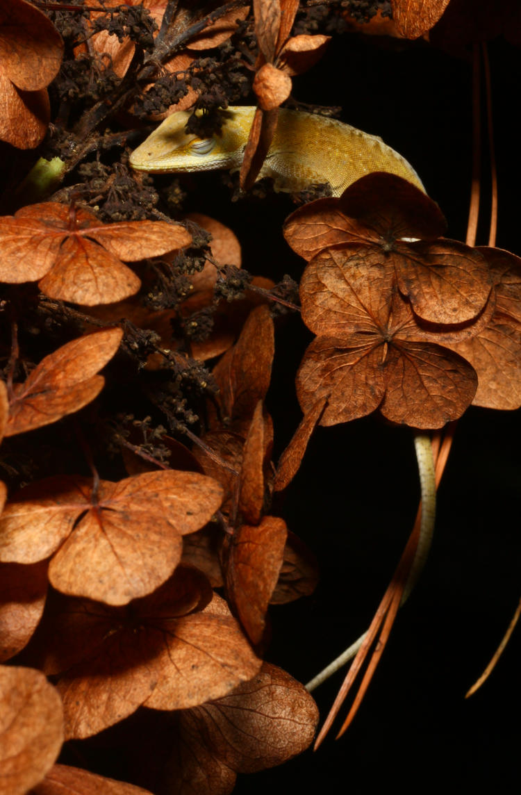
I played around a bit getting an adequate flash angle without disturbing things too much, to which this Carolina anole (Anolis carolinensis) lazily opened an eye, repeatedly, before closing it again, rendering me inconsequential – I’m quite used to that. It’s draped on the dried flowers of the oak-leaf hydrangea (Hydrangea quercifolia,) which seems to be a preferred perch for night basking at least. To the best of my knowledge, this habit of sleeping suspended up in branches or flowers occurs during hotter days and is a method of gathering dew overnight, though it has to be said that this is about a meter from a full birdbath below, so it’s not like water is hard for them to find, meaning I could be wrong about this. Maybe it’s just akin to how cool we suddenly find hammocks in the summertime.
While out with the headlamp, I took a look around back to see what was happening back there, which wasn’t much, but I did find one of the frogs hanging out by the pond.
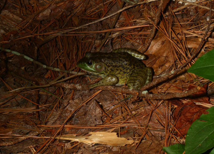
Finding a frog just chillin’ near the water isn’t even slightly uncommon, but the species is a new one for here: this is an American bullfrog (Lithobates catesbeianus,) the first I’ve seen in the backyard, and not a small specimen at that – perhaps a little smaller than my fist. I would have thought the pond was a bit too small for their tastes, and have not confirmed yet that it is a resident and not just on vacation here. I mean, it does kind of resemble me on the beach.
Since it never even twitched as I leaned in, even closer than this, I carefully detoured around (there was a small tree in the way) to the front for the dramatic portrait, being careful not to let the camera or my arms into the beam of the headlamp, which is what normally alerts them to a ‘dangerous’ presence and sends them vaulting back into the pond. I was more successful than expected at this.
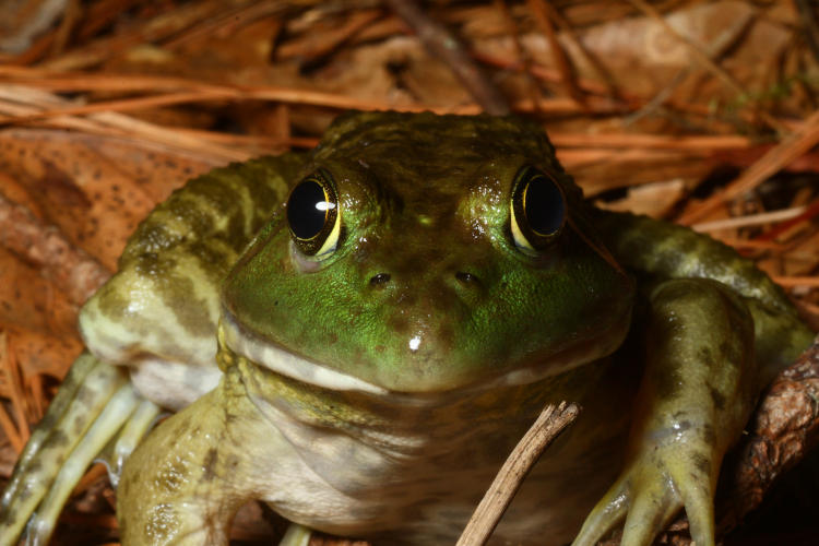
This is full frame using the Mamiya 80mm macro, so you know I was close – roughly half a meter away from its nose, and even got the chance to adjust the flash for better lighting than the original frame. You’d think it was a lawn ornament – until I was a little incautious while getting back up and it sailed into the pond in one great leap over its own shoulder. But now I’m curious to see if its actively sharing the little water source with the resident green frogs, and how many of those remain. Plus I’ll have to sit out in the evening with the audio recorder and see if I can snag the calls of either species, but especially both, for the comparison.