Depends on where you look

tree trunk climbing in fall canopyWe are rapidly approaching ‘peak’ autumn color season here in this section of NC, which is slightly misleading in a couple of ways. First off, peak is different depending on latitude, humidity, and the conditions that the trees were in throughout the summer, so you never have to go very far to find different color conditions. Second, the trees all change at different times and different rates, so each species has its own time for brightest colors, and the best that anyone can aim for (if they’re looking for broad landscapes anyway,) are periods where the greatest number of species visible are closest together in ideal color. Obviously there’s a challenge to this, compounded by the bare fact that a good wind or rain storm near such times can wipe all the leaves from the trees. However, if you’re selective and go for smaller compositions rather than something like an entire hillside, you can shoot ‘peak’ colors for weeks.

Last weekend and yesterday, I got out chasing whatever subjects could be found, and right now that’s primarily autumn scenics – the arthropods have largely called it quits for the year, and even the waterfowl and mammals seem to be scarce, at least where I’ve been. The winter slump has begun, which means I’m going to go into my seasonal funk and try to find various projects to tackle for the next few months. Plus more archive shots will be used, naturally.

But not yet.

green oak leaves against sunlit fall colors
Early morning is often a good time for scenic shots, but there’s a particular exception at this time of year: it’s not good if you’re in the woods looking for images, because it takes a long time for the sunlight to penetrate, and even if you find good colors, they’re likely to appear drab until the sun illuminates them, especially if you have to frame against the sky. So you end up watching for open patches where the sun can bring out the color, and perhaps even provide a little glowing backlight. Thus, here we have some oak leaves stubbornly clinging to their chlorophyll while in the background another species puts on a flamboyant display, and I took advantage of the contrast; you can see that not even the entire oak branch was catching the light. Note that some colors actually do well in open shade; the subtleties of lots of different fallen leaves often look better in subdued light than in bright light, which increases contrast too much. Most of the forest floor on these trips were carpets of lackluster browns and yellows, nothing too distinctive, so no compelling compositions could be found there yet, but perhaps I’ll dig up something a little later on.

beginning fall colors above an old tree stumpLast weekend was even harder, as the colors were sparse and widely separated, so a lot of selectivity and careful framing was in order – even though only two thin trees are producing color here, the angle made the most of them within the frame, and the stump formed the primary point of focus so the colors just kind of fill out the background as the setting. The sky was too clouded to provide any color itself, so the muted light is communicating the grey fall day thing, and you can see that the colors on the ground aren’t anything to write home (or a post) about. However, after getting back and seeing how this frame turned out, I realized I could have changed my angle only slightly and made that cluster of thicker trunks appear almost to ‘sprout’ from the stump, nicely aligned with the sides. I hate it when I get creative after the fact…

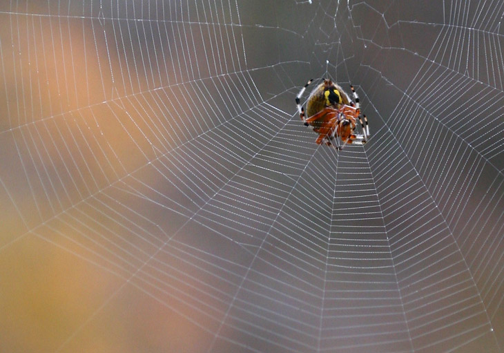
A week ago I posted the photo of the marbled orb weaver striving to be fartsy, and mentioned that those were close to the only wildlife I’d been seeing. This naturally means that I got more photos of the same species, and again, did my best to try and be creative; suffice to say that these aren’t going to win any awards, but are enough to show off on the blog.

marbled orb weaver Araneus marmoreus suspended against beginning fall colorsSuspended in the middle distance over a significant dropoff, I wasn’t going to get very close to this one, so I settled for capturing its subtle presence against the backdrop of the beginning autumn colors, managing to get a hint of the orb web in the image. Marbled orb weavers (Araneus marmoreus) seem to be conflicted: visible here and in that previous linked shot, they have very high visibility markings with the banded legs and the brilliant body colors, which is nature’s way of saying, “Back off!” without having the evolve little Yosemite Sam mudflaps, but they depend on their webs not being obvious in order to feed at all. To the best of my knowledge, flying insects take no note of their colors nor the curious ability to hover in midair apparently unsupported, and thus blunder into the webs, but the birds which might consider them a (sizable) tasty meal are alerted by the incongruous contrast and position. It’s one of those funny things, because like the black-and-yellow argiopes, it’s actually very easy to walk into such a web despite the bright colors, simply because they spider isn’t moving at all; we’re more attuned to movement and larger things ourselves, and can easily lose the spider against the background (more so as the colors develop.) This species is probably worse on the unexpected encounters scale, since argiopes tend to make webs at waist height, but all of the marmoreus I saw placed them right at face level or slightly higher. We managed not to experience that mistake, though.

marbled orb weaver Araneus marmoreus building new web
Venturing out onto the slope the fell off underneath the web and switching lenses, I got a bit more of a detail shot of the same spider, seen now to be constructing the web – this was early morning, so I cannot say if this indicates that marbled orb weavers are more diurnal or if this one was simply making repairs after the previous web was damaged. The conditions hadn’t been quite right for dew, but you can make out a faintly beaded appearance along the web strands; I don’t know if this is actually dew or sticky fluid produced by the spider to increase the efficacy of the web. Now I’m going to have to observe these more closely, though I have rarely seen the species close by at all.

The next find, from yesterday morning, comes courtesy of the Ineluctable Al Bugg, who has had plenty of time to get the jump on me with his own images but is still displaying a beach trip from September as his latest post, possibly to rub it in. It was he, though, that was gazing up at the foliage (that I had already dismissed as being not interesting enough,) and said, “Hey, there’s a rainbow up there!” Now, it was almost perfectly clear at that time and no rainbow was going to be showing in the direction he was facing, since they appear opposite the sun and not nearly straight up, but I figured he had spotted a sundog. The canopy was thick and I had to wander back and forth a bit to make it out, but eventually saw something much more interesting, which disappeared and reappeared over a period of about 15 minutes, finally allowing for a better composition.

circumzenithal arc over autumn colors
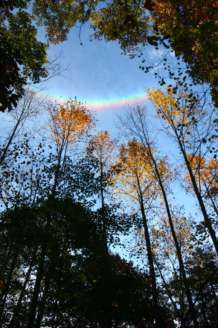
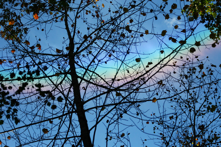
This… is a circumzenithal arc, probably the first I’ve seen and certainly the most vivid. A wide-angle shot at 19mm, this image shows the arc off nicely but doesn’t do it justice because it looks smaller than it was. The name indicates that it describes a partial arc around the zenith (“straight up”) and is notable because the sun is towards the bottom of the frame, thus making the rainbow inverted from what we expect. They’re caused by high-altitude ice crystals, which in this case were sporadic and fleeting, and if I can judge from the size, not all that high either. Here’s a shot through the foliage at 80mm instead.

autumn leaves silhouetted against circumzenithal arc
As I mentioned before, any shots of rainbows and similar sky phenomena should be bracketed in exposure, and more than a couple of frames too – if the camera reads exposure from the foreground subjects it might bleach out the sky and wash out the colors of the arc, and even with minor changes of 1/3 stop, there will be one particular setting where the colors really pop. Don’t be stingy, and use exposure compensation liberally to enure that you get what you want.

circumzenithal arc with sun visible through foliageNow for a bit of trivia. While shooting this, I had the presence of mind not just to try and frame the sun with the arc for comparative purposes, but to note the time of day and the relative positions of both sun (bursting through the trees near the bottom of the image) and arc, because at that time I didn’t even know what a circumzenithal arc was. I could only estimate the altitude of the sun and arc, but figured 30° for the sun and 75-80° for the arc. Later on as I looked up details, I found a source that said that the arc is usually about 46° above the sun. Naturally, I pumped my fist in the air and whooped and did all of those other egotistical guy things (EGTs.) But then, with some playing around with Stellarium and the view-angles I should have been getting from the lens, I ended up with the sun at 20° and the arc at 59° – wasted those whoops, it seems. Though I’m skeptical, because I would swear that the arc was higher. The site that I just linked to, by the way, says that the best times to see such arcs is when the sun is around 22° in altitude, so that lines up, at least…

[A quick nonsense note, while the subject has been brought up: people can be really bad about estimating the altitude of things in the sky above the horizon, especially about “straight up” – this is known to astronomers and is a significant factor in things like UFO sightings. Most times when we think we’re looking straight up we’re actually quite far off the mark, 20° or more, and true 90° up is actually very uncomfortable to do. I know this, have for a long time really, and was trying to be careful about my measurements, but so much for that.]

tiny cluster of red leaves sprouting from hole in tree trunkI finish off with another selective composition, because the tiny sapling venturing from a hole in the tree trunk was interesting enough, more so with the color. It wasn’t much later than this that the humidity built too high and the light conditions descended into heavy haze, dropping the wooded areas into deeper shade and destroying any chances for colorful backlighting. But we got enough frames for the day, I’m thinking.

I’ll have to do this in the front yard someday

jumping spider Habronattus pyrrithrix peering out of shadows
Wouldn’t it be a great diorama, about a thousand times life size?

For Halloween this year, I feature a jumping spider, most likely an Habronattus pyrrithrix (what a great name,) peering out from around the edge of a dog fennel stalk. I captured this while in pursuit of another subject one evening a few years ago, and the flash angle was ideal to produce the ominous effect with the shadows – had I tried to set this up, I would have been playing around a lot to find the precise angle necessary and the spider, as impatient as the entire family is, would have buggered off. And while the mere presence of a spider makes it ominous, there’s also the huddled and apparently wide-eyed ‘expression,’ making it seem as if the spider is hiding from something much worse, just out of the frame. What do spiders have nightmares of, I wonder?

It’s also the end of the month, and this time I have an offering for the kinda-but-not-quite tradition of featuring an abstract at months’ end, something I’ve missed for the past few.

dewdrop reflections in abstract focus
It’s perhaps not too hard to determine that this is a leaf wet with dew, catching the morning sun and seen largely out of focus – this is a crop from a larger frame. What captured my attention were the peculiar effects of the reflections, some of them showing crosswise bars in all orientations. I haven’t actually figured out what causes this yet, so if you know, feel free to respond. It’s probably something supernatural…

Green day

Not today – today has been rain all day. These are all from a few days back, and noticeably had the green thing going on, so…

pale green assassin bug Zelus luridus on button bush podOver at the pond nearby, a pale green assassin (Zelus luridus) like the one seen a few posts back posed in shadow on the pod of a buttonbush (Cephalanthus occidentalis.) While I’ve been seeing them from the start of the insect season this year, for some reason I’ve been seeing more of them recently, and mostly in nymph form – this is telling me that their birthing period does not seem to be linked to seasons. My initial go-to source of arthropod info, BugGuide.net, has nothing to say about this. After shooting some natural light near-silhouettes with the pond in the background, wide open at f4, I added the extension tube for higher magnification – this requires a little fussing around, and while I was doing this, the assassin left the more photogenic location of the seed pod and started venturing up the branches. Thus, I had to abandon being fartsy and go for the basic illustration angle.

pale green assassin bug Zelus luridus
Now, while checking out the seasonal thing with the species, I found another interesting detail, not listed for the individual species but for the whole genus instead. See those fuzzy forelegs? Apparently, Zelus use a sticky substance that coats those tiny hairs to aid in capturing their food, using their forelegs sort of like a sundew plant. I’m going to have to do some serious closeups of them for a later post and see if I can illustrate this better. I have not witnessed them capturing any prey, and have only a few shots of them feeding at all, so now this is something to watch for.

unidentified berries in low depth of field
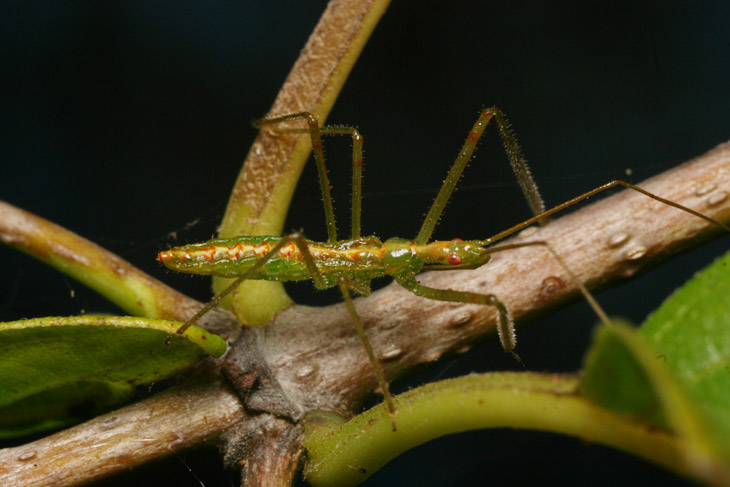
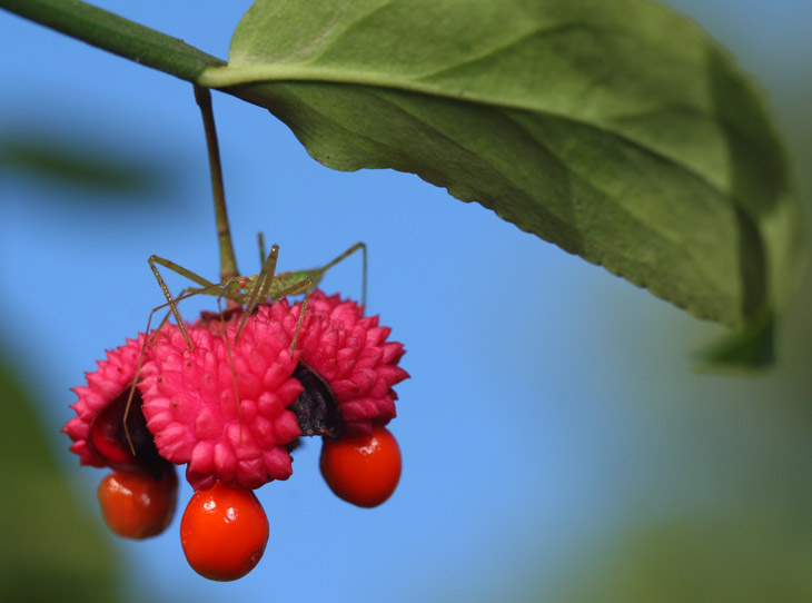
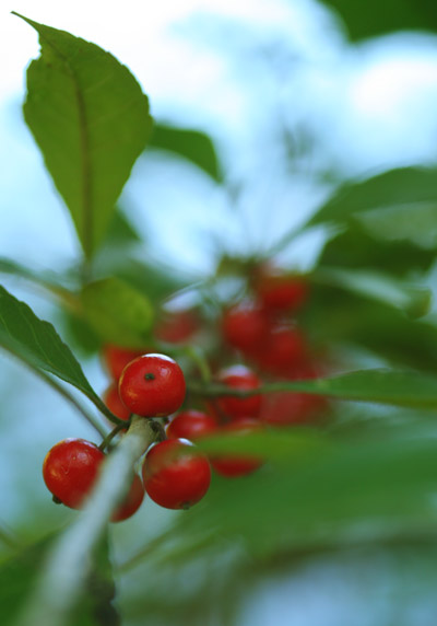
We’re going to gradually turn up the green as we go. In one spot alongside the pond, an unidentified tree was sporting tight clusters of berries, and like the first assassin image above, I picked an angle that would make use of the pond’s surface in the background – again, still working in shade since the light just wasn’t cooperating. An assassin in this composition might have been nice, but noooo, none of them could be found here. Try and make them famous, and this is what you get. Ingrates.

handsome meadow katydid Orchelimum pulchellum posed on leaves against pond reflecting sky
Not all insects were as uncooperative, though. A handsome meadow katydid (Orchelimum pulchellum) – ‘handsome’ is part of the name, not my editorializing – drew my attention by calling distinctly, and posed obligingly against the pond’s reflection of the sky. Disney’s Pinocchio informed us all wrong: no insects call or ‘sing’ by rubbing their hind legs together. Instead, orthopterans create their mating calls by vibrating rough areas of their wing sheaths against one another, sometimes seen as a blur along their mid-back area right between the hing legs. A lot of colorful things actually do better in softer light, getting bleached out by bright sunlight, but you have to admit it worked well for the hue of this species, and is a better version of the same approach seen here – same location, same plants, possibly even the same individual insect, but different lighting.

Carolina mantis Stagmomantis carolina stretched out on leaf
While in that immediate location, I found just one of the many Carolina mantids (Stagmomantis carolina) that I had been observing before, plastered down onto a leaf and looking rather unhappy. The nights have been getting cold, heralding the end of the insect season, and I was suspicious that the position indicated the mantis was dead, but it lifted its head and legs as I drew in close for the shots. However, my main purpose here is a distinctive illustration of one of the hazards of macro photography. The image above was shot at f4, but because the light was more than bright enough, I shot other frames at f11 and f16, realizing in doing so that there was something I was missing.

Carolina manrtis Stagmomantis carolina semi-obscured by leaf
This is only a very slight change in perspective caused by inadvertently shifting a centimeter or two to the side, so the obscuring leaf isn’t something that I moved over to – it’s there in the top photo too, just so out-of-focus that it appears as a faint dark haze. When shooting macro through foliage and in tight conditions, it’s very easy to do this – you have a clear frame in the viewfinder and figure everything’s cool, until the aperture stops down upon releasing the shutter and you discover the foreground leaf later on. I was actually aware of this one quickly, since the Mamiya 80mm macro lens that I adapted to use on the Canon body requires the aperture to be closed manually and thus I could see it, unlike any automatic lens where the aperture only closes (no matter what the setting) when you trip the shutter. The difference is distinctive, isn’t it?

pale green assassin bug Zelus luridus casting shadow through leaf
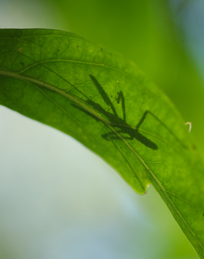
Back in the yard, I found yet another pale green assassin, this time on one of the gardenia bushes. I was just going to ignore it, but while searching for other species I noticed how sharp the shadow was when seen from the underside, and went back in to get the camera again – in the sporadic light of the backyard, I knew the sun could quickly move out of the position where the shadow could even be seen. Yes, that’s the tip of the hind leg peeking out over the leaf edge. I waited a bit to see if the assassin would give me a portrait shot over the edge as well, but like its brethren, it stubbornly moved away from a decent perspective.

magnolia green jumping spider Lyssomanes viridis on underside of gardenia leaf
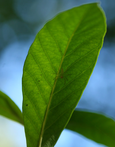
While down there however, I quickly spotted something on a neighboring leaf, this one partially shaded despite being not 20cm away. It was another of my old friends the magnolia green jumping spider (Lyssomanes viridis,) and the gardenia bushes seem far and away their favorite. Or at least, that I’ve managed to discover so far, because my experience now suggests that they typically inhabit the undersides of leaves, which is not a perspective I usually seek, so perhaps they like other plants better but I just haven’t been down there enough. Still, I’ve found four specimens on two bushes less than three meters apart, so the supporting evidence is there. And now I have an inkling of why this species, among so many other jumping spiders in the area, has such a translucent exoskeleton. From the underside of a leaf, coloration like that of the assassin bug isn’t enough to hide their presence, since the sun shining through will show them in silhouette. But with the transparency of the magnolia green jumper, largely all that shows is a few spots around their eyes and along their abdomen, doing a pretty good job of disguising their arachnoness. Arachnicity. C’mon, something has to get past spellcheck…

NotherMagnoliaEyesThe shot above was taken aiming almost straight up, so I sat back up and tried shooting nearly level, edgewise along the leaf, and the spider turned to face me suspiciously. This resulted in a series of images that I combined into an animated gif (pronounced “HEE-la“) – not half as good as the video linked above (or here for convenience,) but still illustrative. I was shooting without a tripod, so the images had to be matched up, and the wandering background perspective is evidence of my minor body movements as I shot the sequence – I’m never going to be able to do those fake statue hoaxes you see on YouTube. Still, it closes out the post nicely.

Monday color 38

monkshood Aconitum blossomsFor this week’s Monday color, we rely on the brilliance of Aconitum blossoms, otherwise known by a zillion different names such as monkshood, wolf’s bane, devil’s bane, Queen of All Poisons, and flake attractor, the last of which is my own, coined after seeing the woo-related claims and usages for the plant that can be found online. While purported to have countless different properties over the centuries, the only two that can be supported with any accuracy are a) that the plant is toxic to a fair degree, and b) the flowers are usually colorful. Many medicinal claims have been made for species throughout the botanical kingdom, and most are anecdotal at best; despite the avowals of numerous naturopathic and mystic flakes, science has not ignored such claims at all, but has tested the majority of them under controlled conditions (meaning, not subject to subjectivity, small sample sizes, and the placebo effect.) The few that actually showed dependable results, like salicylic acid and quinine, quickly became known as, “medicine.” Thus, when you hear phrases such as, “alternative medicine,” or, “traditional medicine,” these can easily be translated to, “not even close to medicine.” Just a little pointer to save you some time.

I’ve shown these flowers before (twice,) but both of those times were in bright sunlight conditions; this time around, it was overcast, so the color is coming courtesy of the flash, which did a much better job of it I think. Taken at the same time as this post just a couple weeks back, I didn’t try to shoot them in the overcast light to show what the effect on the colors would be – most likely, the slow shutter speed would have made the images not very impressive anyway. We’ll stick with this one.

On the negative side 6

just some dice in "sand"
For this escapee from the film negative vault, we go back, oh, about twelve years to a casual photo competition on the rec.photo.equipment.35mm newsgroup (c’mon, don’t make me explain that, it’s not that old.) While I was well into shooting on slide film at the time, I often did the competition shots on negative film and took them to the local drugstore lab for ‘process only,’ scanning the resulting negatives – this saved both money and turnaround time. The challenge, without further explanation, was, “six.” Whatever you wanted, it just had to express six somehow. What you see here came from idle brainstorming (maybe call it brainsprinkling) and the realization that I could potentially make it work, followed by no small amount of “studio” shenanigans.

I’d known for a long time that opposite sides of a regulation die added up to seven, but upon examining one, I realized that adjacent sides added up to six. So, how many times could I show these sides and produce multiple sixes in the image? That was going to require some specific angles, so the dice would have to be propped up on something.

Trickier was a little fact that I kept from the other participants: I only had three dice. Thus, to produce the illusion of six, I needed to reflect them in a mirror, which allowed me to show to opposite sides and how they would add up to six as well. Obviously, some very specific angles were required for this, and I had some playing around to do. I also had to disguise the mirror as much as possible, which meant not just hiding the edges, but eliminating any reflection of myself and the camera. To do this, I propped up a broomstick with a blackout sheet draped over it, and shot with the camera poking out underneath. The mirror angle that showed the back sides of the dice also aimed the mirror away up from the camera, so that worked well. Then I had to ensure that the light angle would adequately illuminate the dice without producing glare from the reflection in the mirror, nor lighting up the blackout cloth too brightly – I had originally tried a flash but ended up working with natural light through a patio door. In short, a lot of playing around for a simple idea, but the experience in setting up such a shot was worthwhile. There was little I could do about the stray reflections which can be seen along the edges of some of the dice, coming from the front surface of the mirror glass rather than the silvered back.

Take a look at the lighting herein, and realize that the three ‘back’ dice, actually the reflections of the ‘front’ dice, should have been in shadow, but the position of the table bounced light from the mirror and illuminated the backs almost exactly like the fronts, a serendipitous thing. While there is a faint color cast to the back dice, coming from the faintly green glass of the mirror, it is barely noticeable and seems like just a facet of the lighting.

But the sneakiest part of this all? The substrate I used to prop up the dice was salt. Which is a cubic, six-sided crystal. Thank you very much.

Real quick

marbled orb weaver Araneus marmoreus on black leaf
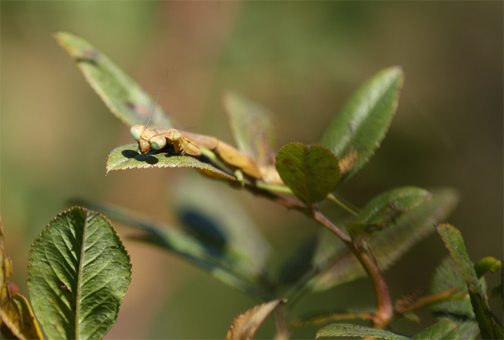
First off, you do know Halloween is coming, right? This little lady seems to…

I know, after claiming I could completely blow off the blog in the last post, I pretty much completely blew off the blog, a demonstration of dependability from me that is entirely unprecedented – it just took the right motivation. More is coming shortly, since I have some recent pics to feature, but first is a trivial post, and Monday color again.

Fall colors are not quite up to snuff yet, but a photo outing this morning netted this marbled orb weaver (Araneus marmoreus) being shy on a dead leaf while still providing a nice portrait angle. Right away, I was thinking how similar it is to a photo shot two years ago, one that I recall easily since it happens to be a favorite of mine (soon to be added to the main site gallery.) And to be honest, I’m pretty sure it’s the same plant species, just one I haven’t pinned down yet.

These spiders, with an abdomen about the size of a grape, could be found everywhere down at the river, one of the few species that wanted to show itself today (and you’re going to see at least one more of them later.) I have barely seen them anywhere else at all, so I’m guessing a few hatchings in the right conditions caused the species to become prevalent in that particular region. But then again, that’s just uneducated me talking.

Monday color 37+

So, the important stuff first: with this post I surpass all previous records for posting within a year, and we’re only in mid-October! Everything past this point is gravy, and even if I stop posting now, I’ve still got that accomplishment under my belt. It’s a warm fuzzy feeling, let me tell you.

A lot of this is due, naturally, to starting this whole “Monday color” thing in the first place, responsible for 39 posts all by itself, not to mention even more images, so it seems only appropriate that I am adding to them with this post, which does serve more of a purpose that gloating, or simply pushing the count over the line. Because it actually follows-up with some things talked about in the previous post.

On taking a casual peek at the Euonymus americanus (or hearts-a-bustin’) tree in the yard today, several days after the images from the previous post, I spotted a new occupant of one of the seed pods, and fetched the camera for a trivial sequel shot.

pale green assassin bug Zelus luridus nymph on hearts-a-bustin' Euonymus americanus seed pod
This pale green assassin nymph (Zelus luridus) had taken shelter within the overhang of the seed pod, adding another layer of color to the layout. I did some quick initial shots, producing the same ‘night macro’ effects as earlier, though if you look close there are faint hints of blue from sky visible through small gaps in the foliage. I then decided to go back out and revisit the subject with a little more effort. During that delay, the assassin had left the shelter (where presumably it had maintained a tad more warmth than being fully out in the open last night) and was now perched atop the husk. Moreover, the sun had shifted and was actually falling onto the pod now. Okay then.

pale green assassin bug Zelus luridus nymph on hearts-a-bustin' Euonymus americanus seed pod
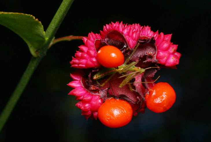
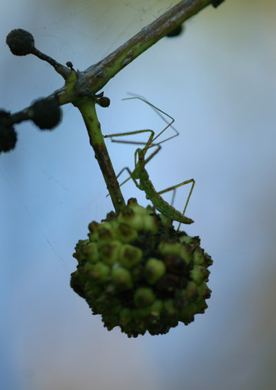
Able to get a decent angle against the sky with this one, I first did the standard exposure – with the macro rig, I have a fixed exposure at 1/200 second at f16, ISO 200, and the flash output is right in line for this. As before, the bright sky came through with some color, though notably deep. It’s okay, but definitely not a natural look. As I first loomed in close, the assassin went into defensive posture, drawing the legs up as protective bars – this is a common trait with the species, and it often serves to obscure the eyes, which is a no-no for nature photography, so finding the angle where a red compound eye remained visible was important.

Next, I shut the flash off and switched to aperture-priority, bracketing a few frames to see what settings I could get away with in completely natural light; again, this was possible because light was actually falling onto the seed pod this time around, whereas for the previous post they had all been in shade.

pale green assassin bug Zelus luridus nymph on hearts-a-bustin' Euonymus americanus seed pod
Not bad, but the shadows are a tad dark under the seed pod, and the light angle not quite ideal for the assassin, though now the sky is acceptable. So, now the challenge is to get the right level of ‘fill-flash’ to balance out the exposure and get good light on the subject, without looking like a spotlight. The FP38 flat-panel flash I was using has a fixed output, so it was a matter of adjusting the angle and distance (mostly aiming above the subject) to reduce the light output to the desired level. With a fixed flash, this could also be done with layers of diffusing material, but I already had a softbox diffuser on it in the first place, a routine part of my macro rig. Eventually, I got the level I was after.

pale green assassin bug Zelus luridus nymph on hearts-a-bustin' Euonymus americanus seed pod
In comparison to the others, the sky still came out slightly dark, but by itself it can easily be mistaken for a natural-light shot. Not the most compelling of images, especially for showing off an assassin bug (the stem should definitely not be right behind the bug,) but it illustrates the lighting thing well – better angles were prevented by other branches. In fact, the leaf peeking in at lower left was too prominent in a couple other frames where the lighting was even better – another hazard of macro work, since while looking through the viewfinder before the aperture has closed down, leaves and branches that are actually in the way may not be seen, only appearing in the final image because the depth-of-field has increased. This post illustrates how this can occur.

While I’m posting, I figure I’ll mention that the Orionids meteor shower peaks on the nights of the 21st and 22nd, if you have the interest. I went out for the previous shower and watched the sky for a bit, resolving to set up the camera for long exposures if the activity appeared decent. Alas, I didn’t see one, and with the light pollution nearby, very long exposures are pointless – the sky will wash out and might obscure any meteors that were actually captured. Perhaps we’ll see if this one fares any better – if I’m successful, you know you’ll see it here, even though I can be lazy about posting now.

Monday color 37

hearts-a-bustin Euonymus americanus seed pod against black backgroundDecisions, decisions…

We have an Euonymus americanus in the yard, more commonly known as a “hearts-a-bustin'” or even a strawberry bush, the latter by people with little imagination and no concept of being confusing as hell, since it has no relation to the plant that actually produces strawberries. As can be seen here, instead it has a remarkable display when the seeds are ripe, and naturally had to appear in the Monday color posts during the appropriate season – these photos were taken just a few days back. And I use the plural because another is coming below. And another is coming below because I am conflicted as to my purpose here – not existentially, because I, we, all life on Earth, has no purpose, we just is – but instead the purpose of these posts and my photography therein.

You see, this image is just a wee bit better aesthetically; the diagonal stem, the framing of the green leaves, the actual position of the berries/seeds… it just works better. Don’t get me wrong, I’m not professing my belief that awards are in order, but when comparing multiple images for which is the strongest, this one stands ahead of the others.

The biggest negative aspect of this image is the common trait of macro photography with flash: the black background. This was taken at 3:45 pm on a perfectly clear day, so certainly not dark conditions, but at f16 and 1/200 second aiming into a shadowy region underneath a tree canopy, the background received no benefit of the flash and thus dropped into darkness. Attempting to counteract this, however, I took the next one.

hearts-a-bustin Euonymus americanus seed pod against deep blue sky background
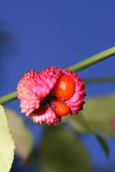
See? By getting much lower and picking the right pod, I could frame it against the sky and get a bit more daylight-looking conditions from the same exposure, albeit a little dark. What I traded for that was the strength of the elements, since there were few pods that could be used and achieve this background, so the pod and leaves and stem and framing were all weaker. We get a stronger sense of the color theme, but that’s about it.

So now you have both, and can decide on your own, not to mention seeing a hint of the things that go through my head when composing and selecting images. Just brimming with benefits, this post…

But what the hell, let me toss in another. Had I wanted to produce something even more natural looking, by lowering the contrast on the seed pod and getting more light from the sky, here’s what it would have taken. First, either a larger aperture, or a longer shutter speed, or both, to bring out the sky brighter – I would probably opt for longer shutter speed because a wider aperture would shorten the depth of field and might make portions of the pod softer in focus. That would probably necessitate a tripod, and either no breeze at all or a specific anchor to keep the branch itself from moving during the exposure. Then – because all of these pods were deep in shadow – I would still be using a flash, but it would have to be lower in power or more diffuse, to provide the appearance of natural sunlight in a ratio that appeared commensurate with the sky exposure – this can be done meticulously with careful light readings, or more quickly and easily by bracketing exposures. Not with the bracketing function of the camera though – that changes shutter speed and/or aperture – but with the flash power and position itself, perhaps moving it closer and further from the pod until the right light level was achieved. This of course means a highly-flexible light bracket or a separate light stand. While doing this, I would likely select a position that also mimics a natural sun angle, so higher and aiming down more. If I wanted to be really meticulous, a second flash or a reflector of some kind might be used underneath the pod to keep the shadows from becoming too dark.

There was also a very narrow window early in the morning where sunlight could actually hit these pods, but it never occurs again during the day – I could potentially make use of that, with the right sunrise conditions.

And, as mentioned earlier, I would do all this with the idea that some seed pod provided a much better appearance/layout/framing option than the one shown here. If you’re going to get elaborate for an image, it should be as strong as possible to warrant the effort.

This all provides a hint that, when you see a powerful nature image, sometimes it’s luck, right time right place and all that, but it might also be meticulous planning and an understanding of what it takes to control all of the elements (certainly better than these images illustrate.) Just something to keep in mind.

Cry, “Sexism!” and let loose…

I’m not going to finish that header, because no matter what, it’s going to be taken the wrong way…

If you’ve been checking out links on that blogroll over on the sidebar, you may be aware that Ed Yong at Not Exactly Rocket Science has a semi-regular Saturday post called, “I’ve Got Your Missing Links Right Here,” that often has links to some interesting science articles. This week’s, however, presented a feature from The Atlantic that just completely misses the boat.

The article is “The Sexism of American Kitchen Design,” by Rachel Z. Arndt, and I provide that link with reluctance because it’s clickbait at best, but if I don’t make it easy for everyone to find it, I’m failing to follow my own advice that people should judge things for themselves, and might even be accused of quote-mining. Some time back I tackled the peculiar crusade of feminism in detail, and largely avoid reading anything on the topic now because the vast majority of those writing about it fall for the same damn things every time – it’s a topic badly in need of critical perspective, but the very act of trying to introduce this perspective is often considered tantamount to condoning or perpetuating sexism. To call it an emotionally-charged topic is not just putting it mildly, it’s understatement to a near-criminal extent.

The article gives an indication of derailing right from the very start, with a subheader that reads, “Over the past century, things like countertop height and sink placement have been built around an idealized vision of a woman’s body.” It’s easy to accept this as stated and move on, but within this simple sentence is an openly-implied assumption that someone was trying to provoke women towards this ideal. Because, you know, if a woman finds herself with a countertop that isn’t comfortable, by sheer will alone she can alter her body towards a height that fits expectations. No no no, that’s Lamarckism, we disproved that long ago; what’s going to happen is that women of the wrong height will, um, fail to make a meal that adequately allows reproduction, and so will be selected against by evolution. No, that would take too long; instead, they’ll simply avoid the kitchen entirely, get divorced, and open up the slot for a woman that fits the kitchen.

Hopefully, I’m expressing how nonsensical the sentence is, and the rest of the article continues to make the same mistakes. In fact, it makes some much more insidious mistakes while in pursuit of a point which simply does not exist.

Before women were all hunched over screens, applying filters and tapping out hashtags to food photos, we were hunched over sinks, sudsing dishes and keeping an eye on the stove. Today’s kitchens may have more machines, but they remain abuzz with structured and artificial femininity, from aprons to pink KitchenAids. Everything matches, even the woman, whose body the kitchen has been designed to fit — albeit inaccurately — since almost a century ago, when engineers measured thousands of women to try to make housework more comfortable.

Now, struggling mightily to ignore the overused social media references, we quickly come to a description of a kitchen that, I admit, I have never seen in my life. Does anyone even wear an apron anymore, despite the fact that they are a functional item of clothing that serves as well in a butcher shop or outside at the grill? And pink appliances? Are you fucking kidding me? By an overwhelming majority, appliances are either neutral colors like white and off-white, or reflect current fads, which today are as often black and brushed chrome – colors quite easy to argue as being more masculine than feminine. While that’s a potential sexism issue all its own for those desperate to make a case with pop psychology, it’s a far cry from what the author portrays here.

Arndt goes on to talk about how engineers like Christine Frederick, back in the early 20th century (yes, you read that right – a female engineer around 1910 or so – the sexism abounds!) recognized the most comfortable working heights and layouts for those in the kitchen, creating charts that paired a person’s height with worksurface height for a good match. The horror! No, wait, that’s not the bad bit (sorry – the more I read this article the worse my sarcasm gets.) We’re getting to it.

But then American industry, for the sake of more efficient production, needed (and still needs) standards. Two decades after Frederick created her chart, standardization took over, and not just in the U.S., but in other parts of the world too. The tailor-made kitchen was gone. While it’s easy enough to make adjustable chairs and bikes, it’s much harder to build customization into an entire room filled with chunks of wood and granite wedged between heavy, expensive, factory-made appliances.

Okay, let’s pause here before the article moves on towards, I dunno, some vague attempt to force the topic along. There’s a very simple reason for standards within industry, and it’s mass-production. Things can be inexpensive if no one has to spend a lot of time building them, if they can be created by machines, if they can be knocked together from the same set of parts – this is a verity of commerce. Anyone at all can, and have always been able to, have a cabinet-maker come in and build a kitchen specific to their needs, body size, and so on. And it’ll be expensive – no matter what gender you are. The way to make things cheap is to make them simple. It’s called supply and demand, and if you want to create, for instance, a countertop that is purchased and liked by the greatest number of people, then you aim for a height that is closest to ideal for the greatest number of people. This is a concept called average.

That didn’t bode well for the woman for whom this new, uniformly-sized kitchen was being designed and made. The sink was the first kitchen object to be standardized. It became part of the continuous countertop — a single height dipping or lifting for no appliance, a look that fell in line perfectly with modernism’s minimalist lines. Everything else rose to meet the sink — the counters, the stove, the cabinets all converged at 36 inches above the floor, writes Leslie Land in her study of modernism and kitchens. That was much too high for the 5-foot-3 average-height woman of the time (and too high even for today’s average 5-foot-4 American woman).

Maybe that height was because that 31-inch sink base — which was actually close to a suitable height for a 5-foot-3 woman — made the lip of the sink an ad-friendly yardstick high. Maybe it was because, as Land writes, another engineer, Lillian Gilbreth, had a 5-foot-7 woman in mind when she designed demonstration kitchens, with their layouts based on motion studies of women at work. Maybe it was arbitrary. No matter — it was set, giving society a yardstick by which to measure the woman and her space alike. In ads, you can see her standing next to her sink, appliance-installation man on bent knee holding a ruler and looking up longingly.

First off, did you catch the detail where the author never actually determined why the height was set the way it was, and is only speculating? How about the part where she speculates that the sink is actually at an ideal height?

Let’s be practical here. A freestanding sink is not just awkward and a poor use of space, it prevents using a counter nearby as a food prep space, or to pile dishes on, or really anything else that anyone in a kitchen does routinely. You kind of have to pick one: either the sink base is an ideal height, or the attached counter is, or they split the difference. But again, mass-production and averages are going to take over because that’s what sells the best.

So we arrive at the speculation that the author and the other sources never made: that the design for counter height and so on reflected an average human height. Not female height. In other words, instead of being designed for women as the sole occupant/user, they started to reflect both women and men using them. Again, this is speculation, as much as the author’s because I can’t be arsed to look up the ergonomic history of kitchen design – but it makes a hell of a lot more sense than anything put forth in the article.

And there’s something to be considered herein. First off, if we are to believe the idea that sexism means “a woman’s place is in the kitchen,” why wouldn’t this be reinforced by making everything in the kitchen at the best height and placement for women? Wouldn’t that make a lot more sense than outright stating how a 5-foot-7 woman is “ideal” (and you will note that the author never establishes how this was determined, nor who holds this opinion)? Again, what purpose could putting the countertops at the wrong height serve? The people that whine about “unrealistic standards of beauty” are closer to making a valid case, because at the very least someone can take various actions to change their facial appearance or even figure – not so much their height. (I find the “unrealistic standards” stuff to be missing the mark too, and I’ll get to that further down.)

Now, take note of this too. Because if kitchens were instead designed for the average height of women, at least according to the author’s numbers (I think they’re off by a few inches,) then that could actually be considered sexist by the exact same reasoning – because it’s specifically excluding men from the kitchen. That’s the insidious part, and throughout the article, Arndt keeps reiterating that the kitchen is a woman’s domain. Well, fantastic job of destroying those stereotypes there. You know, if the counters get any higher, then women might just abandon the kitchen entirely and do something else. I hope you’re starting to see why I found this article ridiculous, and don’t take my word for it – a lot of articles pointing out our society’s ubiquitous sexism make the same mistakes, over and over.

I’m entirely sympathetic about the discomfort of workstations of improper height. At six feet (183 cm,) I’m slightly but not significantly above average male height, but notably above average combined height, at least in the US. Standing and working at the average table (admittedly designed for sitting) will start killing my neck and shoulders quickly, and while I can cope with most counters, average sink height is too low. I have actually put thought into the ability to mass-produce table, cabinet, and counter systems that could be adjusted in height easily, at least in installation. And I hate the over-and-under refrigerators because I can’t see a fucking thing in the fridge below the top shelf, and between my knees and sinuses that can’t bear semi-inversion most days, crouching or bending over is actually uncomfortable to painful. But I somehow have never found myself a victim; I understand that designers have to take a lot of factors into consideration, and if I want things to be more my way, I can pay for them (well, I can’t, which is why I cope.) In the meantime, I often get The Girlfriend to dig out stuff from the bottom shelf ;-)

And that, of course, is why an adjustable set of counters would not find a market that justified the cost of development and manufacture: because what’s comfortable for one person won’t be for another, unless they’re the same height. I mean, has anyone ever considered how completely inappropriate counter heights are for kids? It’s childism!

By standardizing the kitchen, designers also standardized women’s bodies, creating a space in which only a person with a specific body shape could be comfortable.

Just pause, for a second, and savor the nonsense of this sentence. How the fuck does one standardize a woman’s body? I really want to know.

Not to mention (because that would completely destroy the entire point of the article) that men are being standardized in exactly the same way by it, and by everything else of a standard size. But they don’t count.

Around then, clothing sizes were being standardized for the first time too. Before the Mail-Order Association of America requested a study of women’s bodies to create standards, clothing sizes for women were based on bust alone, as men’s clothes had been since soldiers’ uniforms became uniform in the 1800s. The Association wanted simple yet accurate sizes because it wanted fewer returns; sizes, then, were a way to make selling things more efficient.

This is why the article cannot be taken seriously at all. The author is clearly understanding most of the reasoning behind standards and averages, and why they were adopted. But then, immediately afterward,

One of those things was the idea of the perfect body.

What? Where the hell did “perfect” come from? How does one derive this from “average” or even “standard”?

But let’s not let this aspect slip away, because the author changes the subject slightly herein, briefly, and I don’t want to be accused of ignoring it, plus it ties in with a small comment above. Continuing,

After all the measuring was done, sizes were still based on the bust, with an extrapolated hourglass figure filling out the rest of the garment.

There have always been beauty standards, but it wasn’t until the 20th century that those standards, like the kitchen, became integrated with uniform measurements. The problem is the standardizers got it wrong; with designs based on simplified ideals, not reality, women became misfits in their own kitchens and clothes alike.

This becomes a bit more fun, but also requires a bit more careful consideration, something that it seems too few people are actually willing to do within the topic. It is virtually always presented that “beauty standards” are things that men impose on women, and widely implied as being against women’s will (like that’s a collective thing) to boot. It is certainly true enough that there are an average set of traits that will be found attractive by men – and this is just as true in the opposite direction. The bare truth is, if the goal is to attract anyone, fitting their idea of attractive is, you know, kinda why the word exists. No one forces women to buy certain kinds of clothes, and even if there were no other choices, sales would be dismal – note the part up there about reducing returns? Companies, as shocking as this seems, aim to make money. In addition, even if all clothes on the market were standardized into something that women (or men) found repressive, the entrepreneur that suddenly introduced a line that people wanted to buy would clean. Up. You’ve heard the thing about smuggling blue jeans into the Soviet Union? Yeah.

The nature of our sexuality is a nuanced and complicated thing, something studied at length by sociologists, behaviorists, and even biologists – it’s not a topic likely to be understood by facile and superficial attempts at psychology. Nonetheless, there is a simple trait that holds true throughout the human race: men pursue women’s favors. Women do the choosing. To even imply that men have shaped women to their fancy is being completely ignorant of a trait that has been remarkably obvious since long before Shakespeare was writing plays over it, and demonstrated repeatedly in, you know, actual scientific studies. It even exists in other species – spiders do it, for shit’s sake! The “repressed women” idea promoted so often doesn’t even come close to making sense, unless someone is both remarkably selective and wildly interpretive over their “evidence.” And anyone that believes that the “hourglass figure” thing has been forced onto women has never seen college students not just shopping for a new slinky dress to wear to functions, but actively creating new functions for the excuse to wear them. Markets follow the popularity – they don’t create them.

Even this is unnecessary sidetracking, because there’s a common misconception that, when corrected, causes the whole point to vanish. Deriving any kind of average does not even remotely define an ideal, or even “perfect” as mentioned in the article. An average is a mathematical function based on actual measurements – you know, bare facts. It has nothing to do with what anyone might want to see, or possess as a goal. An ideal of any kind is usually quite far away from the concept – people strive not to be average, to stand out, to be better, and calling someone “average” is very often taken as an insult. The “unrealistic standards” we hear of so often reflect this, and form the very nature of marketing: we’re more attracted to those who are not the average, and thus pay more attention to the ads and TV shows and whatnot. The only agenda here is gaining the greatest attention, and so the greatest market share. It happens to men too, so labeling it as sexist shows a complete failure to grasp a simple trait.

The solution, then, must be the opposite of uniformity: customization. The best way to fit everyone, like the best way to make kitchens more comfortable, is to make objects tailored to individual bodies, rather than tailored to the idea of an individual body. Perhaps we should follow the DIY craze, with its jam-making and pickling, its hand-knitted sweaters and backyard-raised chickens; perhaps we should travel back in time 100 years, moving perversely against the expansion of women’s rights (but keeping those rights all the same), to a time when each kitchen was made for the person within it and each shirt for the person inside.

We certainly can – and it would cost a lot more, or require a much more advanced set of skills, and naturally take up a lot more of our time. We moved away from this because the tradeoff – discomfort while working in the kitchen, clothes that are tailored for a loose fit or a casual fashion sense – were something we were willing to accept in light of the reduction in costs and time and effort. We did this, all of us, men and women alike. We are the victims, if you want to be ridiculously overdramatic, of ourselves. And that’s how it’s always been.

I called the article clickbait, and that may well be entirely why it was written this way, since sexism and feminism are two of this decade’s hotbutton issues – in which case I’ve been trolled effectively. But enough people are taking it seriously (which is how it came to my attention,) and will find the points within to make sense – it wouldn’t have passed muster as a feature otherwise, right? So note the irony: an article that tells us of the subtle manipulations – by, what, industry? society? – that make women the victims of their kitchens, is itself composed of a plethora of subtle manipulations to create a victimhood out of easily-explained traits, and thus perpetuate the whole “society is sexist” crusade. So who’s working an agenda here?

And the more subtle aspect that is directly related: as we come across more and more examples, like this, of trying to create a dire threat out of trivial and misinterpreted observations, we can find ourselves less and less likely to pay any attention whatsoever – tempest in a teapot, the boy who cried wolf, and all that jazz. And so the real examples of sexism that do exist, the ones that we should be doing something about, can get subsumed and lost in all the ridiculous noise – when there are countries where women can be jailed or abused just for driving a car, claiming that countertop height is an attempt to force anything on women is actually insulting. There are real causes out there – we don’t need to manufacture any, and the act of doing so will only negatively impact the worthwhile ones.

The nights get chilly

Copes grey treefrog Hyla chrysoscelis on fencepost
That’s the best reason I can think of for suddenly finding a grey treefrog sitting atop a fencepost two afternoons back, since the active season has passed and I haven’t even been hearing their calls for a while now. But I suspect that, with the temperature dropping to around 15°c (59°f) overnight, the ectothermic amphibian was aiming to warm up a bit and aid its digestion during the day. For some reason, this appears to be a favored perch, insofar as they might be said to have any, because this is the fourth time in a year or so that I’ve photographed one there. Same one? Got me – I consider asking for ID to be intrusive.

Copes grey treefrog Hyla chrysoscelis in closeup
The post goes in and out of sunlight throughout the afternoon, but the metal cap might contribute to the heat that it can provide, or maybe the frog just thinks it looks snazzy. I always check, and they never seem to perch in the same place twice on successive nights, though this is on one side of the gate, and last year one was switching sides and locations along the two gateposts for a few days.

This is, I’m fairly certain, a Copes grey treefrog (Hyla chrysoscelis) because that’s the only call I’ve ever heard around here, and the call is the only way to distinguish them short of anatomical examination. More questions arose when I went out front and spotted a much smaller frog perched on the upper leaves of an oak-leaf hydrangea – yes, The Girlfriend and I got a couple to plant in the yard this year. They also go in and out of sun throughout the day, so is a pattern developing?

juvenile Copes grey treefrog Hyla chrysoscelis on oak leaf hydrangea Hydrangea quercifolia
This one was significantly smaller than the first, sporting a lovely patina of green, and I had to look it up to find out what it was. I’m learning, slowly; that white spot beneath the eye was an indicator and should have clued me in, because this is another grey treefrog – the juveniles often have some green coloration for better protection.

juvenile Copes grey treefrog Hyla chrysoscelis with fingertip for scale
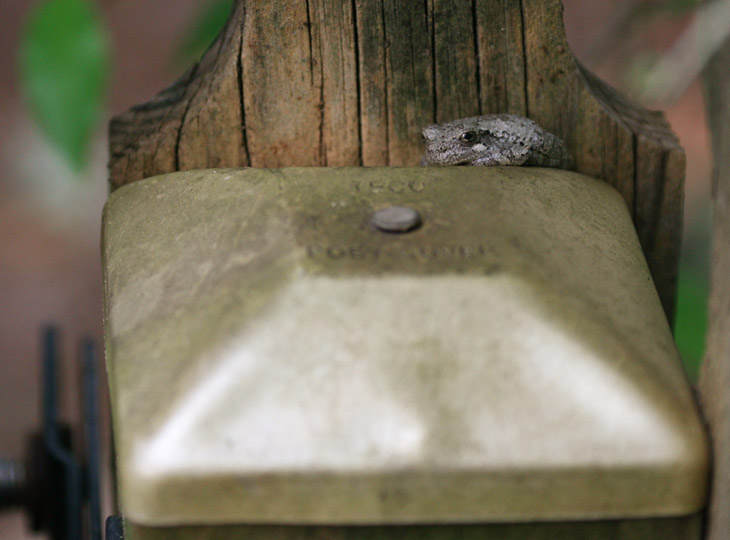
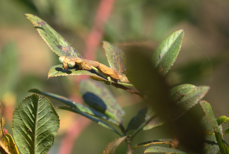
This one was mellow enough for me to do an effective scale shot, which you can compare with the first by knowing that the fencepost it is perched upon is a 4×4 inch post, so about 9 centimeters square – roughly the size of my palm. Or I could say that while the adult was the length of my thumb, this one was the size of my thumbnail (though that’s my forefinger in the pic.) Totally adorable.

I had taken several photos of this one before I even thought to check the second hydrangea nearby, to find another one in a matching position there, and identical in diminutive size. This is enough to make me suspect that we did have a successful brood cycle through the pond I’ve been working on – I’d seen tadpoles on two separate occasions, but never an indication that they had developed farther than that. Guess I’m going to have to watch a lot more closely next year.

juvenile Copes grey treefrog Hyla chrysoscelis on oak-leaf hydrangea Hydrangea quercifolia
This one gives the best idea of the color match and thus the camouflage, despite being right out in plain site on the topmost leaves of the plant – if you only glance at the photo you might not even realize there’s a frog in the frame at all, despite its prominence.

The very first image of the post was taken in natural light, but all the rest were taken with the softbox flash – up until this one. As the sun was lowering in the day, it peeked through the breeze-driven branches to occasionally fall thinly onto the second frog, and I endeavored to capture at least one of these brief light effects.

juvenile Copes grey treefrog catching weak sunset light through the branches
This gives the most accurate representation of the light conditions, as well as being a nice portrait – I think it’s my favorite frame, at least from a fartistic standpoint.

As the light and temperature fell, the frogs began to get active, and The Girlfriend arrived home too late to see the little ones, though the adult was still close by on another fencepost. I haven’t seen them since. The resident pond frogs are still around though, and I just missed a portrait of the largest when I went out there in the middle of typing this post – they’re quite shy, which is good, because it’ll keep them from getting eaten. I think this made me abandon my plans to clean out the bottom of the pond this winter, because I’m pretty sure I’ll have some frogs nestled down in the mud through the season. I can live with that.

1 232 233 234 235 236 329