I’m here to tell you from personal experience how nice it feels to accomplish something, and coincidentally, this ties in with the holiday, because today is Finally Make A Bare Minimum Advance Towards Goals Day. Yep, it’s the day when we get something done, no matter how minimal, that we can feel proud of instead of the usual background embarrassment over ongoing complacency.
For my part, it’s illustrating a little more behavior from my local and easy-to-observe photographic subjects, to wit, the Carolina anoles (Anolis carolinensis.) This actually occurred three days ago, but I hung onto it until now to make celebrating the holiday even easier; otherwise I might have had to accomplish something further today, the thought of which is more than a little galling. So let’s see what I got:
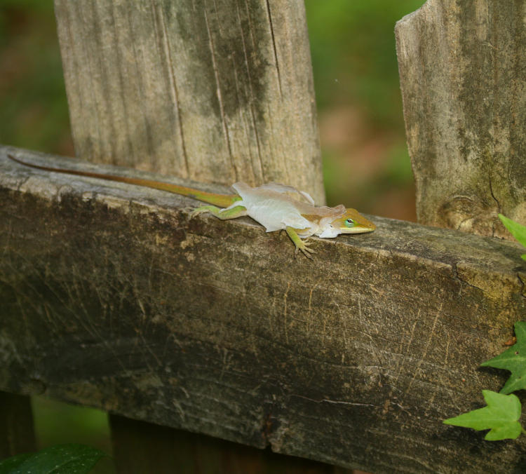
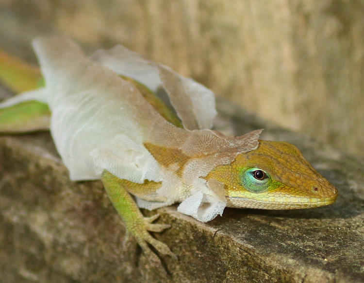
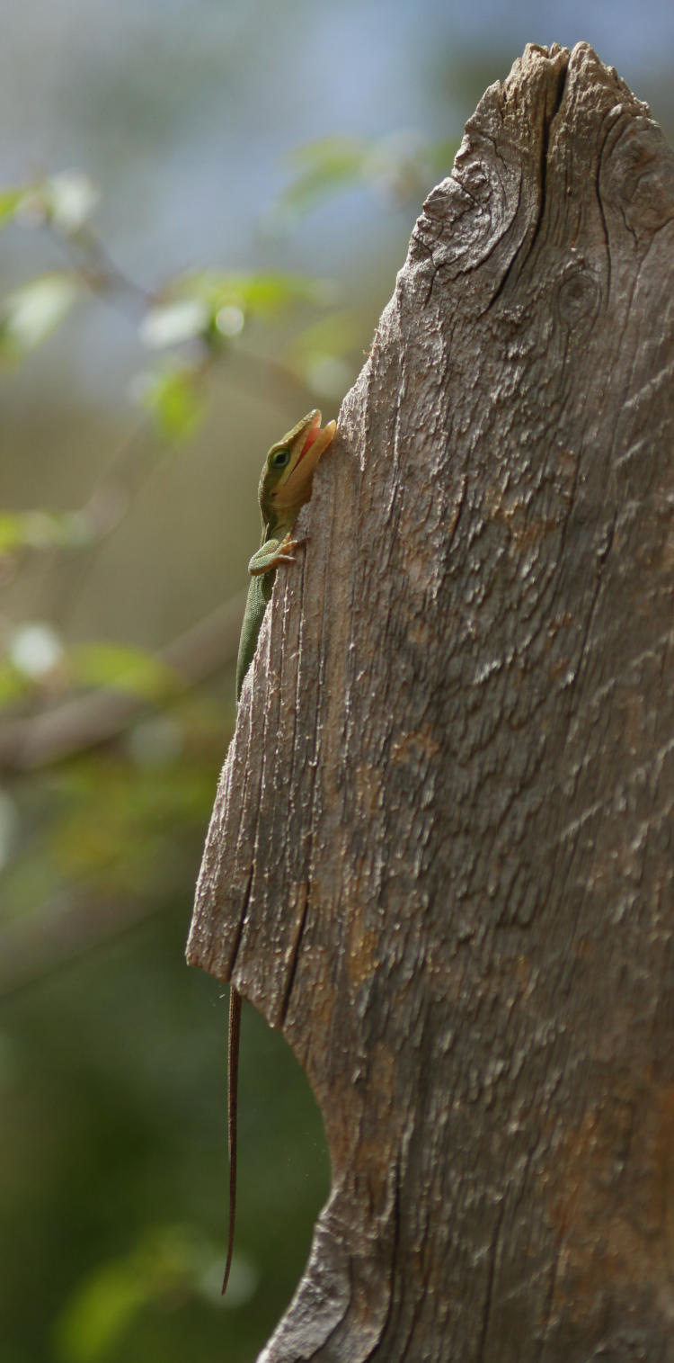
While doing a bunch of gardening, now that spring may actually be here (or maybe not,) I was marching back and forth among the sprawling expanse of Walkabout Estates, including multiple trips through the gate between the anterior and posterior spreads, spotting anoles more than a couple of times – they were attempting to enjoy the brilliant sun and pleasant temperatures and would probably have preferred not to be seeing me so much, but the gardening is almost as much for their benefit as it is for mine. Well, some portion of it anyway – a non-zero percentage at least. But a little later on, I glanced over and found this. This is how an anole sheds its skin, which happens several times a year – not like we do in tiny flakes, nor how a snake does all at once in one distinct piece. It’s pretty decrepit-looking, really. While we’re here, I’ll point out the curved shadow on the fence just beneath the lizard; this is the shadow of my own head, carefully maintained down low where the sudden eclipsing of the sun might have spooked the lizard off. We can go in a little bit closer.
The lizard was well aware of me closing in, but I moved as gently as possible and kept the noise to a minimum, managing not to disturb it. The chances are fairly good that this was one of those that I was seeing earlier that day, though no signs of the impending shed were noticed, and it’s also fairly likely that this was the one that I’d caught sleeping two days previous, since this was a bare meter from the location on the gardenia bush; I was leaning into/through the bush to get these frames.
This is the kind of thing that I want to capture more of, illustrating the various life habits of the species that I pursue, and the fact that it doesn’t happen often suggests that I should be spending a lot more time ‘stalking,’ observing as much as I can from enough distance that they don’t feel too threatened by my presence. This isn’t that difficult with the lizard species, since a few minutes of motionlessness is enough to convince them that the threat is gone – I just haven’t been dedicating the time to it. As for seeing more, such as through video, there really wasn’t anything more to see for this one: the anole was simply basking, probably helping the skin to dry out, and said skin would eventually be brushed away with passage down the fence and among the leaf litter, at least from what I’ve seen so far. Capturing the start would be nice, but admittedly a matter of blind luck. Still, it’s a goal.
What are those goals, you ask? There’s always a list, for any given species, and among them for the anoles is:
Foraging, and capturing meals Mating Giving birth (highly unlikely – this probably takes place in deep concealment) Territorial displays and encounters First emerging from shelter Avoiding (or not) predators Anything else that illustrates their typical behavior
Most of that would be ideal for video, of course, which requires adequate light and usually having the tripod already set up, because handheld macro video is far too shaky and nausea-inducing. So, not quite as casual as I implied above, but it’s also not going to happen unless I make it happen, so I need to kick myself in the ass to make it happen. Good thing that I’ve already observed the holiday for today though, so I can kick back instead and revel in the sense of progress.

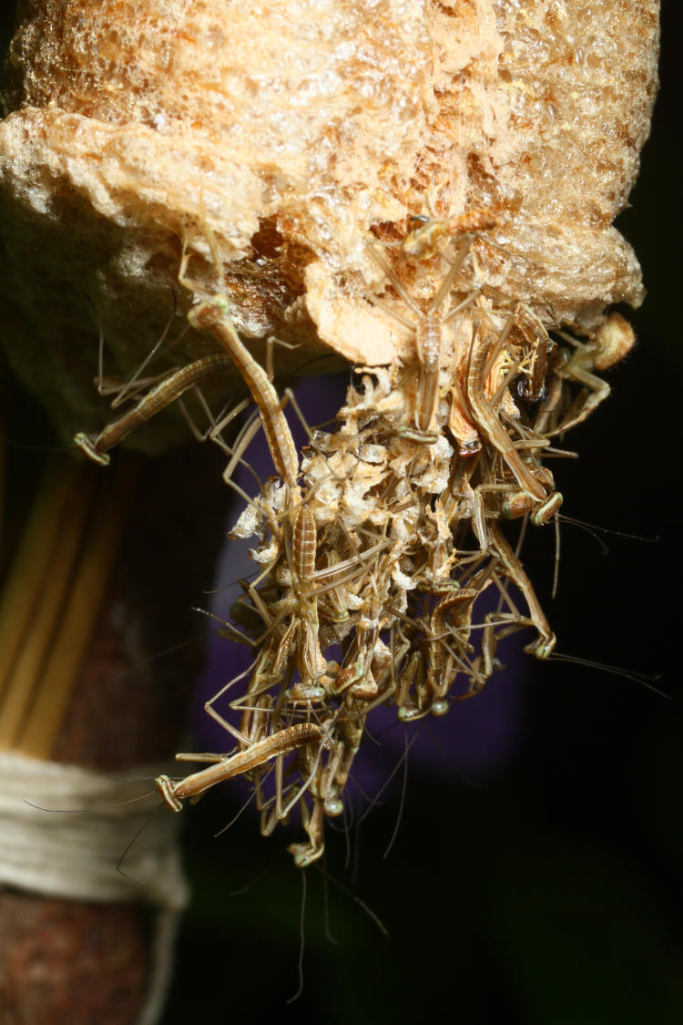


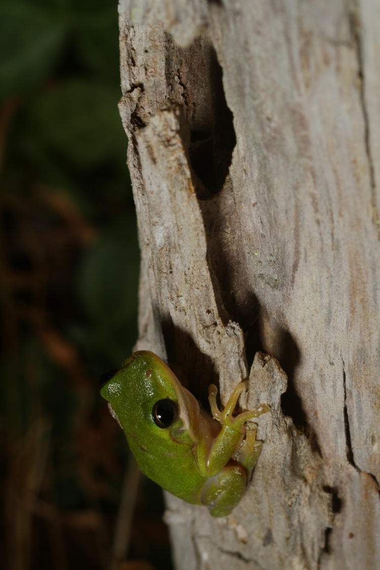
 Even if it had been removed from the greenhouse, there were/are still more in there, evident as night fell. I left the door open for a little while that night in case they decided they wanted out, but really, they’re better off within as long as their metabolism remains slower – there are few bugs for food, but the heater will keep the temperature from dropping too low until we’re quite sure the frosts have ceased for the season.
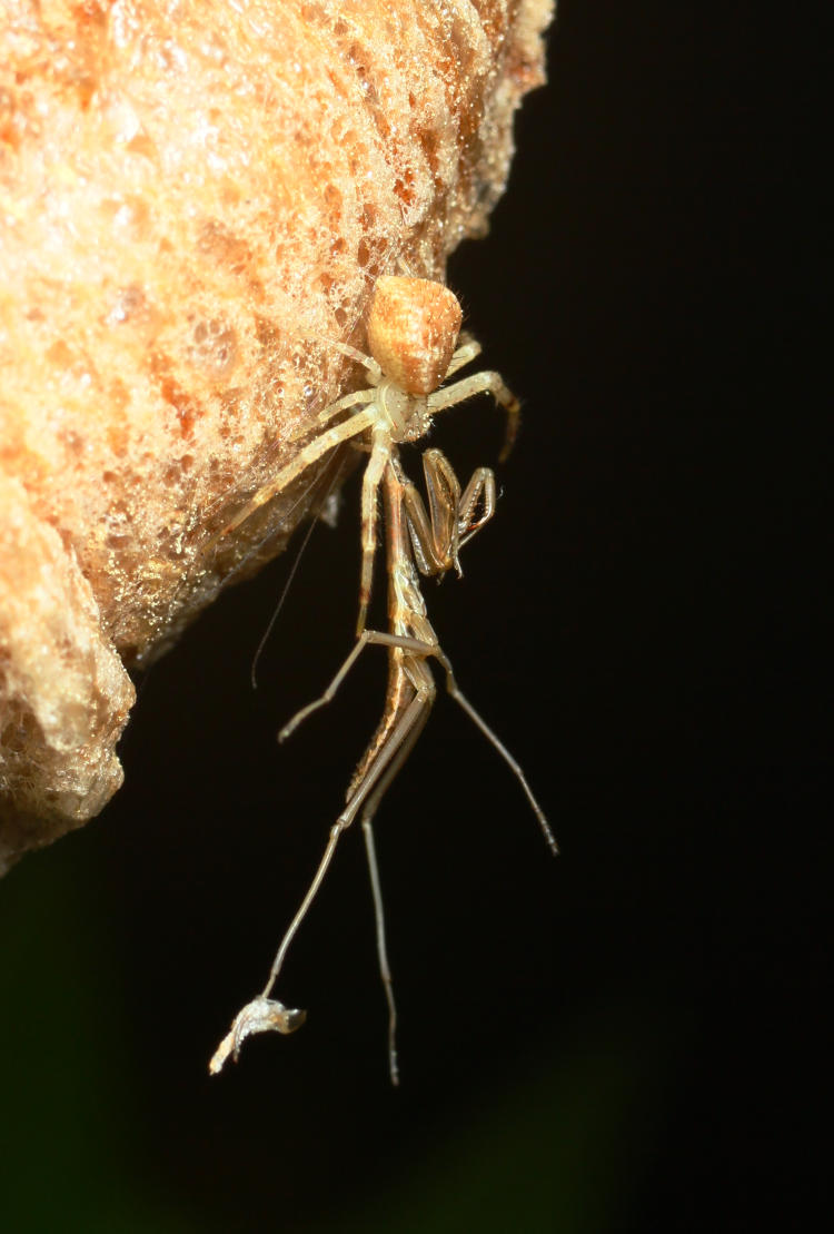