I know, that’s a pretty funny thing to ask on a blog that gets no comments whatsoever, but I have an active fantasy life…
Anyway, here are two versions of a view from the beach trip back in May:
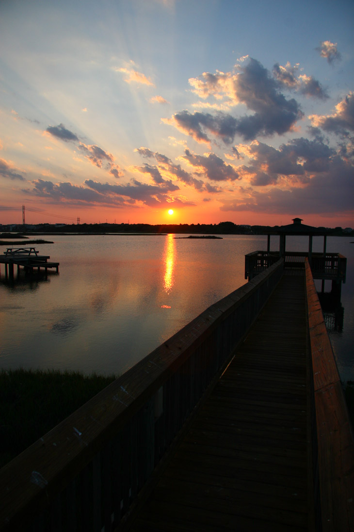
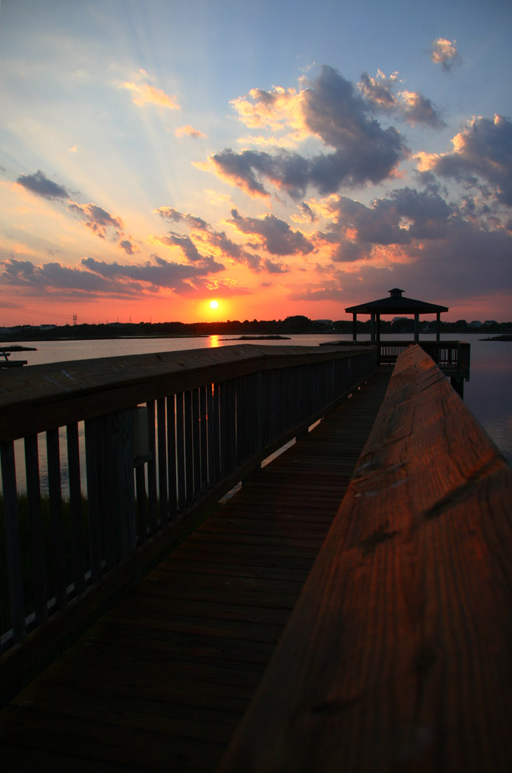
So, not a huge difference between them, but a noticeable one. Both were taken at the same focal length (17mm,) but for the second one I crouched a bit to use the railing of the deck as a more distinctive element. The first, by the way, was taken at eye level, and I’m not that tall – the wide-angle lens makes it seem higher than it was.
So, which do you like better? Go ahead and take a moment to consider before I introduce my own thoughts.
”’
”’
Here’s what I’ve been seeing myself. I like the first for the reflection of the sunset in the water, and more emphasis on the sky and the sunbeams. But the gazebo roof blends into the horizon, and the railed walkway itself seems too distant, as if we’re up on a ladder. In the second, the gazebo becomes more of its own element, and the railing is more dynamic and adds depth, but at the expense of the sunset – it no longer seems to be the focus of attention.
Had you seen either by itself, you might never have cared about how it could be different, but with the ability to compare, you can see how two slightly different positions can result in significant changes in the result, and of course have a hard time deciding on which is best. Or at least I do. Now I wish I’d split the difference for a third frame.
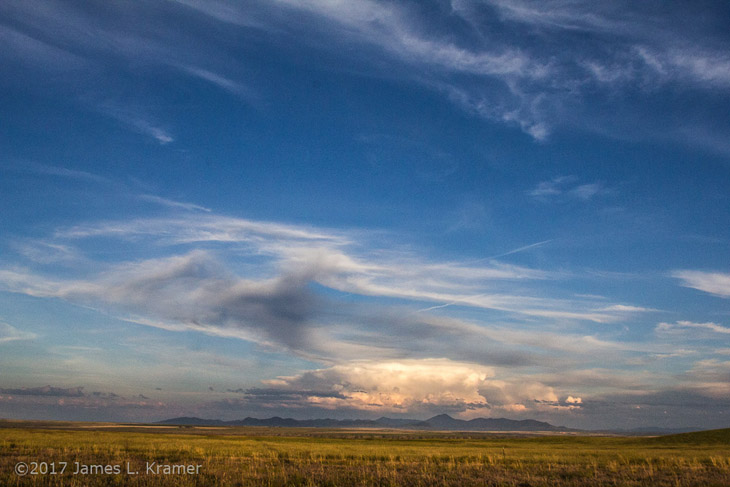
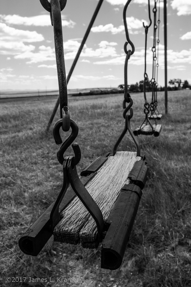
And yes, this was a blatant attempt to maintain that I’m still here and Jim’s pics haven’t taken over the blog. I just don’t have enough time to write much, still, but I’m working on it. A couple of lengthier posts are coming soon*
* You know, for my badly-mangled definition of “soon”…