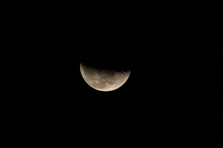
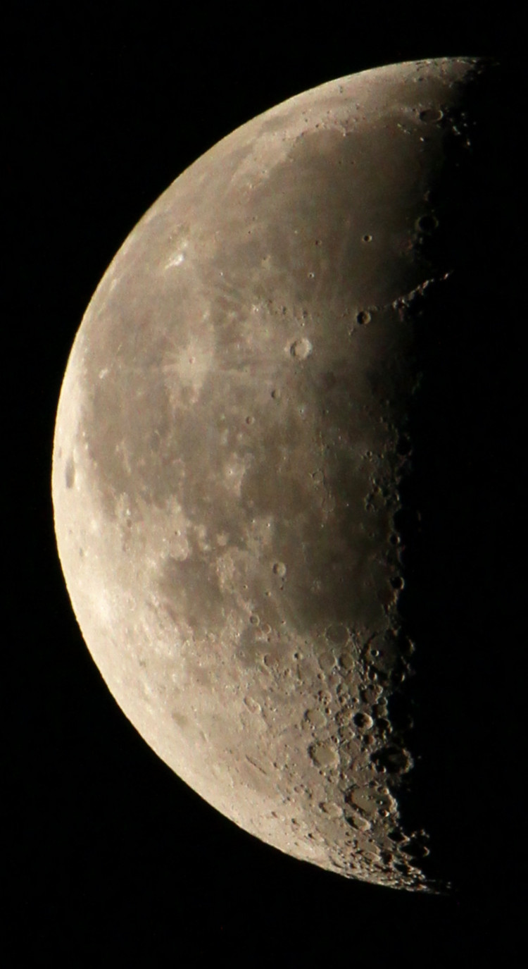
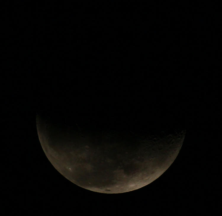
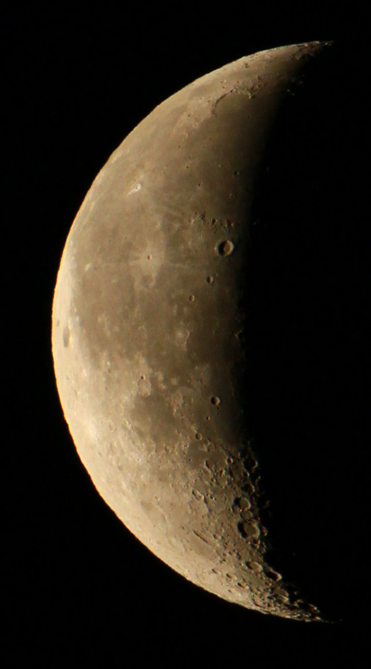
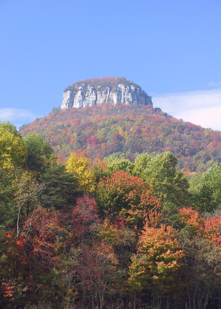
Back when I was trying to locate Crabtree Falls, I stumbled across this location on the map (Green Knob Overlook) and instantly recognized it; comparing Street View with my photo produces an exact match. Many years back I was doing my second trip along the Blue Ridge Parkway north of Asheville, NC, and stopped at an overlook to do a few frames. Not the best of conditions, since the day was pretty close to overcast, and as I stood there I watched the fog come boiling up through the valleys immediately below me. It was quite memorable, because you typically don’t see fog move like this, if at all. The Parkway was cut along the side of the mountain and immediately behind me, opposite this view, rose a steep mountainside. The wind suddenly started to pick up, blowing a bank of fog up over where I stood, and then I watched it also come boiling down the mountain face behind me in a quite dramatic and foreboding manner. In moments I was completely enveloped and visibility dropped down to a dozen meters or so. Abruptly I realized this was not fog but an actual raincloud – not like there’s a lot of difference, but I was high enough up in the mountains that ‘cloud’ was actually more appropriate. I could feel the humidity in the air and the dropping temperature and took the hint: within a minute, I had the cameras and tripod in the car just as the first raindrops fell, and by the time I was leaving the parking area it was rapidly becoming a deluge. This did, in fact, continue for the next hour and I cut my trip short, knowing I would get no more decent opportunities within the mountains.
The Blue Ridge Parkway meanders all over the place, constrained by the terrain, and I didn’t even consider trying to locate the spot where I got the photos – and then happened across it by accident, and confirmed it for this post. You really should go to Street View, turn to face the rising mountain opposite the parking area, and imagine a billowing cloud of grey rolling directly down that face towards you. While I had done some video of the cloud coming up from the valley below, I had put that camera away before the bank came down the mountain face – no great loss, because what I had for video at that time was the Canon Pro 90 and the quality was execrable, which is why I’m not uploading those clips for this.
But if you’re after mountain photos, the exact location really doesn’t matter a whole lot; if you’re anywhere near this spot, as long as conditions are good you should be able to find plenty of scenic views. Curiously, I’ve done too few trips out there and my ‘Mountain’ stock folder is disturbingly spare – I really should work on this.
After three days of near-solid rain, including a horrendous downpour while we were getting dinner last night, the sky suddenly cleared, mostly, and I went down to Jordan Lake out of curiosity, mainly to see how much higher the water level was. Surprisingly, it barely appeared higher at all, so either they kicked out the stops down at the dam end, or most of the water in the area hadn’t yet drained to the lake – perhaps both. But while there, I shot a few frames of opportunity. Above, I played with the angles to get the sun peeking past the tree, and for one frame, I slowly leaned out until the sun just made it past the trunk – it was weird because the shadow line was so distinct, my left eye was catching the light before it was appearing to my right eye through the viewfinder.
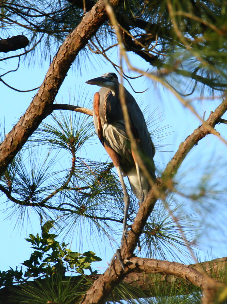
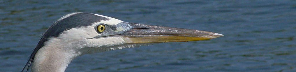
Below, a great blue heron (Ardea herodias herodias) took a prominent perch.
These trunks, by the way, are the same ones that opened this post exactly a year ago, but this is the first time that I’ve ever seen a heron chose to perch there. I’m glad I caught this when I did, because it didn’t last long.
Sunset actually turned out halfway decent – not fabulous, but better than normal.
The post-storm clouds, the patches of humid fog rising from the trees in places, and the low light angle made a complicated mix of colors while there really wasn’t much red at all, but hey, it’s the best I’ve seen in a while. A little later on as the details started to fade, i did a small experiment with the foreground and flash.
Despite dropping the flash exposure down a bit, the buttonbush (Cephalanthus occidentalis) was still a little too bright, so I burned it a bit darker in GIMP. This was shot blind, by the way, roughly aiming the camera held out at arm’s length without framing through the viewfinder. As you might imagine, this is hit-or-miss, but I’m getting better at it.
And finally, a very weird-looking curiosity.
I had the camera set for increased contrast and saturation, which unfortunately was too much for this frame, so I adjusted it back down in post. This was exactly how the cloud looked, only a portion of it catching the sun behind me (well below the horizon now) while the rest remained in shade. I get the irresistible impression of a long exposure with lightning illuminating the cloud from within, because I have plenty of images like that, but no, this is just what you could see from the lakeshore.
I know I’ve been to Jordan Lake too much, and have been trying to expand to other places, but scheduling and weather have not been supportive of that. It’ll change shortly.
It’s occurring to me that it would be a lot easier to run experiments on photographic and camera options if I had subjects that performed consistently and when I needed them to. I can’t even get the cats to do this (no duh,) so it certainly isn’t going to occur with the raptors. Were there a bigger market among nature photographers (or, you know, if we actually got paid a decent amount,) I’d suggest someone start a business of trained hawks to perform on command, or perhaps even start it myself.
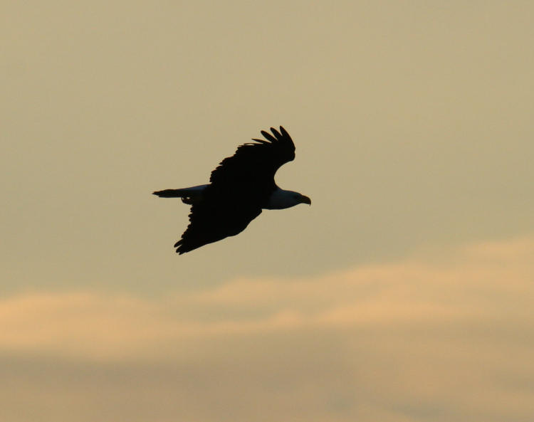
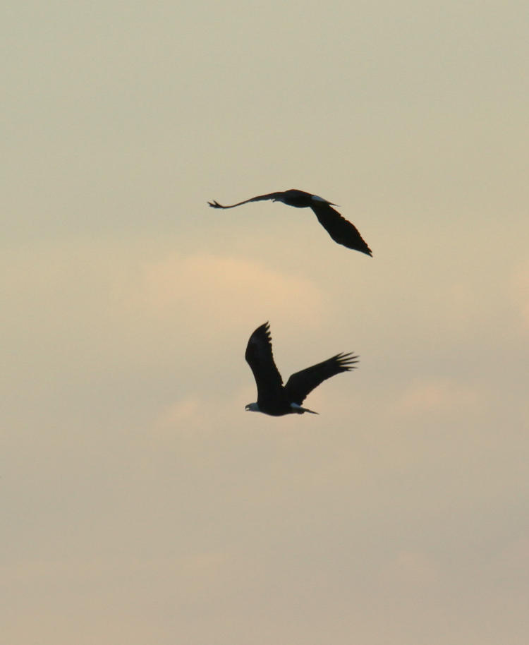
On Monday, before all the rains came, I went back down to the lake to see what I could see, and potentially try out some new ideas. Naturally, the osprey and eagles weren’t being as cooperative as they could be, though I still managed a few acceptable frames. Like this distant bald eagle (Haliaeetus leucocephalus) circling lazily overhead that nevertheless appeared to question my presence.
The eagle only got marginally closer, yet never displayed any indication of actively hunting, but then again, the osprey (Pandion haliaetus) weren’t doing all that much either. Someplace not too far off, someone was burning off a significant amount of wood, judging from the pall of smoke that occasionally drifted over the lake surface, and I believe this particular frame suffered a little because of it.
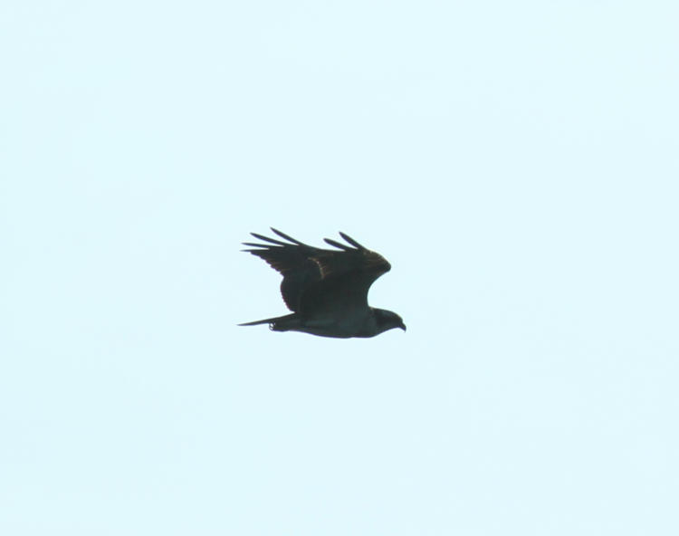
What I was hoping to get were a few good dives from the osprey, or really anything else that wanted to pretend it was an osprey, so I could see if some changes that I’d made actually improved things. It wasn’t a good time for this, apparently, and I saw just a few in the space of a couple hours, with only a handful of dives in there. One, I almost missed. The sky had cleared of all bird life and the camera was resting on my knees when abruptly, fairly close by, I found an osprey had swept in without any circling whatsoever and was already showing signs of having seen a fish, these being the dropping talons and the sharper banking.
With luck that I don’t think I’ve ever had before, the osprey was not too far off and facing almost directly towards me as it spotted the fish. Come to think of it, maybe if I could find just a fish trainer? That could work, though it might be a lot of effort for trainees that keep disappearing.
There was very little hesitation as the osprey entered the stoop (the dive after prey,) and I endeavored to track it down. The lighting was a bit hazy so the colors weren’t as bright as I would have liked, but see all that above.
Definitely accelerating now – look at how cupped the wings are.
I can only assume the fish began moving off, perhaps having spotted the bird bearing down, because in a split-second the osprey stretched out slightly to extend its glide. I say this more from viewing the photos afterward, because I was only trying to keep the bird in the frame as the camera cranked out three frames a second.
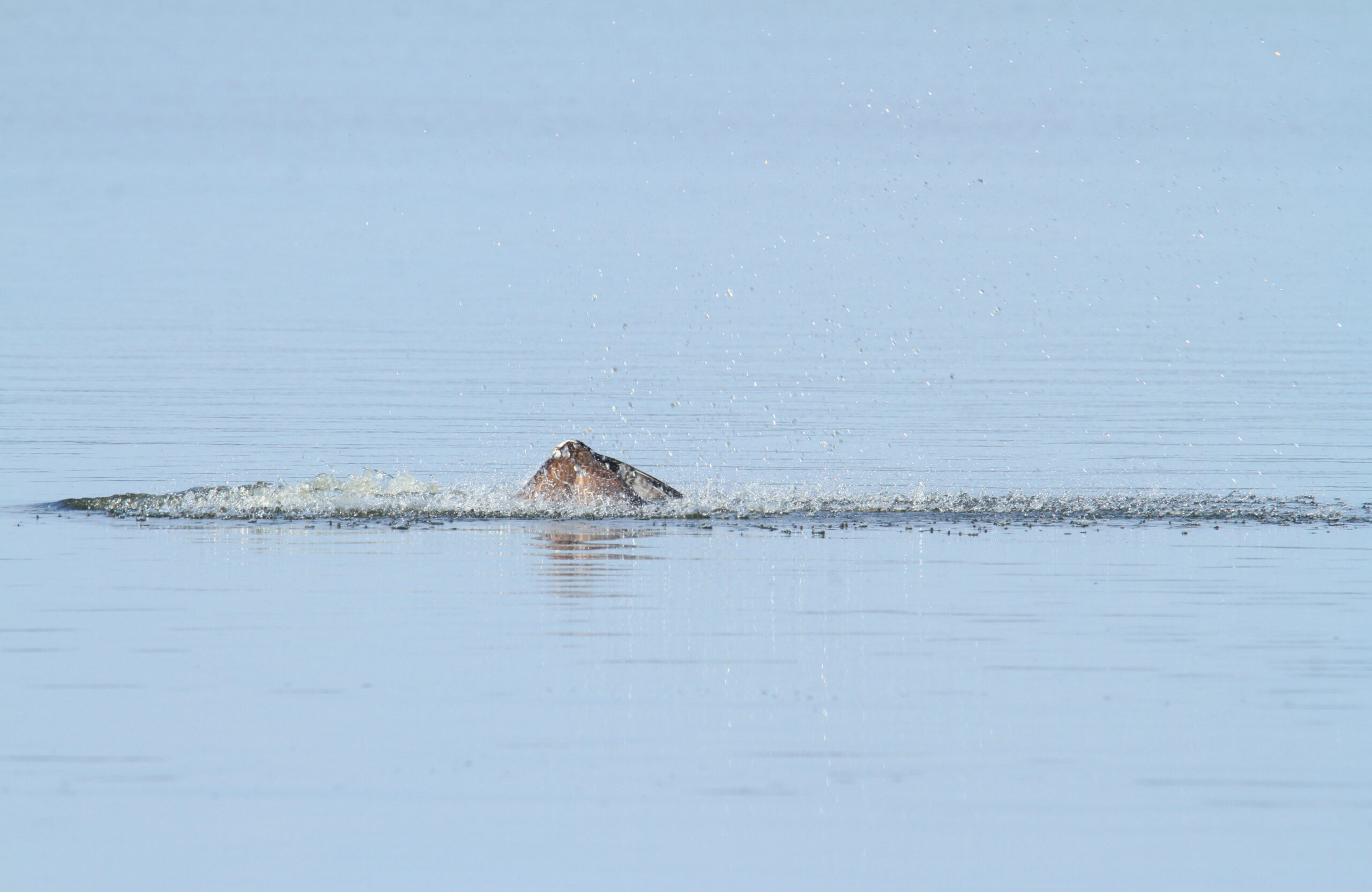
I still blew it, both in tracking and in running an experiment. One of the changes that I made was to assign a function to a button under my thumb, one that shut off autofocus as it was held – this is intended to prevent the AF from suddenly grabbing the background as the diving birds cross the horizon line. However, not only was the osprey too close for this to have a lot of affect, it was coming towards me, so shutting off autofocus would only guarantee that focus was off – better to take my chances. Still, I failed to keep the bird centered as it entered the water, and the splashdown was 90% out of the frame, but what I got was motion-blurred a little anyway. However, I was back on as the osprey emerged back up from its brief total submergence.
This is only slightly cropped from the full frame, to give you an idea of the proximity, and looked perfectly sharp in the viewfinder, but I’ve been burned on that before – it’s hard to tell as the action is going on and everything’s changing, plus the resolution of the little image in the viewfinder isn’t anywhere close to the actual image. Neither is the LCD on the camera back, so checking it onsite remains meaningless. I was prepared to find that focus wasn’t quite on for this frame, and very pleased to be wrong this time. That’s the secret to a happy life: maintain low expectations.
But we need to go in closer on this frame.
Can you tell from this that the osprey missed the fish? No, of course you can’t, because birds don’t really change expression, but it would be easy to believe this anyway, and the osprey did emerge empty-taloned, which was more the average for the day while I was out there. So from an experimental standpoint, I didn’t have a lot of luck, but if you count the results instead, well, okay then.
Today is the summer solstice, the longest period of daylight in the calendar year, as well as World Humanist Day – but I’m not posting about either of these (or much of anything, really.) It’s been raining for two days straight, which we’ve needed, which is a horribly adult thing to say – pathetic all around. But this means I’ve done very little photography, only some of that for a halfway-decent reason. Mostly though, I’ve just been neglecting the blogohedron. Some semi-recent photos will be coming up shortly, so for now I’m featuring two images from yesterday, between the wets, and recognizing the holidays in the lamest way possible.
This is naturally one of the pansies (Viola x Wittrockiana) that The Girlfriend put into the front planters, which are now also hosting the regular balloon flowers and the decorative sweet potato vines, as long as I can keep the damn deer from them. I wandered around shooting a few frames while things were damp, but on unloading realized that a few of them I could do better, though this wasn’t one of those chosen to be revisited. Still, while out there a bit later on, I decided to fire off another frame in case the conditions seemed better, only this time there was an addition.
I checked, and there was not the faintest sign of the crab spider (genus Thomisidae) in the earlier frames, but it hadn’t been that long since the rain had stopped, so it was probably still well under cover. There is a difference of three hours between these images, but you can see that only some of the raindrops have disappeared – it was that kind of day yesterday, still is today, and will remain so for a while yet.
Meanwhile, a friend has slammed down a challenge: two images that indicate, “True,” and, “False,” without emphasis on the primary colors of red, green, or blue, without being too creepy, or vague, or really, overly specific. This has had me picking through the stock folders for a while now. But I like the challenge – the question remains as to whether I’m up to it or not.
This one’s precise – not of where I was standing, because the angle isn’t perfectly recalled, but certainly of the tree itself, which is still there despite this image being taken in 2003, I believe. I was cruising around at night on my bicycle looking for good subjects for B&W film and realized that I could frame the moon within the limbs of this tree. I was working with an Olympus OM-10, partially because it was light and easy to carry on the bike, partially because I could leave it loaded with Ilford Delta 400 while shooting weddings with my workhorse Canon, but this meant only guessing at the exposure and not even knowing how close I was until I unrolled the negatives from the developing reels. Yes, I was doing my own developing too (which I really need to get back into again,) and this was a little problematic in Florida during the summer months; the ideal chemical temperature for film developing is 20°C, but since the water lines weren’t buried very deep the water would come out of the tap at 25°C. I could either try to maintain an ice-cube bath at the proper temperature, pretty tricky for the half-hour that it takes to develop a roll of negatives, or adjust the development times, knowing that contrast would be altered.
I don’t recall which I did for this, but it came out just fine regardless, and the guess at exposure time was perfect. The sidelighting on the tree and mosses, clearly not from the moon, was actually from the floodlights of the old school that owned the property, which would have produced an ugly amber color cast had it been on color film – here it just adds texture.
While I’m not fond of picking favorites or even qualifying photos in this manner, I think this is probably the best true B&W image that I’ve shot – it’s not a huge selection, after all. But this also throws down the gauntlet – gotta dig out the film cameras again…
On an outing the other day, I captured very little of interest, but I can throw down a couple of frames anyway. I initially went back down to Jordan Lake in an attempt to repeat my luck of a couple weeks ago, but that failed miserably. So while poking around, I snagged a few images of vague appeal. Boy, just selling the excitement, aren’t I?
This was not at all the way to go about it, but I was too lazy to change lenses, plus the fact that in the time it would have taken, the butterfly might have left, plus the fact that I still wanted to be ready for osprey and eagles, so this was shot with the Tamron 150-600 lens – I can’t complain. This is a painted lady butterfly (Vanessa cardui) feeding from the recognizable blossoms of a buttonbush (Cephalanthus occidentalis.) I shouldn’t tell you this, but I trust you: the synchronicity of the butterfly’s wings and the leaves of the bush wasn’t actually noticed at the time, though I cropped the frame to emphasize this here. But how well does the long lens perform as a macro? Let’s go in closer on that same frame and see.
That’s not too shabby, that is – or isn’t; what’s the proper word there? Either way, I’m not going to make a habit of this, mostly because I have two good-performing macro lenses already that aren’t one quarter as unwieldy as the long Tamron, but it’s nice to know that its close-focus ability is more than acceptable.
Eventually I left there to check on two different osprey nests to see if there was evidence of the young having hatched, but on the way out I heard some nearby ‘muttering’ that I recognized, and immediately spotted this guy taking a perch in a narrow opening in the branches.
I’m hesitant to switch away from the long lens too quickly, because that habit has stood me well before, and again here. This red-bellied woodpecker (Melanerpes carolinus) might well have been a juvenile, and I say that partially because its proportions didn’t seem quite like an adult, and partially because it was cackling softly with another in the immediate vicinity, who I caught only the barest glimpse of; I’ve had experience multiple times of woodpecker siblings hanging around together and gossiping softly. This one, at least, shows its namesake pinkish belly, one of the least visible traits for a species to be named after, but not as bad as double-crested cormorants.
Neither osprey nest showed signs that the young had hatched, though both appeared to be occupied, so I’m still biding my time. But while walking back from the second, I was passing a small field of wildflowers and shot another few frames of opportunity.
I did a brief search for both of these species, but there are too many variations of each, and too few details to pin anything down, within my sources at least. The flowers, almost certainly of the aster family, were no more than 15mm across, making the bug quite small in itself, but I can at least identify it as a True Bug (Hemiptera) because of the wings and proboscis. This was taken with one of those dedicated macro lenses, the Mamiya 80mm, but in difficult conditions, since the flowers were quite tall, over a meter, and thus swayed in the slightest breeze. Between that, and my attempts to hold still at the precise distance of sharp focus, it was largely hit-or-miss, trying to fire off frames as everything came together. Most of what I shot will be discarded, but this one is close enough, as a tighter crop shows:
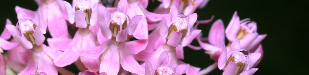
Those are some fine markings there, continuing even onto the legs, though not helping it blend in with the aster at all. But you can imagine trying to succinctly (yet effectively) describe it in a search engine to determine the species; not worth any more time than I’ve already spent. I feel quite comfortable that your lack of certainty regarding the species will not be debilitating.
Scared up just a couple with the last big sort, and had a little bit of a theme going. What luck!
While down at the Neuse River, three great blue herons (Ardea herodias herodias) were visible simultaneously at three different compass points, though most images of them were lackluster. This one, however, gained some action points when doing a quick shake to settle its feathers. No, it’s not missing a wing or anything – that’s the natural coloration around the wing joints.
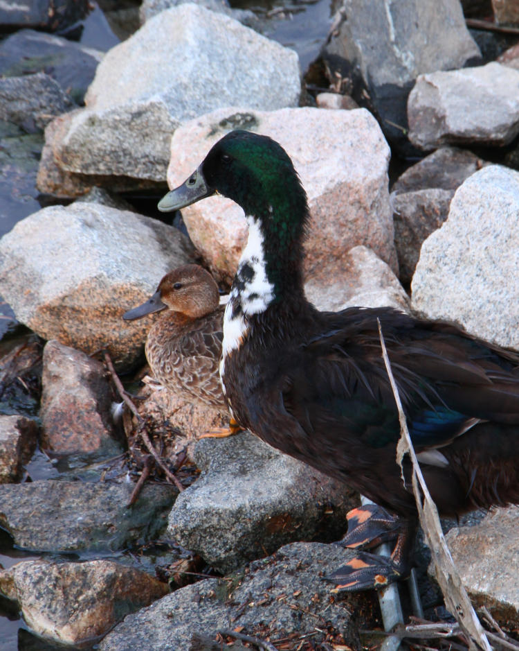
For the end of month abstract last month, I featured two mallards (Anas platyrhynchos) captured while panning, and in going back through the images I realized that I did have a frame where all three of them were closer together, though I still liked the panning blur from the other one better.
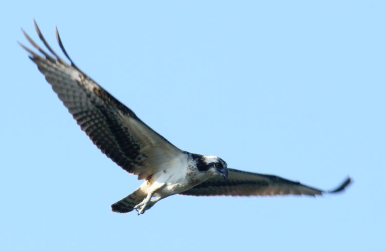
Meanwhile, I mentioned in another post that, while I had numerous overhead passes from osprey (Pandion haliaetus,) somehow none of the frames that I captured while they were so positioned were actually sharp, so I’d passed on this one at the time, but then pulled it back out again because the dead-on stare from on high just had a small element of humor to it.
Osprey, like most if not all birds, cannot change expression, but this viewing angle makes the supra-orbital ridge, the ‘brow line’ above the eyes, about vanish and so we actually get an impression of surprise. Probably just an impression, because I’d been in plain sight for at least 20 minutes at this point so the osprey was simply glancing down at the sound of the shutter, perhaps getting its own curious pose from me as I craned backwards with the heavy lens (counterbalanced by the gut, though, so I was in no danger of going over backwards.)
And one not-so-blurred, damn sharp in fact, but it has a curious trait that I wanted to point out.
Nothing seeming too remarkable, until you look close at the eyes and realize that you can make out the pupils even from this awkward vantage. And again, from 15-25 meters away as it cruised above the water looking for fish. But the focus is so short that the talons are blurred, if that makes you happier.
I’ve been back twice now, by the way, with virtually no activity either time, and evidence that the closest nest, at least, had not hatched yet. Just happened to get lucky with an extremely busy day, I guess.
This is just an initial experiment, which admittedly came up promising, but I’m aiming for better.
The beginnings of the idea have been kicking around in my head for ages, but then this variation came up just a few days ago, and I finally got the chance to pursue it. There’s been some faint color tweaking done to this frame, but otherwise it’s unaltered.
The most realistic-looking aspect, isn’t. The moon is actually one of those decorative self-illuminated orbs, about 18cm across, that I’ve had hanging over my desk at Walkabout Studios for a few years – they’re pretty cool, really. Its companion is – no, go ahead, guess. I’ll wait.
.
.
… Dum de dum de dum…
.
.
Give up? Or did you guess that it’s a superball? Which is correct – it’s semi-transparent, which made it perfect for this, and illuminated by a flashlight held just outside the frame. I did some others, with the light source actually underneath the superball and both bodies closer, but this one wins the post position. Both objects are perched atop light stands on our back deck, with me shooting straight down on them from the upper landing so the lightstands are hidden behind them from this perspective, but it was also done at night with no other lighting so they sat in darkness anyway. The superball is actually significantly closer to the camera, shooting at f22 for a high depth-of-field, but I’m going to try others with them closer to the same distance, which will make the ‘gas giant’ seem much further away.
I used the interior illumination of the moon ornament for these, but it’s a curious color register from the LEDs used and certain wavelengths of color seem absent, which makes tweaking the Curves kinda tricky. I could always try exterior illumination, possibly even doing moon phases, but it would have to be bright light and anyway wouldn’t work with this particular ornament, which is designed to look proper with its interior lighting and so the surface features aren’t true to the moon: to make the darker mares, the material has to be thicker and thus they aren’t smoother and flatter like the real satellite. However, I could probably print an accurate one…
We’ll see what pops up here later on. Aren’t you excited?
Not long after moving to North Carolina in 1990, I was following some trails, really, quite some distance and found that they ended up at University Lake in Carrboro. I had my (not so) trusty Wittnauer Challenger in hand, a rangefinder with a fixed and so-so 50mm lens, looking for scenic opportunities, when I heard the rowers approaching. I found a decent gap in the trees and timed it as they passed through the center and the glitter trail, producing one of my earliest fartsy prints. Which, truth be told, I’m still fond of despite the thousands of photos taken since, and the commensurate (more or less, anyway) increase in skills. Many modern lenses would have taken the sunlight shining almost directly into the glass and rendered countless ghosts and flares, but this one just made it seem appropriate.
Know what’s scary? The young couple in the boat could have been married, divorced, remarried, and have not only kids, but grandkids since this photo was taken – who knows?
By that, we mean, “Post-processing,” which some may argue doesn’t really apply as composition, but it all depends on how you use it, doesn’t it?
I’ll lead off with saying that getting the image that you want in-camera, while your chosen subject is right there in front of you, is not just preferred, you want it to be an integral part of your shooting – it’s really hard to go back and get something that you missed. Even if the location is close by, the light will have changed, the foliage will be different, and so on. Examine all the possibilities that you can think of while you can – experiment, change positions and angles, try different settings or metering methods, whatever it takes. And don’t trust the preview on the little LCD to tell you anything crucial; take more images with little variations to be sure.
But the way you treat the image afterward, back home at your computer, can have a significant effect on your images as well, and there are certain skills that should be developed for this. Composition is not just what you have in the frame, but also what you leave out, and even the positioning in the frame will determine whether something is your main subject or not. I have a whole page and video on cropping, so I won’t repeat too much here, but there are definitely times when the original image isn’t strong enough as taken, yet can become entirely different with a little creative cropping. On occasion, you will suddenly discover the possibilities within that never occurred to you while taking the photo – including sometimes finding a hidden subject.
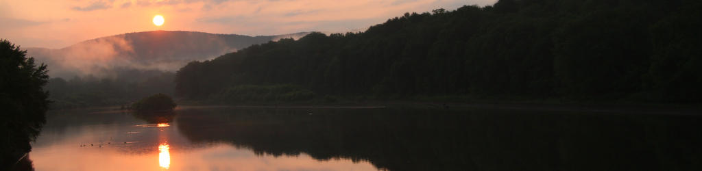
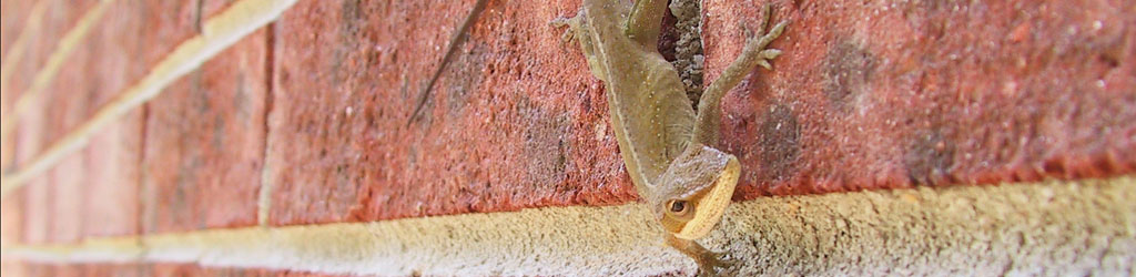
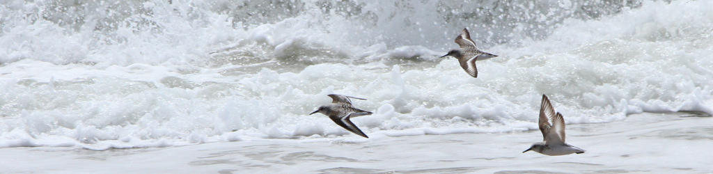
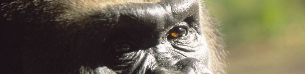
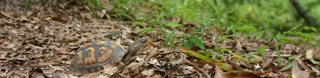
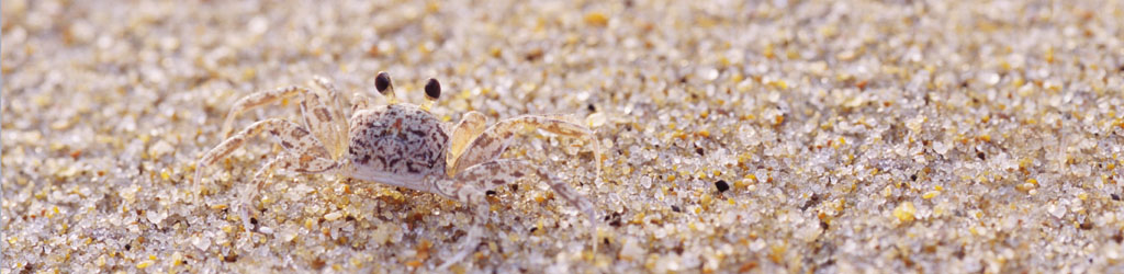
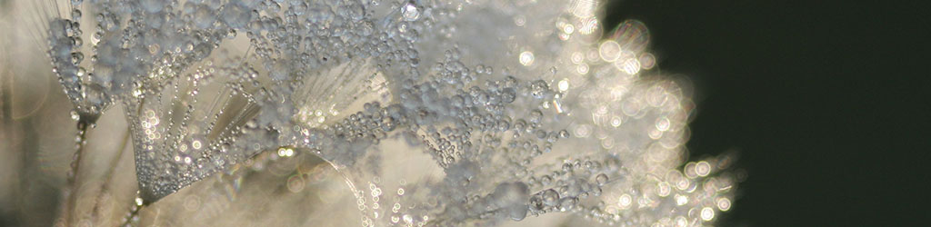
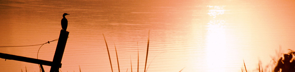
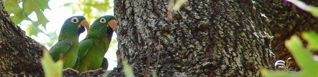
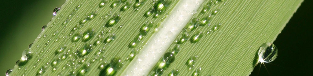
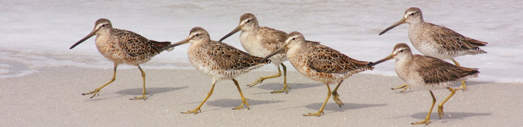
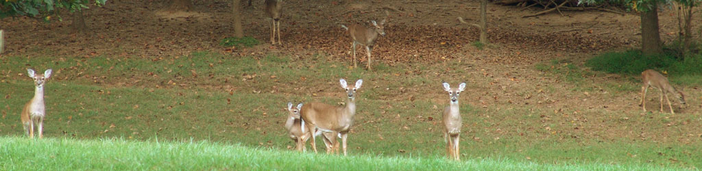
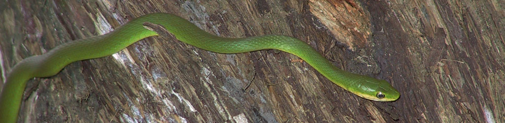
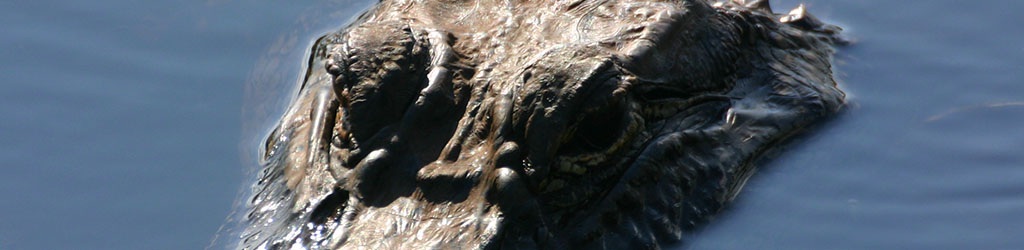
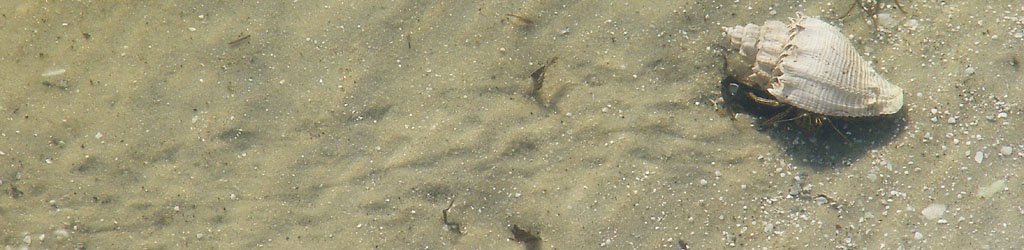
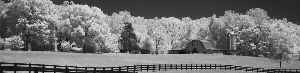
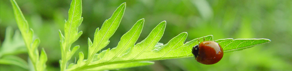
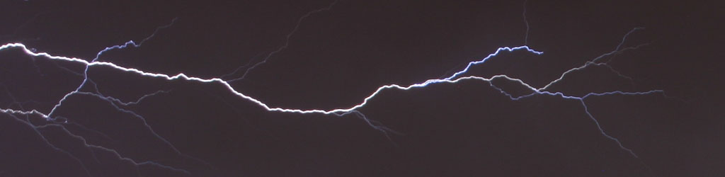
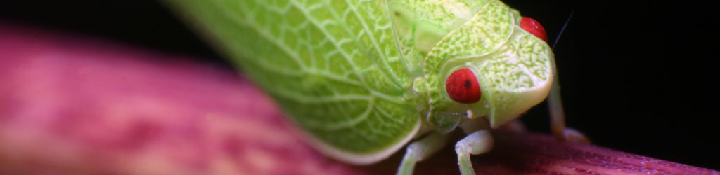
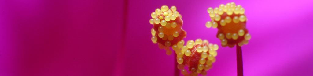
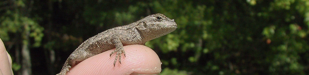
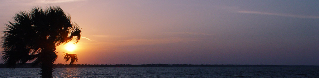
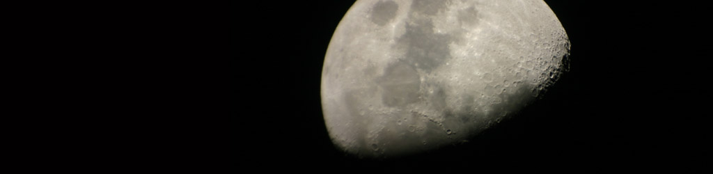
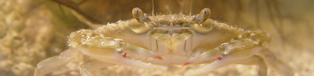
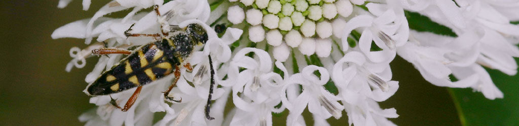
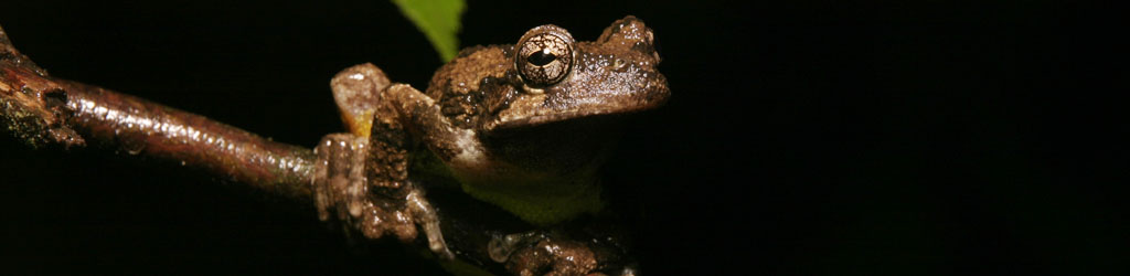
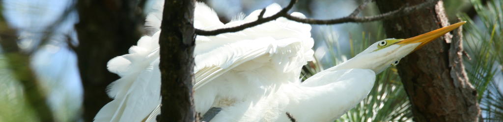
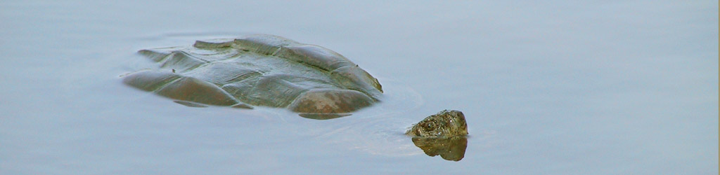
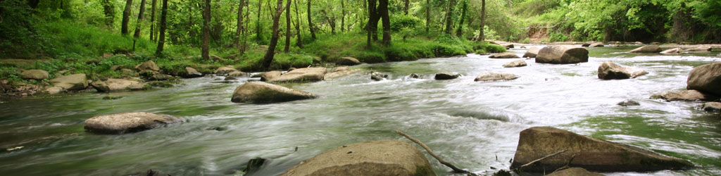
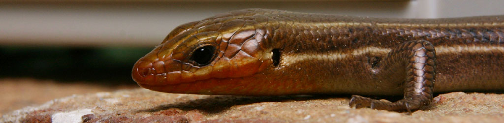
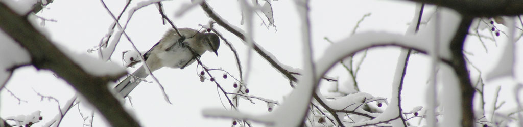
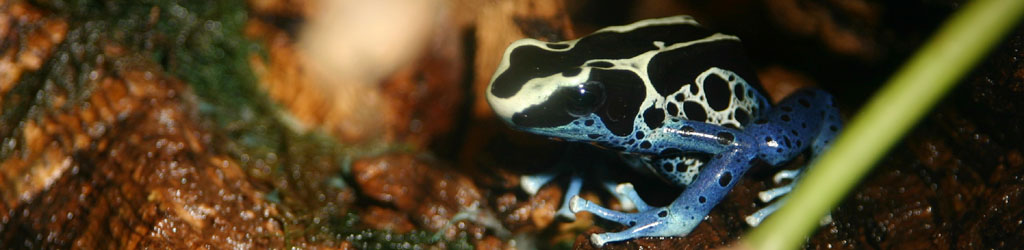
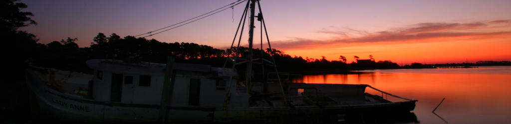
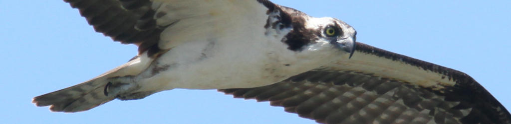
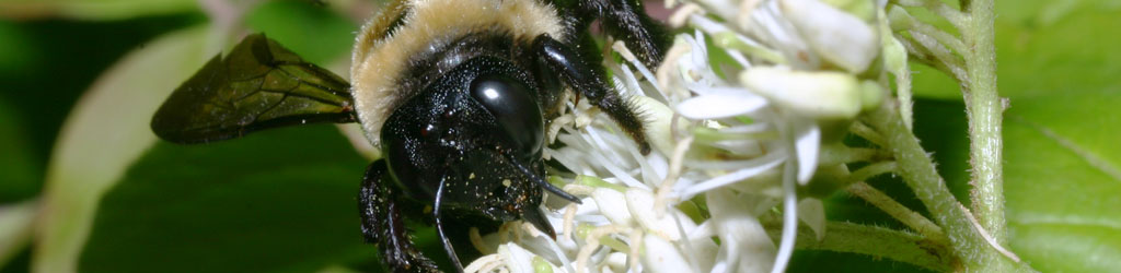
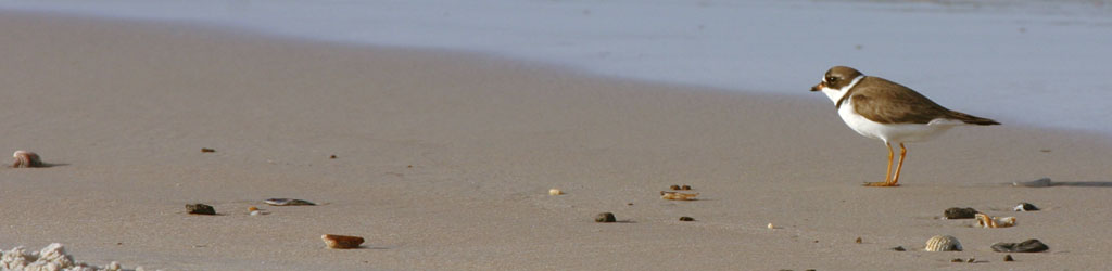
End usage dictates a lot of this, too. We might see the potential in shooting the image vertically, but then a desire for something horizontal pops up, or we need to fill a particular space, or a client wants a specific frame size. Weddings and portraiture especially have demands for 8×10 or 11×14 formats, neither of which fits the standard 2×3 (8×12, 11×16.5) ratio of the typical SLR frame, so we need to know how to accommodate these, without ever forgetting to leave enough space to crop down while we’re actually shooting the images. When a client wanted a selection of images in panoramic or banner form, something that I had rarely ever considered aiming for, I was forced to find out how many images that fit their other criteria could also be turned into panoramics. But it led to the banners at the top of the pages here now.
It’s well worth it to have decent photo editing software on your computer, and learn how to use it for the most common needs of course. Is it necessary to have the bestest and most elaborate package? Not ever, in my experience – I’ve used Adobe Photoshop right alongside lightweight and freeware packages like GIMP, as well as several ‘consumer’ programs, and presently use GIMP for all of my needs. Many packages are intended for graphics professionals doing elaborate creations, with only a fraction of their tools and filters aimed towards photography itself, so why pay for things you won’t use? Below I’ll break down different tiers of functions, for better than 90% of the edits you would perform.
But first off, Optimize your monitor. Making sure that your display is as accurate as possible will help you in editing, and really, if you’re doing anything with photography (or artwork, or design, blah blah,) you really should have this locked in. My old page on adjusting your monitor is here, but I fear that it is sadly outdated now; I would at least recommend finding both a ‘typical’ image with a great range of colors and light levels, and a good gamma image that gives step transitions between full white and full black – these allow you to know when your display is as good as it can get. Recheck this at least every six months, because monitor settings wander, and of course after any graphics hardware or software updates. Also, make sure that your viewing/editing position is as close to straight on to the monitor surface as possible, since most monitors present a color and gamma shift when viewed at an angle.
Some basic functions you should definitely have in your arsenal:
Cropping and Resizing. Already covered in detail, and really, any program can perform these more than adequately. The biggest difference that I’ve seen has been in upsampling, making an image larger than the original, and there are variations in the algorithms used for this. If you end up doing this a lot, it might be worth the search for software that produces the best results for you.
Color correction. Again, typically covered by most programs quite well, though using this effectively becomes almost an art form in itself. Many programs have a Curves function which allows you to strengthen or weaken colors within particular brightness ranges, which might seem confusing until you learn how it works. Briefly, I’ll point out that sunlight and shadows actually have different color registers, and you can mimic or reduce the effect of these as needed: for photos taken in bright sunlight, the shadows will lack some of the red and yellow color registers that are present in the highlights, so you may want to reduce this effect, or accentuate it, depending on the image and usage itself.
But there’s also the bare fact that most artificial light has a color cast to it that you may not desire, or you’re trying to improve skin tones, or you simply need more contrast or saturation. There is no way I could provide a decent guide to this, especially not in a single post, but I’ll offer two bits of advice. 1, Practice, a lot – it’s not a simple thing to learn. And 2, Make Subtle Changes, less than you think you might need, at least at first. We get used to seeing things and can keep pushing changes farther than they should go, thinking that it continues to improve; instead make smaller changes, then set aside the image and work on something else for a short while. When you come back, see if you still think it needs tweaking, and in what direction – initial impressions count for a lot here.
By the way, while many programs have something called Auto-Levels, not once have I ever seen it do a good job. It might help you visualize where a color shift is happening, but like most automatic tools, it’s not very good – you can easily do it by hand much better.
Cloning/Rubber Stamping/etc. I think every program calls it something different, but the gist is, copying a very small portion of the image over into a different area, mostly to cover up dust on the lens/sensor, dust or hairs on the scan, and the occasional trash that sneaks into a photo – I’ll do it for display prints with a bit of high-contrast schmutz that was present, like a yellow leaf that draws too much attention. Doing this well is harder than it might seem at first, because we tend to tune out the color and gradient shifts that occur across a surface or in the sky, and thus copying from the wrong area leaves an obvious bright or dark smudge, no better than the dust we were trying to eliminate. While it takes practice, it’s very handy, especially when dealing with old images or doing restorations.
Resolution Control. This is mostly for printing, since online usage should be solely by pixel dimensions, but printing requires a certain resolution – my general rule is 300 pixels per inch for the finished size. Having the ability to do this easily makes your work flow a lot faster, but it’s not that hard to do some simple calculations for end usage as well. Do not confuse the dots per inch (DPI) of most consumer printers with pixels per inch, since they are not interchangeable – DPI mostly relates to each color ink that gets laid down, and to make all the colors in a decent print from 3 to 8 ink colors, some layering and combining is required, so DPI will always be higher than PPI, which relates only to the fine details that we want to see.
Sharpening. There are a lot of filters/functions to accomplish this, and umpteen different ways to use them – doing some online searches and experiments will help. The most common one is the confusingly-named Unsharp Mask, which is sufficient for most uses, but the finer details can be tricky. My basic rule is, first get to your final resolution, whether it be for printing or web use, whatever. Then enlarge the image on your screen to 200% or better, and perform your sharpening tests there. If halos are forming around high contrast areas, you’re going too far and need to back off a little. Just remember that no digital tricks will correct bad photos – sharpening is for light enhancement only.
Dodging/Burning. This is a method of selectively lightening or darkening very specific portions of an image, usually in the shape and size of whatever ‘brush’ you like. Definitely handy to draw attention to, or away from, areas in the image that got too little or too much light, very easy to do with nature photography. But so you know, perhaps one out of every 35-50 images seen on these pages have been treated in this way – sharpening takes place only a little more often, about half of those just to compensate for reducing details in the web resolution version of an image.
Those are the basics, which I’d insist on having and knowing. Now a few advanced functions.
Layers and Masking. These are invaluable for compositing, retouching, laying in text, and so on. Doing work on a different layer can allow you to turn it on and off, or even make it semi-opaque, as needed. Masks are even better, because they allow you to do this selectively, in only small portions of the frame, and can alter it repeatedly. Very slick.
Paths and Stroking. Essentially, a method of doing precise work, such as painting a straight line or specific curve, without trying to do this with a mouse or touchpad. I do this very infrequently and keep forgetting the steps, but in certain specific cases it’s a huge help.
By the way, graphics professionals and artists swear by drawing tablets, but all will admit they’re a tough thing to get used to initially. I don’t do it enough, or elaborately enough, to merit both the expense and the space needed, but I’ve tried them in the past – I can see the benefits, and also agree with the learning curve. If you’re just doing photographs, you likely won’t see the benefit, but if you’re doing anything freehand like painting or drawing or even selective dodging/burning, you might get a lot more use from one.
High Dynamic Range, or HDR. A method of combining two or more images that have exposures in the range that you prefer. Often enough in photography, we can expose for the highlights, like the sky color, but in doing so lose the shadow details, because photos just don’t capture the range that we can see with our eyes. So HDR takes an exposure for the highlights, and another for the shadows (and so on,) and combines the best bits of each. This used to be done by hand with those layer masks, but now some programs do it automatically. I personally consider it cheating, and it very often looks fake to anyone familiar with how light works – useful, perhaps, in advertising, but mostly what is shows is the inability to use light properly or seek the correct conditions. You do you, however.
This is actually a two-frame stack; one had the eye sharp, and the other had the nose sharpImage Stacking. Very similar to the above, but used more often in macro and astrophotography. In macro work, depth-of-field drops very short, just a trait of high magnification, so multiple images are taken, all with focus shifted just a little farther away, so one image has the eyes sharp, another the ‘shoulders,’ another the ‘waist,’ and so on, and the sharp portions of each are used to make a single image that appears to have much higher depth-of-field. For astrophotography, it enhances very faint objects while ignoring the dark sky, and is considered a standard tool anymore. I’ve done a very limited number of the former, and none of the latter – I still consider it cheating, but for illustration purposes it can be handy, with full disclosure of course. It’s making composite images, pure and simple, and while it does not introduce something that wasn’t actually there, it’s more a computer function than photography, and drastically misleading to anyone attempting such images on their own.
I guess my basic rule is, if there’s a specific illustrative or informative goal, then fine, go for it. But if you’re intending to do ‘art’ or showing off your skills, well, you’re not, are you? You’re just showing off the software that you use. Learning to do it without digital tricks is much more skillful.
Other creative/artistic filters and effects. By these I mean the pre-packaged effects like Mosaic and Canvas and so on. On rare occasions, using one of these in a limited manner might help you create a vision, but realize that everyone familiar with the same program will probably recognize the effect instantly, and will know that all you did was click an option – this includes 90% of art directors and contest judges. If you’re trying to do something unique and talented, that takes some effort. Use the computer to help you, but don’t count on it to do anything.
That’s all I can think of right now, but it’s probably enough.